New
Loading the page…
Loading the page…
Loading the page…
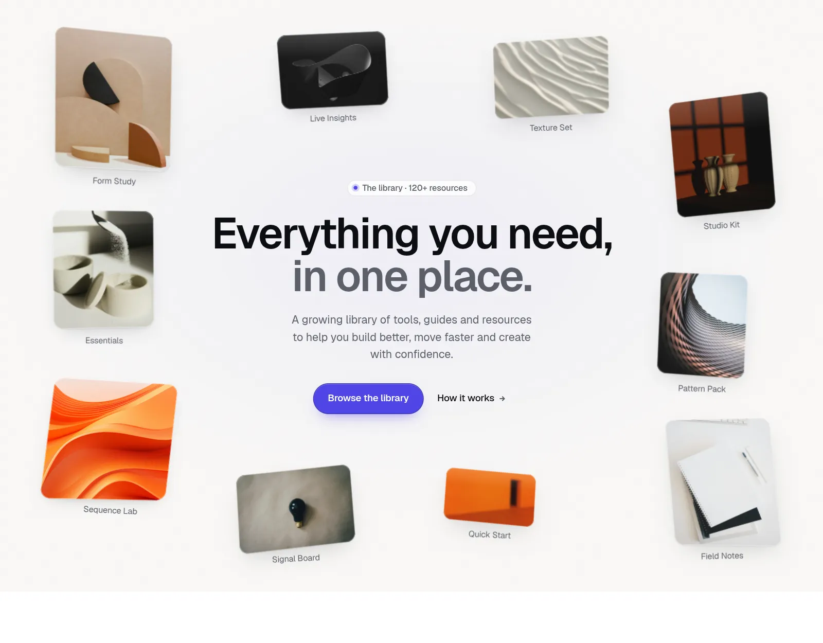
A 3D parallax image gallery hero for React: cards float around your headline, follow the cursor like a camera, lift and face you on hover, and open into a cinematic lightbox. Framer Motion, light/dark themes, keyboard, touch and reduced-motion support.
by UpForkComponentUpdated 9 Oct 2026
Before you buy
How this component gets from the preview into your project, and what buyers ask most.
How to use it
From the preview to your project
Try it in the preview
Switch between light and dark, and resize it to phone and tablet widths, before you decide.
Get it
Free products are yours with a free account. Paid ones settle in USDT on TRON, sent straight to the wallet on your order.
Install it
Components go into your project with one shadcn command, dependencies included. Everything else downloads with a checksum.
Make it yours
It's your code now: rename it, restyle it and wire in your real data.
Or hand it to your AI
Copy the prompt and let your coding assistant place it in your project, following your conventions.
Yes, a free one: it keeps your order, every payment you make for it and the files together. Free products need it too: without an account you can look and try the live preview, but not download, install or copy anything.
Send the price as a USDT transfer on TRON (TRC-20) to the wallet on your order, shown with its QR code, then paste the transaction ID on the order. It's checked on-chain, and the files unlock once it's confirmed. Paid less? You're asked for the rest.
Yes. The Standard License covers unlimited personal and commercial projects, client work included; just don't resell it on its own. Open-source licenses say so on the product.
Create a CLI token on your account page, put it in your project's .env.local, add UpFork to components.json once, and install with npx shadcn add: free and paid components alike.
Onto your order, in your account. Download links last ten minutes and can be made again.
Releases are scanned for malware and reviewed before anyone can download them, and every file shows its SHA-256 so you can check what you got.
Building with an AI assistant?
Copy a ready-made prompt with the code, its dependencies and a demo, and your assistant can put it in place for you.
Selling your own work?
Get approved once, then publish components, templates and apps, paid in USDT straight to your own wallet.
Components
npm packages
20 files · 1 package · 20 assets
The code comes with the Pro plan
The files above install into your project with one command, or download as a ZIP.
See the plansPerspective Cards turns a collection into a scene. Your image cards float in 3D around the headline, each one turned toward it, and the whole scene moves with the cursor like a camera: near cards travel more than far ones while the headline drifts gently the other way. Click a card and that exact card grows into a cinematic lightbox, then flies back into its place when you close it.
seed, with captions kept clear of other cards..dark class or the system setting. Any accent colour; six CSS variables to re-theme.Pointer movement, idle float, hover and scroll all run on motion values, so React never re-renders while anything moves, and only transform and opacity change. The main bundle is under 12 kB gzipped; the lightbox and the phone layout load as small separate chunks. Our demo scores 98+ for performance and 100 for accessibility, best practices and SEO in Lighthouse (desktop), with zero layout shift.
PerspectiveCards component in TypeScript, with its own stylesheetPerspectiveLightbox, PerspectiveCard, usePointerParallax and the pure layout functionsmotion (Framer Motion) is the only dependencynext/image through the renderImage propPass your own items (image, title, alt text, size, and an optional description and link), headline, call to action and accent colour. Tune depth, parallax and tilt, or try another composition with seed.


