New
Loading the page…
Loading the page…
Loading the page…
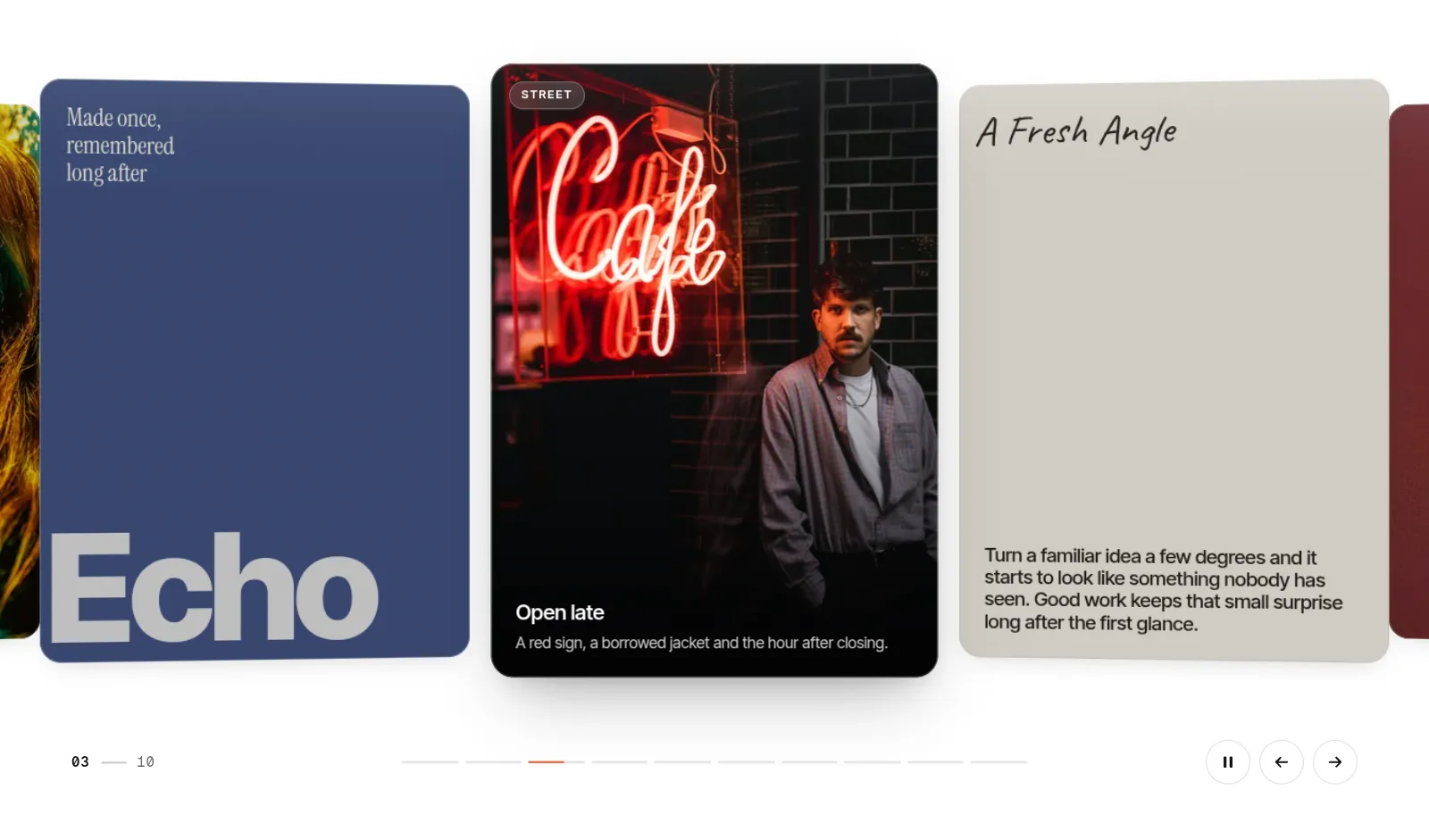
A draggable 3D carousel for React and Next.js: photo, video and text cards on a curved arc with momentum, a seamless infinite loop, autoplay and a click-to-expand detail view. Built with Motion, keyboard and screen-reader accessible, light and dark.
by UpForkComponentUpdated 9 Oct 2026
Before you buy
How this component gets from the preview into your project, and what buyers ask most.
How to use it
From the preview to your project
Try it in the preview
Switch between light and dark, and resize it to phone and tablet widths, before you decide.
Get it
Free products are yours with a free account. Paid ones settle in USDT on TRON, sent straight to the wallet on your order.
Install it
Components go into your project with one shadcn command, dependencies included. Everything else downloads with a checksum.
Make it yours
It's your code now: rename it, restyle it and wire in your real data.
Or hand it to your AI
Copy the prompt and let your coding assistant place it in your project, following your conventions.
Yes, a free one: it keeps your order, every payment you make for it and the files together. Free products need it too: without an account you can look and try the live preview, but not download, install or copy anything.
Send the price as a USDT transfer on TRON (TRC-20) to the wallet on your order, shown with its QR code, then paste the transaction ID on the order. It's checked on-chain, and the files unlock once it's confirmed. Paid less? You're asked for the rest.
Yes. The Standard License covers unlimited personal and commercial projects, client work included; just don't resell it on its own. Open-source licenses say so on the product.
Create a CLI token on your account page, put it in your project's .env.local, add UpFork to components.json once, and install with npx shadcn add: free and paid components alike.
Onto your order, in your account. Download links last ten minutes and can be made again.
Releases are scanned for malware and reviewed before anyone can download them, and every file shows its SHA-256 so you can check what you got.
Building with an AI assistant?
Copy a ready-made prompt with the code, its dependencies and a demo, and your assistant can put it in place for you.
Selling your own work?
Get approved once, then publish components, templates and apps, paid in USDT straight to your own wallet.
Components
npm packages
20 files · 1 package · 40 assets
The code comes with the Pro plan
The files above install into your project with one command, or download as a ZIP.
See the plansA draggable 3D carousel for React and Next.js, built for the front page of a studio, a portfolio, a product drop or a magazine. Photo, video and text cards sit on a shallow curved arc and move like real objects: drag them 1:1, flick them with momentum, and they always land exactly on a card. It runs on its own small physics engine, written for this component, with no carousel library underneath.
.dark class or colour scheme. Set your fonts and accent
colour with CSS variables.Nothing in React re-renders while the carousel moves: every frame runs on Motion values, using transforms and opacity only. Images load eagerly only near the start, cards far off screen stay mounted but hidden, and the first screen is laid out before any JavaScript runs, so there is no layout shift. About 13 KB gzipped on top of React and Motion.
A labelled carousel region with a single tab stop for the active card, slide announcements for screen readers ("Slide 3 of 9"), visible focus rings, a proper dialog that keeps and returns focus, an always-available pause button, and full support for reduced motion (no springs, no autoplay, a still arc). axe reports no issues, and captions keep a 4.5:1 contrast over the photos.
Installs with the shadcn CLI and adds motion (Framer Motion's current name). React 19 (18 works), Next.js App
Router or Vite. Plain CSS with dc- classes, so it sits beside Tailwind CSS without touching it.
<DynamicCarousel slides={slides} label="Selected work" />
Props let you set the card width and aspect ratio, gap, loop, autoplay interval, depth, tilt and parallax strength,
alignment, theme, accent colour, and whether a click opens the detail view. There is also a ref with next(),
prev(), goTo(), pause() and play(), and an onChange callback.
The preview shows it four ways: an editorial set of ten mixed cards, a dark product rail at full depth, a flat minimal rail, and a complete studio page with all three. Demo photographs come from Unsplash and the ink clip from Pexels; replace them with your own.


