New

Backgrounds
Loading the page…
Loading the page…
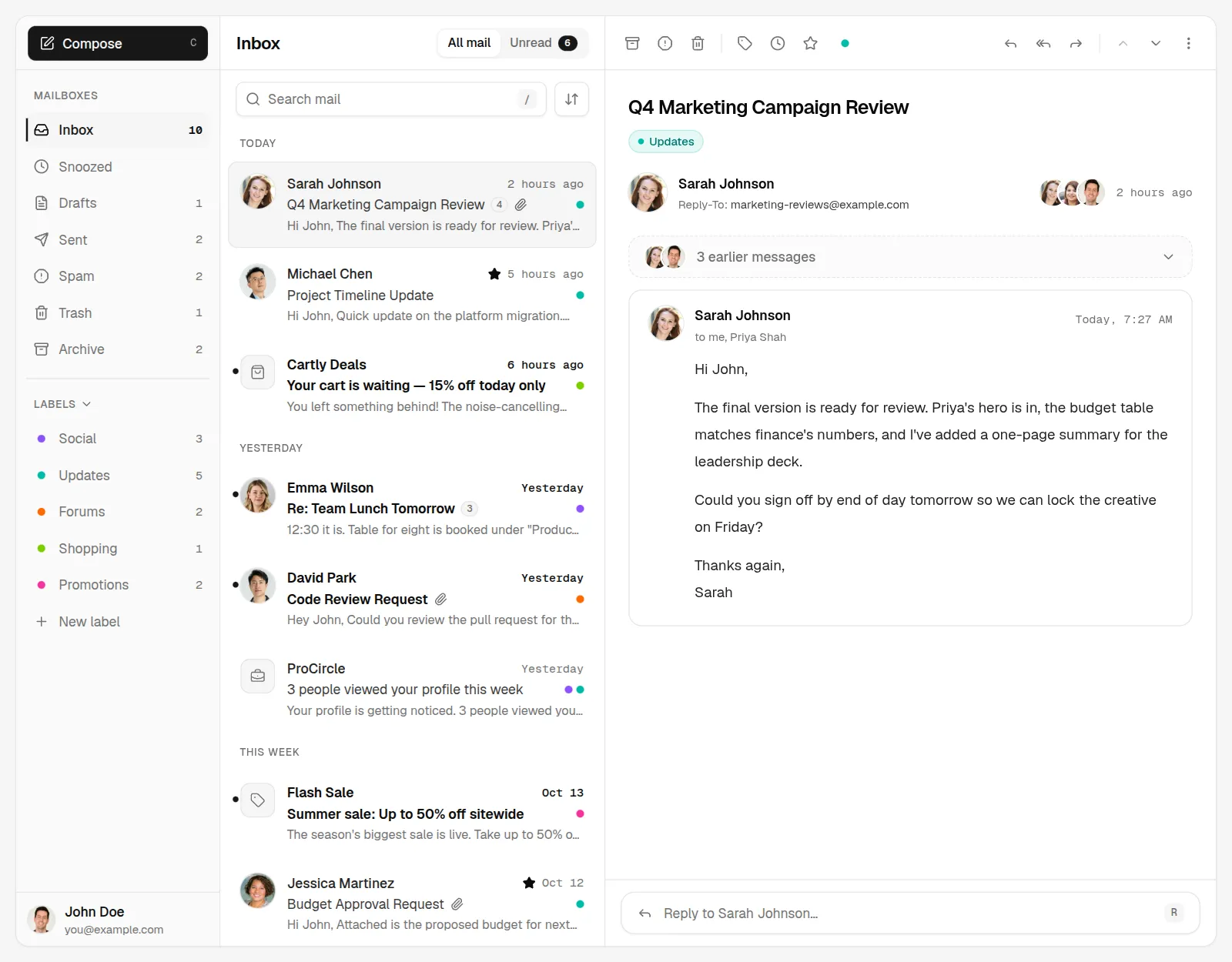
A complete email client for React and shadcn/ui: three resizable panes, folders and labels, threaded conversations, a rich-text compose window with recipient chips and attachments, an inline reply, snooze, multi-select with bulk actions, undo toasts, keyboard shortcuts, phone…
by UpFork, built by Ramin ValadanComponentUpdated 15 Oct 2026
Before you buy
How this component gets from the preview into your project, and what buyers ask most.
How to use it
From the preview to your project
Try it in the preview
Switch between light and dark, and resize it to phone and tablet widths, before you decide.
Get it
Free products are yours with a free account. Paid ones settle in USDT on TRON, sent straight to the wallet on your order.
Install it
Components go into your project with one shadcn command, dependencies included. Everything else downloads with a checksum.
Make it yours
It's your code now: rename it, restyle it and wire in your real data.
Or hand it to your AI
Copy the prompt and let your coding assistant place it in your project, following your conventions.
Yes, a free one: it keeps your order, every payment you make for it and the files together. Free products need it too: without an account you can look and try the live preview, but not download, install or copy anything.
Send the price as a USDT transfer on TRON (TRC-20) to the wallet on your order, shown with its QR code, then paste the transaction ID on the order. It's checked on-chain, and the files unlock once it's confirmed. Paid less? You're asked for the rest.
Yes. The Standard License covers unlimited personal and commercial projects, client work included; just don't resell it on its own. Open-source licenses say so on the product.
Create a CLI token on your account page, put it in your project's .env.local, add UpFork to components.json once, and install with npx shadcn add: free and paid components alike.
Onto your order, in your account. Download links last ten minutes and can be made again.
Releases are scanned for malware and reviewed before anyone can download them, and every file shows its SHA-256 so you can check what you got.
Building with an AI assistant?
Copy a ready-made prompt with the code, its dependencies and a demo, and your assistant can put it in place for you.
Selling your own work?
Get approved once, then publish components, templates and mobile components, paid in USDT straight to your own wallet.
Components
shadcn/ui components
33 files · 10 packages · 15 assets
The code comes with the Pro plan
The files above install into your project with one command, or download as a ZIP.
See the plansA premium mail client you drop into a dashboard: folders and labels on the left, the conversation list in the middle, the thread on the right, in three resizable panes that remember their sizes. Search highlights what it finds, rows animate out when you archive them, every action can be undone, and the whole thing runs from the keyboard. The Compose window floats bottom-right like Gmail's, with recipient chips, rich text, attachments and autosave. Tablets get two panes, phones one screen at a time with swipes and a full-screen composer. It uses only shadcn/ui's theme tokens, so it looks finished in light and dark and takes on your theme.
Built from the brief in prompt/component/mail-upgrade-prompt.md (a redesign of an admin template's Mail page),
written from scratch.
Next.js 16 (App Router), React 19, TypeScript strict, Tailwind CSS 4, shadcn/ui (Radix), react-resizable-panels,
sonner, TipTap 3, motion, zustand, cmdk, react-day-picker, lucide icons, Geist and Geist Mono.
pnpm install
pnpm dev                    # http://localhost:3000
pnpm build && pnpm start    # production
The demo page is the mail client filling the window, with a light / system / dark switch. Press ? for the
shortcuts. The address bar follows the view (?folder=sent, ?label=social, ?id=code-review), so views can be
linked and Back works.
import { Mail } from "@/components/mail"

export default function MailPage() {
  return (
    <div className="h-[calc(100dvh-12rem)]">
      <Mail urlState />
    </div>
  )
}
<Mail> fills its parent, so give the parent a height. It picks its layout from its own width, not the window's,
so it works inside any dashboard shell: three panes from 900 px, two from 640 px, one below.
| Prop | Default | What it does |
|---|---|---|
data | the demo mailbox | Your mailbox: { me, people, labels, threads } (see types.ts) |
defaultFolder | "inbox" | The folder to open first (the address bar wins when urlState is on) |
defaultThreadId | — | The conversation open at first, by thread id |
urlState | false | Mirror ?folder, ?label and ?id in the address bar |
shortcuts | true | Gmail-style single-key shortcuts |
toaster | true | Mount a sonner <Toaster />; turn off if your layout already has one |
loadingDelay | 320 | How long the list shows its skeleton on first load and folder changes (0 = never) |
storageKey | "mail" | Where pane sizes are kept in localStorage |
onSend(draft) | — | Called when a message is sent, to hand it to your backend |
onReply(thread, mode, html) | — | Called when a reply or forward is sent |
className | — | Classes for the root |
All state lives in one zustand store made per <Mail> (store.ts): the actions (change with Undo snapshots,
send, reply, saveDraft, addLabel, wakeSnoozed…) are pure functions over the threads, and every count is
derived from the data, never stored. Swap createMailData() for your own data loader and call your API from
onSend / onReply, or wrap store.actions to persist changes.
•••, attachment cards
with a download button, and your own messages on a quieter surface.Real buttons with names, a roving tab stop in the list (↑ ↓ Home End), focus rings from --ring, labelled switches
and fields, live announcements for counts, inert behind the full-screen composer, and reduced motion respected
everywhere. axe-core (WCAG 2.2 AA) reports no issues on the main screens in either theme. One detail: shadcn's
muted-foreground on muted is 4.3 : 1, just under AA, so muted text on muted or accent surfaces uses the
foreground at 60 % instead (TEXT_ON_MUTED in parts.tsx): same palette, 5 : 1.
pnpm test          # Vitest: store, Undo snapshots, send/draft/reply, snooze, search, grouping, dates, parsing
pnpm lint          # ESLint (Next's config, React Compiler rules)
pnpm typecheck
node scripts/e2e.mjs [url]          # 108 click-through checks in Chrome (the brief's checklist, phone and tablet)
node scripts/a11y.mjs [url]         # axe-core on 7 screens × light and dark
pnpm shots [url] [scene…]           # screenshots in .review/ at 1440, 1024, 768 and 390 px, light and dark
components/mail/
  mail.tsx              <Mail>: store, layouts by width, dialogs, toaster
  store.ts              the zustand store and its pure thread operations (Undo snapshots)
  selectors.ts          counts, views, search, sorting, date groups, highlights
  data.ts               the demo mailbox (dates relative to now)
  mail-sidebar.tsx      folders, labels, New label, the icon rail
  mail-list.tsx         header, tabs, search, sort, bulk bar, groups, skeleton, empty states
  mail-list-item.tsx    a row: avatar/checkbox, quick actions, chips, swipe, long press
  mail-toolbar.tsx      the folder-aware toolbar
  thread-view.tsx       the reading pane, earlier messages, draft preview, no-selection state
  message-card.tsx      a message, its body (paragraphs, lists, quotes) and attachments
  inline-reply.tsx      the reply box
  compose-window.tsx    the Compose window
  rich-text.tsx         TipTap and its toolbar (its own chunk, preloaded while idle; editor.tsx loads it)
  recipient-input.tsx   address chips with suggestions
  label-picker.tsx      Manage labels
  snooze-menu.tsx       Snooze presets (+ snooze-calendar.tsx, loaded when the date picker opens)
  sender-card.tsx       the hover card (a tap-to-open card on touch screens)
  shortcuts.tsx         the keyboard shortcuts and the cheat sheet
  use-thread-actions.ts every action with its toast and Undo
  url-state.ts          the address bar sync
components/ui/          the shadcn/ui components it uses, unchanged
public/images/avatars/  the photos (CREDITS.md), public/files/ the demo attachments
scripts/                fetch-avatars, attachments, e2e, a11y, screenshots
Everything is drawn from shadcn's tokens (background, foreground, muted, accent, border, ring,
primary, destructive, sidebar) plus the five label hues in parts.tsx (LABEL_STYLES). Change your theme and
the mail follows; there are no hard-coded colours in the components. Times and counts use font-mono (Geist Mono in
a default shadcn project).
Avatar (a plain <img> with explicit width and height, lazy, with the initials fallback
delayed so it never flashes) instead of next/image, so the component installs in any React project.Photos: Unsplash, listed in public/images/avatars/CREDITS.md. The names, addresses and messages are invented.
Icons: lucide. UI primitives: shadcn/ui (MIT).
0 reviews · 0 bugs
Ship it0With fixes0Skip0· 0 reviews
0 bugs0 open0 fixed
Members who have it review it and report its bugs. Sign in
No reviews or bugs yet.


