New

Backgrounds
Loading the page…
Loading the page…
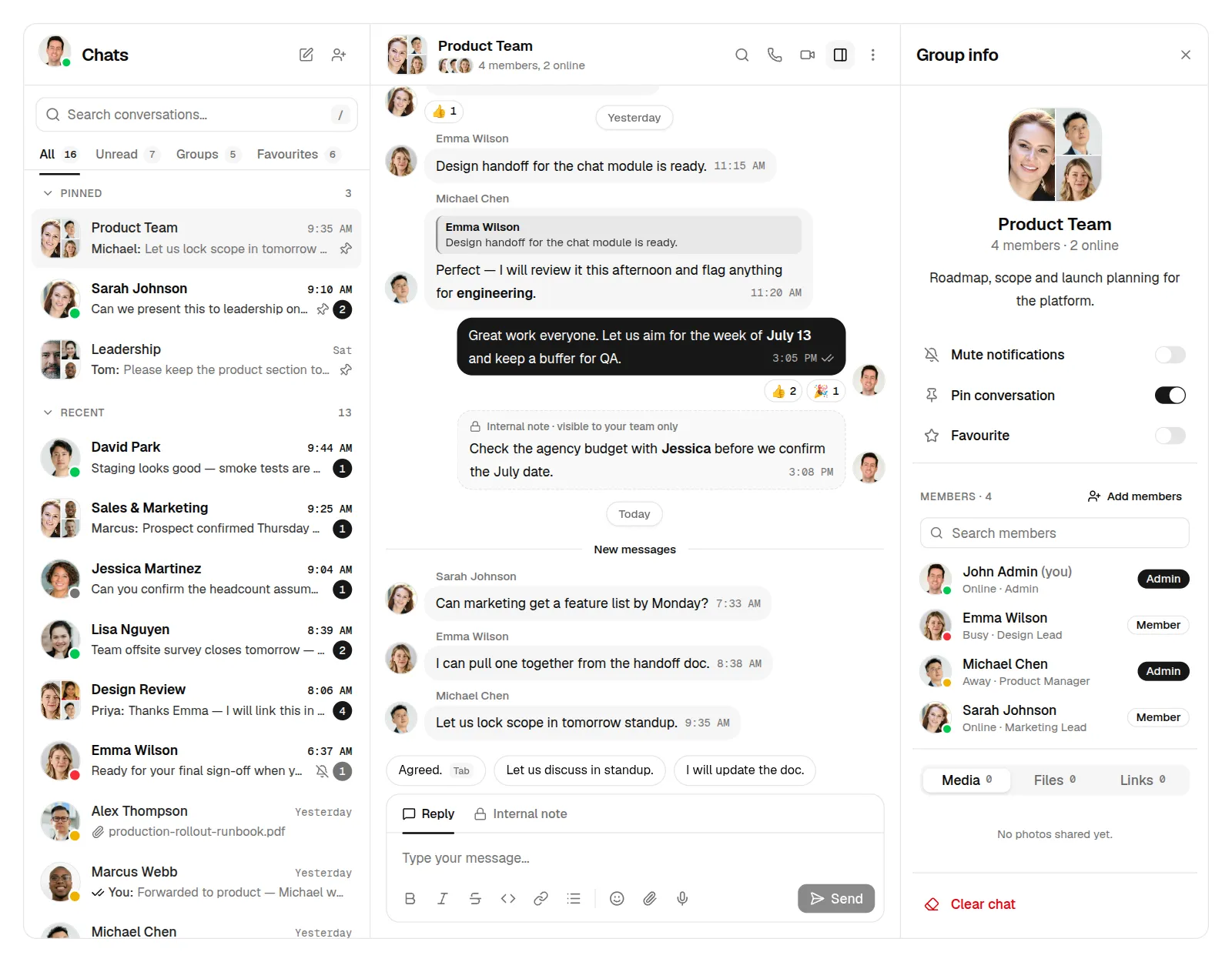
A complete team chat for React and shadcn/ui: conversation list with tabs, threads with replies, reactions and Markdown, image lightbox, file uploads, voice notes, internal notes, @mentions, calls, contact and group details, profile and invites. Light and dark, phone to desktop.
by UpFork, built by Ramin ValadanComponentUpdated 15 Oct 2026
Before you buy
How this component gets from the preview into your project, and what buyers ask most.
How to use it
From the preview to your project
Try it in the preview
Switch between light and dark, and resize it to phone and tablet widths, before you decide.
Get it
Free products are yours with a free account. Paid ones settle in USDT on TRON, sent straight to the wallet on your order.
Install it
Components go into your project with one shadcn command, dependencies included. Everything else downloads with a checksum.
Make it yours
It's your code now: rename it, restyle it and wire in your real data.
Or hand it to your AI
Copy the prompt and let your coding assistant place it in your project, following your conventions.
Yes, a free one: it keeps your order, every payment you make for it and the files together. Free products need it too: without an account you can look and try the live preview, but not download, install or copy anything.
Send the price as a USDT transfer on TRON (TRC-20) to the wallet on your order, shown with its QR code, then paste the transaction ID on the order. It's checked on-chain, and the files unlock once it's confirmed. Paid less? You're asked for the rest.
Yes. The Standard License covers unlimited personal and commercial projects, client work included; just don't resell it on its own. Open-source licenses say so on the product.
Create a CLI token on your account page, put it in your project's .env.local, add UpFork to components.json once, and install with npx shadcn add: free and paid components alike.
Onto your order, in your account. Download links last ten minutes and can be made again.
Releases are scanned for malware and reviewed before anyone can download them, and every file shows its SHA-256 so you can check what you got.
Building with an AI assistant?
Copy a ready-made prompt with the code, its dependencies and a demo, and your assistant can put it in place for you.
Selling your own work?
Get approved once, then publish components, templates and mobile components, paid in USDT straight to your own wallet.
Components
63 files · 8 packages · 25 assets
The code comes with the Pro plan
The files above install into your project with one command, or download as a ZIP.
See the plansA complete chat app (the dashboard's /apps/chat) built on shadcn/ui with Base UI primitives, Tailwind CSS 4,
motion, sonner, zustand and the frimousse emoji picker. Light and dark, phone to wide desktop.
npm install
npm run dev      # http://localhost:5201
npm run build && npm run start   # review build on http://localhost:5200
/); All / Unread / Groups / Favourites with
live counts; collapsible Pinned, Recent and Archived sections; rows with presence ring, smart dates, You: and
receipts, typing and draft previews, Markdown in previews, pin / mute / 99+ badges; hover quick actions,
right-click menu (mute 1 h / 8 h / 1 week / Always), skeletons, ↑/↓ + Enter, reorder animation.xl (sheet below), contact and group info with Media / Files / Links,
My profile (avatar upload with circle crop, sections, status, custom status), Invite (chips, invalid e-mails,
role, message, copy link), New chat / New group, confirmations for every destructive action, toasts with Undo,
keyboard shortcut sheet (?).| Path | |
|---|---|
0 reviews · 0 bugs
Ship it0With fixes0Skip0· 0 reviews
0 bugs0 open0 fixed
Members who have it review it and report its bugs. Sign in
No reviews or bugs yet.
components/chat/chat-layout.tsxChatLayout: panes, URL state (?c=, ?m=), shortcuts, overlays |
components/chat/actions.ts | pure actions (sendMessage, react, muteChat, clearChat, …) |
components/chat/store.ts | the zustand store (data + UI state) |
components/chat/commands.ts | user commands: confirm dialogs and toasts with Undo |
components/chat/data.ts | the demo conversations (dates move to "today" on load) |
components/chat/demo.ts | demo realism: receipts, typing, canned replies, uploads (remove for a real backend) |
lib/contacts.ts | the people, shared by every app of the dashboard |
public/images/avatars/ | profile photos (npm run avatars, credits in CREDITS.md) |
public/images/chat/ | image attachments (npm run media, credits in CREDITS.md) |
public/emojibase/en/ | emoji data for the picker, self-hosted (npm run emoji) |
npm run shots takes review screenshots (light and dark, 1440 → 390 px) into screenshots/.
The app needs a <Toaster /> (sonner) mounted once, as app/layout.tsx does.


