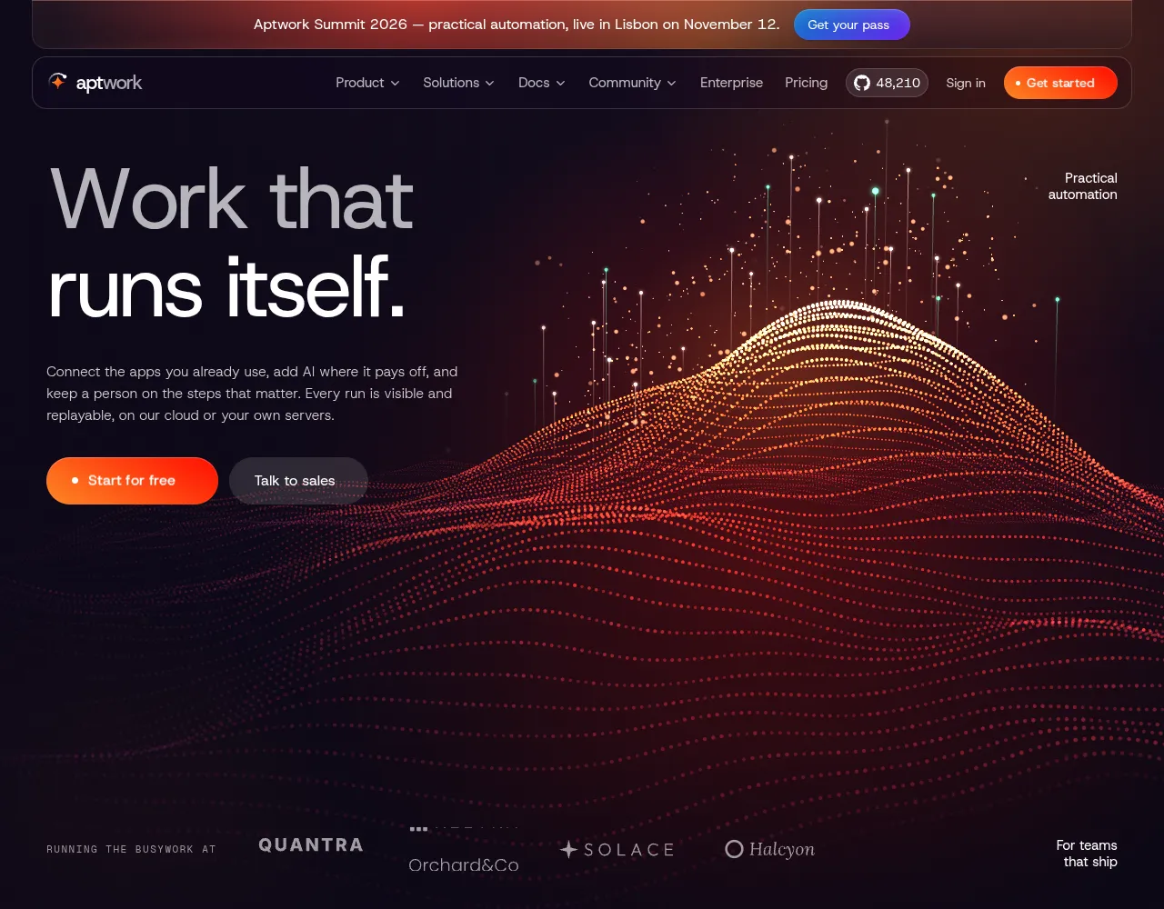


Landing page
FreeMIT LicenseFeatured
Aptwork – AI automation SaaS landing page
A dark, motion-rich landing page for an automation or AI SaaS: a three.js data-terrain hero, workflows that actually run, a pinned 3D feature deck, pricing and FAQ. Next.js 16, Tailwind 4, GSAP.
by UpFork, built by Ramin ValadanLanding pageUpdated 27 Oct 2026
Code
46 files · 5 packages · 76 assets
46 files76 assets6 packages278 KB of code
About
A landing page template for an automation product, built as a single long-scroll page with cinematic, scroll-driven scenes. It was bred from two design languages: the product system of a workflow-automation platform (floating glass header, mega menus, glowing cards, bento grids, integration walls) and the editorial motion of a designer's portfolio (giant split-letter type, a hero that shrinks into a card, a pinned project switcher, a sideways rail, pluckable strings, a 3D fly-through). Its own idea is the workflows: they are not pictures, they run in front of the visitor.
| Stack | Next.js 16 (App Router, TypeScript strict) · React 19 · Tailwind CSS 4 · GSAP 3.15 (ScrollTrigger, SplitText, Flip, MotionPath) · Lenis smooth scroll · three.js (the hero scene, custom GLSL) · lucide-react |
| Page | Header · Hero · Workflows ("Watch it work") · Principles + proof · Building blocks · AI grid · Code & debug stack · Integrations · Results · Enterprise · Testimonials · Pricing · FAQ · Footer · "Talk to sales" dialog |
| Responsive | 360px phones to 1920px+ desktops; editorial type scales with the viewport and is clamped at both ends |
| A11y | One h1, labelled landmarks, keyboard menus (role="menubar"/menu, aria-expanded), accordion and dialog semantics, focus trap and restore, inert closed panels, visible focus rings |
| Reduced motion | Honoured everywhere: no scroll lock, no smooth scrolling, pinned scenes become static grids or cross-fades, text appears without splitting, the strings are silent |
Run it
pnpm install
pnpm dev          # http://localhost:3000
pnpm lint && pnpm build && pnpm start
Node.js 20.9+ (22 recommended) and pnpm. The build fetches Host Grotesk and Geist Mono from Google Fonts once; to
go fully offline, switch app/layout.tsx to next/font/local.
What happens on the page
| Section | What it does |
|---|---|
| Intro | Scrolling waits about two seconds: the headline rises letter by letter, the side notes and buttons follow, the header drops in, then scrolling unlocks, while the 3D terrain rises out of a flat, dark field and its data pins start firing. |
| Hero (300vh) | A 3D "data terrain" (three.js, custom shaders): about 45,000 dots in rows form a landscape of light that flows slowly toward the viewer, with a glowing peak whose crest burns white-hot. Data pins shoot up from the surface like runs firing (some in "succeeded" green), sparks rise off the ridge, and the field bulges and brightens under the pointer while the camera drifts with it. Pins and sparks fade out wherever the text is. On scroll the card shrinks to half size and rounds into a card while a wall of running automations sharpens behind it, and the camera glides in. Customer logos roll like a slot machine. |
| Watch it work (400vh) | A fire dome rises over the wall, the section pins, and every scroll step snaps to the next use case: its product window slides up, the previous one dims, and the window on top runs its workflow — steps light up, a data packet travels along the edges, checks pop in, an approval note appears, and the execution log fills in with timings. On phones the canvas is zoomed and the camera follows the run. |
| Principles | Three promises; hovering one draws a fire line under it from the left and wipes it away to the right. Proof tiles below. |
| Building blocks (275vh) | A rail of five cards slides sideways while pinned; fire grows from the centre of the card you hover. |
| AI grid | Agent console with status pills that pop in (hover replays them), the self-hosting stack, and a chat that rises line by line. The grid eases back to 90% as it leaves. |
| Build & debug (300vh) | A pinned deck of two cards. The first tilts up into place as you arrive; scrolling on, it leans back, sinks and dims while the second rises in front, its copy following, with a 01 → 02 progress line. Both product views are live: a code step whose run cursor walks the JavaScript while the input rows light up and the output fills in, and a workflow where one step fails (429, rate limited), "Re-run this step" is pressed, only that step runs again and the run carries on. Below 1024px (and with reduced motion) the cards stack. |
| Integrations (240vh) | Tiles fly out of deep space, through the headline and past the camera; then two rows tilt up from the floor and run in opposite directions. |
| Results | Rows split by strings you can pluck with the mouse (they play a note after the first click anywhere). A case-study card springs to the row under the cursor. |
| Enterprise | Capabilities, a row of server racks rising in over a soft light, a quote card. |
| Testimonials | One voice at a time; the avatars reorder around the speaker (GSAP Flip). Arrows, avatar clicks or a drag switch quotes. |
| Pricing | Monthly/yearly toggle with counting prices; the fire fill moves to whichever plan you hover. |
| FAQ | Single-open accordion; the plus turns into a minus inside a fire disk. |
| Footer | The closing call to action on a fire-lit horizon with drifting stars, then a glass card with the big wordmark, contacts, socials and links. |
Project layout
app/                 layout (fonts, metadata), page (section order), globals.css (tokens + effects), icon.svg
components/
  brand/             Logo, Mark (an AI spark with a run looping round it)
  hero/              Hero (intro, shrink, wall), DataTerrain (loads the 3D scene), LogoSlots
    terrain/         scene.ts (three.js setup, layouts per screen shape, pointer, scroll), shaders.ts (GLSL),
                     palettes.ts (colour presets)
  workflow/          WorkflowWindow (the run timeline, incl. fail + re-run), WorkflowCanvas (the SVG),
                     CodeStepWindow (a code step that runs), HintArea
  sections/          Workflows, Principles, Blocks, AiGrid (+ OrchestratorArt), FeatureStack (the deck),
                     Integrations, Results, Enterprise, Testimonials, Pricing, Faq
  layout/            Header (menus, drawer), Footer
  modal/             ContactModal, ContactForm (with the phone country picker)
  providers/         SmoothScroll (Lenis on GSAP's ticker), ContactModalProvider
  ui/                RollButton, Button, TextReveal, SectionHeading, Collapse, StringLine, InitialsAvatar, icons
data/
  site.ts            every word on the page, menus, plans, people, links
  workflows.ts       the live workflows (nodes, edges, run steps, an optional failing step) and the deck's syncFlow
lib/                 gsap (plugin registration), anim (timeline helpers), hooks, pluck (the string sound), cn
public/              images/ (workflow diagrams, illustrations, star fields), logos/, icons/, og-image.jpg
Re-skin it
- Brand.
data/site.ts→brand(name, two-part wordmark, legal name, contacts, GitHub stars). The mark iscomponents/brand/Logo.tsx(the spark takes the fire gradient, the loop and its node take the text color); the browser icon isapp/icon.svg; the share image ispublic/og-image.jpg(1200×630). The hero core's tools are The hero scene's colours are a preset:data/site.ts→hero.sceneis"ember"(matches the page) or"ocean"(blue-teal); add your own incomponents/hero/terrain/palettes.ts. For a fully cool hero, also change the warm tints of.hero-card-bginglobals.css. Its composition per screen shape (camera, peak position, dot density, where the text is) islayoutFor()incomponents/hero/terrain/scene.ts. - Palette.
app/globals.css→ the@themeblock: surfaces (ink,night,navy-*), fire (fire-*), electric (volt-*) and text roles.bg-fire/text-fireare the brand gradient. Components never carry a hex (the workflow SVG's node tints live at the top ofWorkflowCanvas.tsx). - Type.
app/layout.tsxloads the fonts. Editorial sizes are utilities inglobals.css:text-display(hero),text-section,text-heading,text-title,text-lead,text-meta— each is phone / tablet / desktop and clamped. - Copy. Everything a visitor reads is in
data/site.ts, including menus, plans, FAQ, testimonials and the form's labels and messages. Headlines are two-tone:{ dim, bright }. - Workflows.
data/workflows.ts. A flow is nodes on a 1000×400 canvas (trigger,squareorwidefor AI steps withtools), edges between them (with optional branch labels) and arun: the steps in order, what the log says each did, how long it took and how long it glows. Icons are names looked up incomponents/ui/icons.ts. - Contact form.
ContactFormtakesonSubmit(data); it currently only shows "Demo only. No message was sent." Wire it to your CRM, an email API or a Server Action.
Media and placeholders
| What | Where | Replace with |
|---|---|---|
| Hero scene, mark, product views | Drawn in code (three.js + GLSL, SVG, HTML): nothing to replace, everything re-colours with the presets and tokens | Pick a palette in data/site.ts, change the flows in data/workflows.ts, the code in CodeStepWindow.tsx |
| Wall snapshots | public/images/workflows/*.svg, data/site.ts → wallTiles, wallCode, wallLog | Your own screens |
| Enterprise racks | public/images/enterprise-racks.webp (1609×1178, transparent) | Any cut-out illustration; keep a transparent background |
| Customers, case studies | public/logos/*.svg (white wordmarks) | Real logos once you have permission |
| People | Initials avatars drawn in code (InitialsAvatar) | Photos, if you have the rights |
| Integrations | public/icons/tiles/*.svg (generic line icons) | Your integrations' logos |
All companies, people, quotes, numbers and prices are fictional placeholders. Customer wordmarks are invented; nothing implies an affiliation.
Notes
- Smooth scroll. Lenis runs on GSAP's ticker and feeds ScrollTrigger, so pinned scenes stay in sync. Elements
that should scroll natively inside the page (the dialog, the country list, the mobile menu) carry
data-lenis-prevent. - Sound. The strings in Results synthesize a plucked note with the Web Audio API (no audio files). Browsers only allow sound after a user gesture, so the strings stay silent until the visitor has clicked or pressed a key once.
- No video, no heavy images. The hero, the logo, the console and every product view are drawn in code, so they stay sharp at any size and the page ships under 1 MB of static assets. three.js (about 140 KB gzipped) loads after the page has painted. Everything that animates pauses while it is off screen.
- The hero scene runs at 60 fps on an integrated laptop GPU (Intel Iris Plus, tested). It draws about 45,000 dots
on desktops and 16,000 on phones, caps the pixel ratio (1.75 desktop, 1.5 phones), stops rendering when the hero is
off screen or the tab is hidden, draws one still frame for
prefers-reduced-motion, and falls back to its soft CSS light when WebGL is unavailable. - Licenses. Host Grotesk and Geist Mono: SIL Open Font License. lucide: ISC. Lenis: MIT. three.js: MIT. The
simplex noise in
shaders.tsis Ashima Arts / Stefan Gustavson's (MIT). GSAP and its plugins: GSAP's standard no-charge license (commercial use allowed; see gsap.com/standard-license). The images, videos, logos and icons inpublic/were made for this template.
Reviews and bugs
0 reviews · 0 bugs
Ship it0With fixes0Skip0· 0 reviews
0 bugs0 open0 fixed
Members who have it review it and report its bugs. Sign in
No reviews or bugs yet.
Manual installation
Without the CLI
- 01
Install the packages
npm install @gsap/react gsap lenis lucide-react three - 02
And their TypeScript types
npm install -D @types/three - 03
Copy the files into your project
- app/page.tsx
- components/aptwork/brand/Logo.tsx
- components/aptwork/hero/DataTerrain.tsx
- components/aptwork/hero/Hero.tsx
- components/aptwork/hero/LogoSlots.tsx
- components/aptwork/hero/terrain/palettes.ts
- components/aptwork/hero/terrain/scene.ts
- components/aptwork/hero/terrain/shaders.ts
- components/aptwork/layout/AptworkShell.tsx
- components/aptwork/layout/Footer.tsx
- components/aptwork/layout/Header.tsx
- components/aptwork/modal/ContactForm.tsx
- components/aptwork/modal/ContactModal.tsx
- components/aptwork/providers/ContactModalProvider.tsx
- components/aptwork/providers/SmoothScroll.tsx
- components/aptwork/sections/AiGrid.tsx
- components/aptwork/sections/Blocks.tsx
- components/aptwork/sections/Enterprise.tsx
- components/aptwork/sections/Faq.tsx
- components/aptwork/sections/FeatureStack.tsx
- components/aptwork/sections/Integrations.tsx
- components/aptwork/sections/OrchestratorArt.tsx
- components/aptwork/sections/Pricing.tsx
- components/aptwork/sections/Principles.tsx
- components/aptwork/sections/Results.tsx
- components/aptwork/sections/Testimonials.tsx
- components/aptwork/sections/Workflows.tsx
- components/aptwork/ui/Button.tsx
- components/aptwork/ui/Collapse.tsx
- components/aptwork/ui/icons.ts
- components/aptwork/ui/InitialsAvatar.tsx
- components/aptwork/ui/RollButton.tsx
- components/aptwork/ui/SectionHeading.tsx
- components/aptwork/ui/StringLine.tsx
- components/aptwork/ui/TextReveal.tsx
- components/aptwork/workflow/CodeStepWindow.tsx
- components/aptwork/workflow/HintArea.tsx
- components/aptwork/workflow/WorkflowCanvas.tsx
- components/aptwork/workflow/WorkflowWindow.tsx
- lib/aptwork/anim.ts
- lib/aptwork/cn.ts
- lib/aptwork/data/site.ts
- lib/aptwork/data/workflows.ts
- lib/aptwork/gsap.ts
- lib/aptwork/hooks.ts
- lib/aptwork/pluck.ts
The paths follow the shadcn/ui layout, with
@/as your project’s import alias. - 04
Its pictures load from UpFork
The code above points at UpFork’s copies (562 KB), so there’s nothing to copy. To host them yourself, use Download source: its ZIP has the files where the code expects them, and a README on the switch.
It shows pictures with
next/image, which loads only from hosts it’s told about. Add this tonext.config:images: { remotePatterns: [{ protocol: "https", hostname: "upfork.dev", pathname: "/assets/**" }], }, - 05
Add its styles to your stylesheet
Copy the rules of
globals.css(in the code above) into your global stylesheet,app/globals.cssin Next.js, after its@importlines. The CLI does this for you.
Before you buy
Everything you need to know
How this landing page gets from the preview into your project, and what buyers ask most.
How to use it
From the preview to your project
- 01
Try it in the preview
Switch between light and dark, and resize it to phone and tablet widths, before you decide.
- 02
Get it
Free products are yours with a free account. Paid ones settle in USDT on TRON, sent straight to the wallet on your order.
- 03
Install it
Components go into your project with one shadcn command, dependencies included. Everything else downloads with a checksum.
- 04
Make it yours
It's your code now: rename it, restyle it and wire in your real data.
- 05
Or hand it to your AI
Copy the prompt and let your coding assistant place it in your project, following your conventions.
Yes, a free one: it keeps your order, every payment you make for it and the files together. Free products need it too: without an account you can look and try the live preview, but not download, install or copy anything.
Send the price as a USDT transfer on TRON (TRC-20) to the wallet on your order, shown with its QR code, then paste the transaction ID on the order. It's checked on-chain, and the files unlock once it's confirmed. Paid less? You're asked for the rest.
Yes. MIT and the Standard License both cover unlimited personal and commercial projects, client work included; the Standard License only asks that you don't resell it on its own. The product's page names its license.
Create a CLI token on your account page, put it in your project's .env.local, add UpFork to components.json once, and install with npx shadcn add: free and paid components alike.
Onto your order, in your account. Download links last ten minutes and can be made again.
Releases are scanned for malware and reviewed before anyone can download them, and every file shows its SHA-256 so you can check what you got.
Building with an AI assistant?
Copy a ready-made prompt with the code, its dependencies and a demo, and your assistant can put it in place for you.
Selling your own work?
Get approved once, then publish components, templates and mobile components, paid in USDT straight to your own wallet.
Landing pages
More like this


