New
Loading the page…
Loading the page…
Loading the page…
Before you buy
How this mobile component gets from the preview into your project, and what buyers ask most.
How to use it
From the preview to your project
Try it in the preview
Switch between light and dark, and resize it to phone and tablet widths, before you decide.
Get it
Free products are yours with a free account. Paid ones settle in USDT on TRON, sent straight to the wallet on your order.
Install it
Components go into your project with one shadcn command, dependencies included. Everything else downloads with a checksum.
Make it yours
It's your code now: rename it, restyle it and wire in your real data.
Or hand it to your AI
Copy the prompt and let your coding assistant place it in your project, following your conventions.
Yes, a free one: it keeps your order, every payment you make for it and the files together. Free products need it too: without an account you can look and try the live preview, but not download, install or copy anything.
Send the price as a USDT transfer on TRON (TRC-20) to the wallet on your order, shown with its QR code, then paste the transaction ID on the order. It's checked on-chain, and the files unlock once it's confirmed. Paid less? You're asked for the rest.
Yes. The Standard License covers unlimited personal and commercial projects, client work included; just don't resell it on its own. Open-source licenses say so on the product.
Create a CLI token on your account page, put it in your project's .env.local, add UpFork to components.json once, and install with npx shadcn add: free and paid components alike.
Onto your order, in your account. Download links last ten minutes and can be made again.
Releases are scanned for malware and reviewed before anyone can download them, and every file shows its SHA-256 so you can check what you got.
Building with an AI assistant?
Copy a ready-made prompt with the code, its dependencies and a demo, and your assistant can put it in place for you.
Selling your own work?
Get approved once, then publish components, templates and mobile components, paid in USDT straight to your own wallet.
Mobile
A curved dial carousel for React Native: items ride a true circular arc and the one under the ring is chosen. Momentum, detent haptics and an exact landing, with a live fractional index to blend the screen above, like a camera's filter dial. Touch, mouse and wheel, light and…
by UpFork, built by Ramin ValadanMobile componentUpdated 14 Oct 2026
9 files · 6 packages
import * as Haptics from 'expo-haptics';
import {
  memo,
  useCallback,
  useEffect,
  useImperativeHandle,
  useMemo,
  useRef,
  useState,
  type ReactNode,
  type Ref,
} from 'react';
import {
  AccessibilityInfo,
  I18nManager,
  Platform,
  StyleSheet,
  View,
  useWindowDimensions,
  type AccessibilityActionEvent,
  type LayoutChangeEvent,
  type StyleProp,
  type ViewStyle,
} from 'react-native';
import { Gesture, GestureDetector } from 'react-native-gesture-handler';
import Animated, {
  cancelAnimation,
  useAnimatedReaction,
  useAnimatedStyle,
  useDerivedValue,
  useReducedMotion,
  useSharedValue,
  withDelay,
  withSequence,
  withSpring,
  withTiming,
  type SharedValue,
} from 'react-native-reanimated';
import { scheduleOnRN } from 'react-native-worklets';

import { useScheme, type Scheme } from '../../lib/use-scheme';
import {
  layoutArc,
  placeOnArc,
  placesAt,
  smooth,
  wrapIndex,
  wrapPlaces,
  type ArcGeometry,
} from './geometry';

export type ArcPickerHandle = { scrollToIndex(index: number, animated?: boolean): void };

export type ArcPickerItemInfo<T> = {
  item: T;
  index: number;
  /** 1 under the ring, falling to 0 one place away: follows the dial every frame. */
  active: SharedValue<number>;
};

export type ArcPickerProps<T> = {
  data: readonly T[];
  keyExtractor: (item: T, index: number) => string;
  renderItem: (info: ArcPickerItemInfo<T>) => ReactNode;
  /** A name for the item, shown under the ring as the dial turns. */
  getLabel?: (item: T, index: number) => string;
  accessibilityLabelForItem: (item: T, index: number) => string;
  /** What the dial chooses, for screen readers: "Filter". */
  accessibilityLabel?: string;
  /** The chosen item, if you control it. */
  index?: number;
  defaultIndex?: number;
  /** Once the dial has settled on another item. */
  onChange?: (index: number) => void;
  /** A tap on the item already under the ring. */
  onPressSelected?: (index: number) => void;
  /** Pass one to follow the dial as a fractional index (wrapped into 0…length with `loop`). */
  progress?: SharedValue<number>;
  itemSize?: number;
  /** The gap between items along the arc. */
  spacing?: number;
  /** The circle's radius. Defaults to 1.6× the dial's width: a gentle arc. */
  radius?: number;
  /** How many degrees of the circle can show items. */
  span?: number;
  /** `bottom`: the circle's centre is below and the ends fall away. `top`: it's above and the ends rise. */
  position?: 'bottom' | 'top';
  orientation?: 'upright' | 'tangent';
  shape?: 'circle' | 'rounded' | 'none';
  /** Wrap around without end. Needs six items or more. */
  loop?: boolean;
  /**
   * Drawn inside the ring, over the chosen item: a shutter's face. The dial keeps every touch (so a drag can start
   * on the ring); a tap there is `onPressSelected`, and `pressed` follows the finger on the ring from 0 to 1.
   */
  renderCenter?: (info: { pressed: SharedValue<number> }) => ReactNode;
  /** What a double-tap does, for screen readers ("Takes a photo"). Activating the dial calls `onPressSelected`. */
  accessibilityHint?: string;
  ringColor?: string;
  labelColor?: string;
  scheme?: Scheme;
  haptics?: boolean;
  style?: StyleProp<ViewStyle>;
  ref?: Ref<ArcPickerHandle>;
};

const SNAP = { stiffness: 260, damping: 28, mass: 1 };
const TAP = { stiffness: 200, damping: 24, mass: 1 };
const REDUCED = { duration: 180 };
/** `withDecay`'s travel for a deceleration of 0.995: velocity (per second) × this. */
const DECAY_TRAVEL = 0.995 / (1 - 0.995) / 1000;
const RUBBER = 0.35;
const DETENT_GAP = 45;
const LABEL_HEIGHT = 20;
const LABEL_GAP = 78;
const LOOP_MIN = 6;
/** Up to this many items, every item stays mounted and the dial never re-renders while it turns. */
const MOUNT_ALL = 40;

const COLORS = {
  dark: {
    ring: '#FFFFFF',
    hairline: 'rgba(255, 255, 255, 0.34)',
    border: 'rgba(255, 255, 255, 0.85)',
    label: '#FFFFFF',
    shadow: 'rgba(0, 0, 0, 0.22)',
    shadowActive: 'rgba(0, 0, 0, 0.30)',
  },
  light: {
    ring: '#15151D',
    hairline: 'rgba(21, 21, 29, 0.26)',
    border: '#FFFFFF',
    label: '#15151D',
    shadow: 'rgba(20, 20, 30, 0.22)',
    shadowActive: 'rgba(20, 20, 30, 0.30)',
  },
} as const;

// On the web a vibration before the first tap is refused with a console error, and desktops can't vibrate anyway.
const CAN_BUZZ = Platform.OS !== 'web';
const webGrab = Platform.OS === 'web' ? ({ cursor: 'grab', outlineStyle: 'none' } as unknown as ViewStyle) : null;

/**
 * The pointer's speed (points a second) over its last moves. Gesture Handler's own is sometimes 0 for a quick flick on
 * the web; this one is measured from the samples kept as [position, time, position, time, …].
 */
function trackedSpeed(samples: number[]) {
  'worklet';
  const n = samples.length;
  if (n < 4) return 0;
  const x1 = samples[n - 2];
  const t1 = samples[n - 1];
  let k = n - 4;
  while (k >= 2 && t1 - samples[k - 1] <= 100) k -= 2;
  const dt = t1 - samples[k + 1];
  return dt > 0 ? ((x1 - samples[k]) / dt) * 1000 : 0;
}

/** The place of a slot from the ring, for a dial at `p`. */
function placesFromRing(slot: number, p: number, wrap: boolean, n: number) {
  'worklet';
  return wrap ? wrapPlaces(slot - p, n) : slot - p;
}

/**
 * A curved dial carousel: items ride a true circular arc and the one under the fixed ring is chosen. Turn it with a
 * finger, a mouse drag or the wheel; it has weight, momentum and detents, and lands exactly under the ring.
 */
export function ArcPicker<T>({
  data,
  keyExtractor,
  renderItem,
  getLabel,
  accessibilityLabelForItem,
  accessibilityLabel = 'Picker',
  accessibilityHint,
  index: controlledIndex,
  defaultIndex = 0,
  onChange,
  onPressSelected,
  progress,
  itemSize = 64,
  spacing = 14,
  radius: radiusProp,
  span = 110,
  position = 'bottom',
  orientation = 'upright',
  shape = 'circle',
  loop: loopProp = false,
  renderCenter,
  ringColor,
  labelColor,
  scheme: schemeProp,
  haptics = true,
  style,
  ref,
}: ArcPickerProps<T>) {
  const scheme = useScheme(schemeProp);
  const colors = COLORS[scheme];
  const reduceMotion = useReducedMotion();
  const window = useWindowDimensions();
  const [width, setWidth] = useState(window.width);
  const n = data.length;
  const loop = loopProp && n >= LOOP_MIN;
  const rtl = I18nManager.isRTL;
  const ringSize = Math.round(itemSize * 1.25);
  const radius = radiusProp ?? Math.max(width * 1.6, itemSize * 2);

  const { geometry, height, labelTop } = useMemo(
    () =>
      layoutArc({
        width,
        itemSize,
        ringSize,
        spacing,
        radius,
        span,
        position,
        orientation,
        rtl,
        labelHeight: getLabel ? LABEL_HEIGHT : 0,
      }),
    [width, itemSize, ringSize, spacing, radius, span, position, orientation, rtl, getLabel],
  );

  const clampIndex = useCallback((i: number) => Math.min(Math.max(Math.round(i), 0), Math.max(n - 1, 0)), [n]);
  const startIndex = clampIndex(controlledIndex ?? defaultIndex);
  // The dial itself: a fractional place. With `loop` it runs without end; every slot wraps itself.
  const p = useSharedValue(startIndex);
  const [selected, setSelected] = useState(startIndex);
  const settledRef = useRef(startIndex);
  const click = useSharedValue(0);
  const pressed = useSharedValue(0);

  // Which slots are mounted: every item when there are few, else a window round the ring.
  const reach = geometry.reach;
  const mountAll = n <= MOUNT_ALL && (!loop || n >= reach * 2 + 3);
  const [center, setCenter] = useState(startIndex);
  useAnimatedReaction(
    () => Math.round(p.value),
    (now, before) => {
      if (mountAll || before === null) return;
      if (Math.abs(now - center) >= 2) scheduleOnRN(setCenter, now);
    },
    [mountAll, center],
  );

  // The fractional index, for the screen above.
  useAnimatedReaction(
    () => p.value,
    (value) => {
      if (progress) progress.value = loop ? wrapIndex(value, n) : value;
    },
    [progress, loop, n],
  );

  // Detents: the ring clicks as each item passes under it, with a tick no closer than 45 ms.
  const lastDetent = useRef(0);
  const onDetent = useCallback(() => {
    const now = Date.now();
    if (now - lastDetent.current < DETENT_GAP) return;
    lastDetent.current = now;
    if (haptics && CAN_BUZZ) Haptics.selectionAsync().catch(() => undefined);
  }, [haptics]);
  useAnimatedReaction(
    () => Math.round(p.value),
    (now, before) => {
      if (before === null || now === before) return;
      click.value = withSequence(withTiming(1, { duration: 16 }), withDelay(60, withTiming(0, { duration: 110 })));
      scheduleOnRN(onDetent);
    },
    [onDetent],
  );

  // Where the wheel and the keyboard are headed, so quick notches add up.
  const wheel = useRef({ total: 0, target: null as number | null, idle: null as ReturnType<typeof setTimeout> | null });

  const announce = useCallback(
    (index: number) => {
      const item = data[index];
      if (item !== undefined) AccessibilityInfo.announceForAccessibility(accessibilityLabelForItem(item, index));
    },
    [data, accessibilityLabelForItem],
  );

  const settle = useCallback(
    (slot: number) => {
      const index = loop ? wrapIndex(slot, n) : clampIndex(slot);
      wheel.current.target = null;
      if (haptics && CAN_BUZZ) Haptics.impactAsync(Haptics.ImpactFeedbackStyle.Light).catch(() => undefined);
      if (index === settledRef.current) return;
      settledRef.current = index;
      setSelected(index);
      onChange?.(index);
      announce(index);
    },
    [loop, n, clampIndex, haptics, onChange, announce],
  );

  /** Turns the dial to a slot (a place on the endless dial with `loop`), and settles there. */
  const springTo = useCallback(
    (slot: number, config: typeof SNAP, velocity = 0) => {
      'worklet';
      const done = (finished?: boolean) => {
        'worklet';
        if (finished) scheduleOnRN(settle, slot);
      };
      p.value = reduceMotion ? withTiming(slot, REDUCED, done) : withSpring(slot, { ...config, velocity }, done);
    },
    [p, reduceMotion, settle],
  );

  /** The slot for a data index nearest the dial, so a loop takes the short way round. */
  const slotFor = useCallback(
    (index: number) => {
      const target = clampIndex(index);
      if (!loop) return target;
      return target + n * Math.round((p.value - target) / n);
    },
    [clampIndex, loop, n, p],
  );

  const scrollToIndex = useCallback(
    (index: number, animated = true) => {
      if (n === 0) return;
      const slot = slotFor(index);
      cancelAnimation(p);
      if (animated) springTo(slot, TAP);
      else {
        p.value = slot;
        settle(slot);
      }
    },
    [n, slotFor, p, springTo, settle],
  );

  useImperativeHandle(ref, () => ({ scrollToIndex }), [scrollToIndex]);

  useEffect(() => {
    if (controlledIndex !== undefined && clampIndex(controlledIndex) !== settledRef.current) scrollToIndex(controlledIndex);
  }, [controlledIndex, clampIndex, scrollToIndex]);

  // One pan does it all: a drag turns the dial, a short touch that doesn't move is a tap. Touching a moving dial
  // catches it, like a hand on a spinning wheel.
  const startX = useSharedValue(0);
  const startP = useSharedValue(0);
  const startTime = useSharedValue(0);
  const lastMove = useSharedValue({ x: 0, t: 0 });
  const samples = useSharedValue<number[]>([]);
  const travel = geometry.step + geometry.push;
  const last = n - 1;

  const tapAt = (x: number, y: number) => {
    'worklet';
    const near = Math.round(p.value);
    let best = Number.NaN;
    let bestDistance = itemSize * 0.75;
    for (let k = near - reach; k <= near + reach; k += 1) {
      if (!loop && (k < 0 || k > last)) continue;
      const spot = placeOnArc(k - p.value, geometry);
      if (Math.abs(spot.theta) > geometry.hideAngle) continue;
      const distance = Math.hypot(spot.x - x, spot.y - y);
      if (distance < bestDistance) {
        bestDistance = distance;
        best = k;
      }
    }
    if (Number.isNaN(best)) {
      springTo(Math.round(p.value), SNAP);
      return;
    }
    if (best === near && Math.abs(p.value - near) < 0.08) {
      p.value = near;
      if (onPressSelected) scheduleOnRN(onPressSelected, loop ? wrapIndex(near, n) : near);
      return;
    }
    springTo(best, TAP);
  };

  const pan = Gesture.Pan()
    .enabled(n > 1)
    .activeOffsetX([-6, 6])
    .failOffsetY([-16, 16])
    .onBegin((event) => {
      cancelAnimation(p);
      if (Math.hypot(event.x - geometry.cx, event.y - geometry.apexY) < ringSize / 2 && Math.abs(p.value - Math.round(p.value)) < 0.08) {
        pressed.value = withTiming(1, { duration: 90 });
      }
      startX.value = event.absoluteX;
      startP.value = p.value;
      startTime.value = Date.now();
      lastMove.value = { x: event.absoluteX, t: Date.now() };
      samples.value = [event.absoluteX, Date.now()];
    })
    .onStart(() => {
      pressed.value = withTiming(0, { duration: 120 });
    })
    .onUpdate((event) => {
      if (event.absoluteX !== lastMove.value.x) {
        lastMove.value = { x: event.absoluteX, t: Date.now() };
        samples.value = [...samples.value.slice(-10), event.absoluteX, Date.now()];
      }
      const moved = (event.absoluteX - startX.value) * geometry.dir;
      const raw = startP.value - placesAt(moved, geometry);
      if (loop) p.value = raw;
      else p.value = raw < 0 ? raw * RUBBER : raw > last ? last + (raw - last) * RUBBER : raw;
    })
    .onEnd((event) => {
      // Speed as places a second, at the rate the item under the finger is moving along the arc.
      const rate = Math.abs(event.absoluteX - startX.value) < travel ? travel : geometry.step;
      // On the web the pointer's last speed lingers after it stops: a release after a pause has none.
      const resting = Date.now() - lastMove.value.t > 80;
      const speed = Math.abs(event.velocityX) > 1 ? event.velocityX : trackedSpeed(samples.value);
      const velocity = resting ? 0 : (-speed * geometry.dir) / rate;
      const from = Math.round(startP.value);
      let target = Math.round(p.value + velocity * DECAY_TRAVEL);
      // A deliberate flick always moves at least one item.
      if (target === from && Math.abs(velocity) > 1.2) target = from + Math.sign(velocity);
      if (!loop) target = Math.min(Math.max(target, 0), last);
      springTo(target, SNAP, velocity);
    })
    .onFinalize((event, success) => {
      pressed.value = withTiming(0, { duration: 180 });
      if (success) return;
      const still = Math.abs(event.absoluteX - startX.value) < 10 && Date.now() - startTime.value < 400;
      if (still) tapAt(event.x, event.y);
      else springTo(Math.round(p.value), SNAP);
    });
  const gesture = n > 1 ? pan : Gesture.Tap().onEnd((event) => tapAt(event.x, event.y));

  // The wheel (one notch, one item) and the keyboard, on the web.
  const stepBy = useCallback(
    (by: number) => {
      if (n < 2) return;
      const base = wheel.current.target ?? Math.round(p.value);
      let target = base + by;
      if (!loop) target = Math.min(Math.max(target, 0), last);
      wheel.current.target = target;
      cancelAnimation(p);
      springTo(target, TAP);
    },
    [n, p, loop, last, springTo],
  );
  const onWheel = (event: { nativeEvent: { deltaX: number; deltaY: number; deltaMode?: number } }) => {
    const { deltaX, deltaY, deltaMode } = event.nativeEvent;
    const delta = (Math.abs(deltaX) > Math.abs(deltaY) ? deltaX : deltaY) * (deltaMode === 1 ? 40 : deltaMode === 2 ? 400 : 1);
    const state = wheel.current;
    if (Math.abs(delta) >= 50) {
      state.total = 0;
      stepBy(Math.sign(delta));
    } else {
      state.total += delta;
      if (Math.abs(state.total) >= 60) {
        stepBy(Math.sign(state.total));
        state.total = 0;
      }
    }
    if (state.idle) clearTimeout(state.idle);
    state.idle = setTimeout(() => {
      state.total = 0;
      state.target = null;
    }, 220);
  };
  const onKeyDown = (event: { nativeEvent: { key: string }; preventDefault?: () => void }) => {
    const forward = rtl ? 'ArrowLeft' : 'ArrowRight';
    const back = rtl ? 'ArrowRight' : 'ArrowLeft';
    const key = event.nativeEvent.key;
    let by = 0;
    if (key === forward || key === 'ArrowDown') by = 1;
    else if (key === back || key === 'ArrowUp') by = -1;
    else if (key === 'Home') by = -Math.round(p.value);
    else if (key === 'End') by = last - Math.round(p.value);
    else return;
    event.preventDefault?.();
    stepBy(by);
  };
  useEffect(
    () => () => {
      if (wheel.current.idle) clearTimeout(wheel.current.idle);
    },
    [],
  );
  const webProps = Platform.OS === 'web' ? ({ onWheel, onKeyDown, focusable: true } as Record<string, unknown>) : {};

  const onAccessibilityAction = (event: AccessibilityActionEvent) => {
    const name = event.nativeEvent.actionName;
    if (name === 'increment') stepBy(1);
    else if (name === 'decrement') stepBy(-1);
    else if (name === 'activate') onPressSelected?.(settledRef.current);
  };

  const onLayout = (event: LayoutChangeEvent) => {
    const next = Math.round(event.nativeEvent.layout.width);
    if (next > 0 && next !== width) setWidth(next);
  };

  // The slots: data indices when every item is mounted, else places on the dial round its centre.
  const slots = useMemo(() => {
    const out: { slot: number; index: number; key: string }[] = [];
    if (n === 0) return out;
    if (mountAll) {
      for (let index = 0; index < n; index += 1) out.push({ slot: index, index, key: keyExtractor(data[index], index) });
      return out;
    }
    const span = reach + 2;
    for (let slot = center - span; slot <= center + span; slot += 1) {
      if (!loop && (slot < 0 || slot > last)) continue;
      const index = loop ? wrapIndex(slot, n) : slot;
      out.push({ slot, index, key: loop ? `${keyExtractor(data[index], index)}@${slot}` : keyExtractor(data[index], index) });
    }
    return out;
  }, [n, mountAll, reach, center, loop, last, keyExtractor, data]);

  const wrap = mountAll && loop;
  const corner = shape === 'circle' ? itemSize / 2 : shape === 'rounded' ? itemSize * 0.28 : 8;
  const ringCorner = shape === 'circle' ? ringSize / 2 : corner * (ringSize / itemSize);
  const selectedItem = data[selected];
  const itemLabel = selectedItem === undefined ? '' : accessibilityLabelForItem(selectedItem, selected);

  return (
    <View onLayout={onLayout} style={[styles.root, { height }, style]}>
      <GestureDetector gesture={gesture}>
        <Animated.View
          accessible
          accessibilityRole="adjustable"
          accessibilityLabel={accessibilityLabel}
          aria-valuemin={1}
          aria-valuemax={Math.max(n, 1)}
          aria-valuenow={selected + 1}
          aria-valuetext={n > 0 ? `${itemLabel}, ${selected + 1} of ${n}` : ''}
          accessibilityHint={accessibilityHint}
          accessibilityActions={
            onPressSelected
              ? [{ name: 'increment' }, { name: 'decrement' }, { name: 'activate' }]
              : [{ name: 'increment' }, { name: 'decrement' }]
          }
          onAccessibilityAction={onAccessibilityAction}
          style={[StyleSheet.absoluteFill, webGrab]}
          {...webProps}>
          {slots.map(({ slot, index, key }) => (
            <Slot
              key={key}
              item={data[index]}
              index={index}
              slot={slot}
              n={n}
              wrap={wrap}
              p={p}
              geometry={geometry}
              size={itemSize}
              corner={corner}
              border={colors.border}
              shadow={colors.shadow}
              shadowActive={colors.shadowActive}
              renderItem={renderItem}
              pressed={pressed}
            />
          ))}
          {getLabel
            ? slots.map(({ slot, index, key }) => (
                <Label
                  key={`label:${key}`}
                  text={getLabel(data[index], index)}
                  slot={slot}
                  n={n}
                  wrap={wrap}
                  p={p}
                  top={labelTop}
                  cx={geometry.cx}
                  dir={geometry.dir}
                  color={labelColor ?? colors.label}
                />
              ))
            : null}
        </Animated.View>
      </GestureDetector>
      <Ring
        size={ringSize}
        corner={ringCorner}
        x={geometry.cx}
        y={geometry.apexY}
        color={ringColor ?? colors.ring}
        hairline={colors.hairline}
        glow={scheme === 'dark'}
        click={click}
      />
      {renderCenter ? (
        <View
          pointerEvents="none"
          accessibilityElementsHidden
          importantForAccessibility="no-hide-descendants"
          style={[
            styles.center,
            { width: ringSize, height: ringSize, left: geometry.cx - ringSize / 2, top: geometry.apexY - ringSize / 2 },
          ]}>
          {renderCenter({ pressed })}
        </View>
      ) : null}
    </View>
  );
}

type SlotProps<T> = {
  item: T;
  index: number;
  slot: number;
  n: number;
  wrap: boolean;
  p: SharedValue<number>;
  geometry: ArcGeometry;
  size: number;
  corner: number;
  border: string;
  shadow: string;
  shadowActive: string;
  renderItem: (info: ArcPickerItemInfo<T>) => ReactNode;
  pressed: SharedValue<number>;
};

function SlotInner<T>({
  item,
  index,
  slot,
  n,
  wrap,
  p,
  geometry,
  size,
  corner,
  border,
  shadow,
  shadowActive,
  renderItem,
  pressed,
}: SlotProps<T>) {
  const active = useDerivedValue(() => smooth(1 - Math.abs(placesFromRing(slot, p.value, wrap, n))));
  const half = (geometry.step / geometry.radius) * 0.5;

  const place = useAnimatedStyle(() => {
    const d = placesFromRing(slot, p.value, wrap, n);
    const spot = placeOnArc(d, geometry);
    const angle = Math.abs(spot.theta);
    const far = smooth(angle / geometry.fadeAngle);
    let opacity = 1 - 0.65 * far;
    // Past the span's end (when it ends on screen) items fade out instead of popping.
    if (angle > geometry.spanAngle - half) opacity *= 1 - smooth((angle - (geometry.spanAngle - half)) / (half * 2));
    if (angle > geometry.hideAngle) opacity = 0;
    const scale = (1 - 0.18 * far) * (1 + 0.28 * active.value) * (1 - 0.06 * pressed.value * active.value);
    const turn = geometry.tangent ? geometry.dir * geometry.sign * spot.theta : 0;
    return {
      opacity,
      zIndex: Math.round(100 - Math.min(Math.abs(d), 9) * 10),
      transform: [
        { translateX: spot.x - size / 2 },
        { translateY: spot.y - size / 2 },
        { rotate: `${turn}rad` },
        { scale },
      ],
    };
  });
  const lifted = useAnimatedStyle(() => ({ opacity: active.value }));

  const content = useMemo(() => renderItem({ item, index, active }), [renderItem, item, index, active]);
  const round = { borderRadius: corner };

  return (
    <Animated.View pointerEvents="none" style={[styles.slot, { width: size, height: size }, place]}>
      <View style={[StyleSheet.absoluteFill, round, { boxShadow: `0px 6px 14px ${shadow}` }]} />
      <Animated.View style={[StyleSheet.absoluteFill, round, { boxShadow: `0px 10px 24px ${shadowActive}` }, lifted]} />
      <View style={[StyleSheet.absoluteFill, round, styles.clip]}>{content}</View>
      <View style={[StyleSheet.absoluteFill, round, { borderWidth: 2, borderColor: border }]} />
    </Animated.View>
  );
}
const Slot = memo(SlotInner) as typeof SlotInner;

type LabelProps = {
  text: string;
  slot: number;
  n: number;
  wrap: boolean;
  p: SharedValue<number>;
  top: number;
  cx: number;
  dir: number;
  color: string;
};

/** A label that slides and cross-fades with the dial, rather than swapping when it settles. */
const Label = memo(function Label({ text, slot, n, wrap, p, top, cx, dir, color }: LabelProps) {
  const style = useAnimatedStyle(() => {
    const d = placesFromRing(slot, p.value, wrap, n);
    const away = Math.abs(d);
    return {
      opacity: away > 1 ? 0 : 1 - smooth(away * 1.4),
      transform: [{ translateX: cx - 80 + dir * d * LABEL_GAP }],
    };
  });
  return (
    <Animated.Text
      numberOfLines={1}
      importantForAccessibility="no"
      style={[styles.label, { top, color }, style]}>
      {text.toUpperCase()}
    </Animated.Text>
  );
});

type RingProps = {
  size: number;
  corner: number;
  x: number;
  y: number;
  color: string;
  hairline: string;
  glow: boolean;
  click: SharedValue<number>;
};

/** The fixed selection ring: a 2 px stroke, a hairline round it and two index ticks. It clicks with each detent. */
const Ring = memo(function Ring({ size, corner, x, y, color, hairline, glow, click }: RingProps) {
  const outer = size + 12;
  const stroke = useAnimatedStyle(() => ({ opacity: 0.86 + 0.14 * click.value }));
  const halo = useAnimatedStyle(() => ({ opacity: 0.45 + 0.55 * click.value }));
  const fine = useAnimatedStyle(() => ({ opacity: 0.7 + 0.3 * click.value }));
  const outerCorner = corner === size / 2 ? outer / 2 : corner + 6;
  return (
    <View
      pointerEvents="none"
      accessibilityElementsHidden
      importantForAccessibility="no-hide-descendants"
      style={[styles.ring, { left: x - outer / 2 - 8, top: y - outer / 2 - 8, width: outer + 16, height: outer + 16 }]}>
      <Animated.View
        style={[
          styles.ringPart,
          { width: outer, height: outer, borderRadius: outerCorner, borderWidth: StyleSheet.hairlineWidth, borderColor: hairline },
          fine,
        ]}
      />
      <Animated.View style={[styles.tick, { top: 2, backgroundColor: color }, fine]} />
      <Animated.View style={[styles.tick, { bottom: 2, backgroundColor: color }, fine]} />
      {glow ? (
        <Animated.View
          style={[
            styles.ringPart,
            { width: size, height: size, borderRadius: corner, boxShadow: `0px 0px 18px ${withAlpha(color, 0.35)}` },
            halo,
          ]}
        />
      ) : null}
      <Animated.View
        style={[styles.ringPart, { width: size, height: size, borderRadius: corner, borderWidth: 2, borderColor: color }, stroke]}
      />
    </View>
  );
});

/** A #RRGGBB (or rgb/rgba) colour at another alpha. */
function withAlpha(color: string, alpha: number) {
  const hex = /^#([0-9a-f]{6})$/i.exec(color);
  if (hex) {
    const v = parseInt(hex[1], 16);
    return `rgba(${(v >> 16) & 255}, ${(v >> 8) & 255}, ${v & 255}, ${alpha})`;
  }
  const rgb = /^rgba?\(([^,]+),([^,]+),([^,)]+)/i.exec(color);
  if (rgb) return `rgba(${rgb[1].trim()}, ${rgb[2].trim()}, ${rgb[3].trim()}, ${alpha})`;
  return color;
}

const styles = StyleSheet.create({
  root: { width: '100%' },
  slot: { position: 'absolute', left: 0, top: 0 },
  clip: { overflow: 'hidden' },
  label: {
    position: 'absolute',
    left: 0,
    width: 160,
    height: LABEL_HEIGHT,
    lineHeight: LABEL_HEIGHT,
    textAlign: 'center',
    fontSize: 13,
    fontWeight: '600',
    letterSpacing: 1.2,
  },
  ring: { position: 'absolute', alignItems: 'center', justifyContent: 'center' },
  ringPart: { position: 'absolute' },
  tick: { position: 'absolute', width: 2, height: 6, borderRadius: 1 },
  center: { position: 'absolute', alignItems: 'center', justifyContent: 'center' },
});
Arc Picker is the dial behind camera filters, avatar builders, mood check-ins and theme choosers. Items ride a true circular arc, and the one under the fixed ring is chosen. It turns like a physical dial: weight, momentum, a click as each item passes, and an exact landing under the ring.
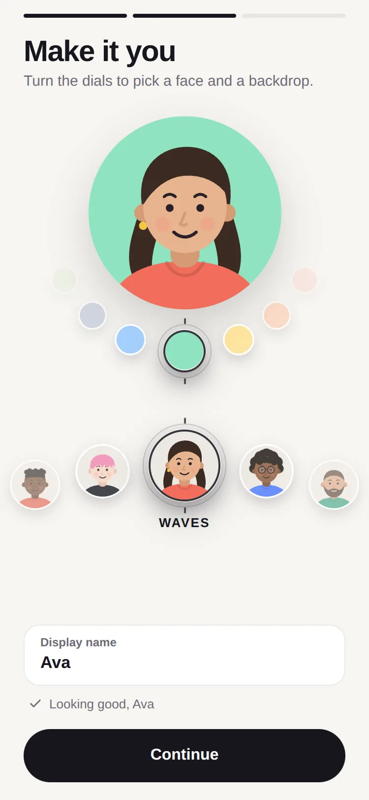
Three complete demos: a camera with a lakeside scene drawn in Skia and nine live filters, an avatar builder with ten drawn faces and a backdrop dial curving under them, and a mood journal whose whole screen takes the mood's colour.
0 reviews · 0 bugs
Ship it0With fixes0Skip0· 0 reviews
0 bugs0 open0 fixed
Members who have it review it and report its bugs. Sign in
No reviews or bugs yet.
React Native · Expo SDK 57
Built withSkiaExpo HapticsGesture HandlerReanimatedSVGSafe Area Context
Copy the files into your app
At your app’s root, the folders side by side as they are: the files import each other by relative paths.
Install the packages with Expo
npx expo install @shopify/react-native-skia expo-haptics react-native-gesture-handler react-native-reanimated react-native-svg react-native-workletsAnd what the demos use
npx expo install react-native-safe-area-contextSee it in your app
Make demos/avatar.tsx your app’s App.tsx, inside the GestureHandlerRootView that Gesture Handler needs at its root:
On the web, load Skia first
Phones need nothing more. On the web, copy node_modules/canvaskit-wasm/bin/full/canvaskit.wasm into your app’s public/ folder, add this index.web.ts, and set "main" to "index" in your package.json:
UpFork installs every revision just so into a fresh Expo app (SDK 57), type-checks it and builds it for the web before it goes on sale. An AI assistant can do it for you through UpFork’s MCP server: Install mobile components has both ways.
import { GestureHandlerRootView } from 'react-native-gesture-handler';

import Avatar from './demos/avatar';

export default function App() {
  return (
    <GestureHandlerRootView style={{ flex: 1 }}>
      <Avatar scheme="light" />
    </GestureHandlerRootView>
  );
}
import '@expo/metro-runtime';
import { LoadSkiaWeb } from '@shopify/react-native-skia/lib/module/web';
import { registerRootComponent } from 'expo';

// Skia's engine first (public/canvaskit.wasm), then the app: nothing that uses Skia may load before it.
LoadSkiaWeb({ locateFile: (file: string) => `/${file}` })
  .then(() => import('./App'))
  .then(({ default: App }) => registerRootComponent(App));


