New
Loading the page…
Loading the page…
Loading the page…
Before you buy
How this mobile component gets from the preview into your project, and what buyers ask most.
How to use it
From the preview to your project
Try it in the preview
Switch between light and dark, and resize it to phone and tablet widths, before you decide.
Get it
Free products are yours with a free account. Paid ones settle in USDT on TRON, sent straight to the wallet on your order.
Install it
Components go into your project with one shadcn command, dependencies included. Everything else downloads with a checksum.
Make it yours
It's your code now: rename it, restyle it and wire in your real data.
Or hand it to your AI
Copy the prompt and let your coding assistant place it in your project, following your conventions.
Yes, a free one: it keeps your order, every payment you make for it and the files together. Free products need it too: without an account you can look and try the live preview, but not download, install or copy anything.
Send the price as a USDT transfer on TRON (TRC-20) to the wallet on your order, shown with its QR code, then paste the transaction ID on the order. It's checked on-chain, and the files unlock once it's confirmed. Paid less? You're asked for the rest.
Yes. The Standard License covers unlimited personal and commercial projects, client work included; just don't resell it on its own. Open-source licenses say so on the product.
Create a CLI token on your account page, put it in your project's .env.local, add UpFork to components.json once, and install with npx shadcn add: free and paid components alike.
Onto your order, in your account. Download links last ten minutes and can be made again.
Releases are scanned for malware and reviewed before anyone can download them, and every file shows its SHA-256 so you can check what you got.
Building with an AI assistant?
Copy a ready-made prompt with the code, its dependencies and a demo, and your assistant can put it in place for you.
Selling your own work?
Get approved once, then publish components, templates and mobile components, paid in USDT straight to your own wallet.
Mobile
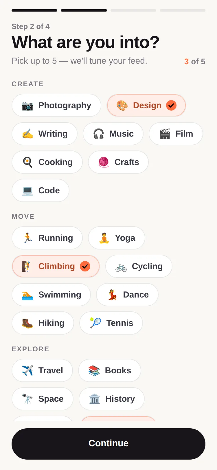
Choice chips that fill with colour from where you pressed, draw their check, and reflow like sliding objects. Multiple or single choice, limits with a polite refusal, wrap, scroll and grid layouts, three variants, three sizes, search. Light and dark, keyboard and screen readers.
by UpFork, built by Ramin ValadanMobile componentUpdated 14 Oct 2026
5 files · 4 packages
import { useEffect, useRef, useState, type ReactNode, type Ref } from 'react';
import {
  Platform,
  Pressable,
  StyleSheet,
  Text,
  View,
  type GestureResponderEvent,
  type LayoutChangeEvent,
  type StyleProp,
  type ViewStyle,
} from 'react-native';
import Animated, {
  Easing,
  interpolateColor,
  useAnimatedProps,
  useAnimatedStyle,
  useReducedMotion,
  useSharedValue,
  withDelay,
  withSequence,
  withSpring,
  withTiming,
} from 'react-native-reanimated';
import Svg, { Circle, Path } from 'react-native-svg';

import { useScheme, type Scheme } from '../../lib/use-scheme';
import { onColor, over, readableOn, rgba } from './color';

export type ChipSize = 'sm' | 'md' | 'lg';
export type ChipVariant = 'tinted' | 'outline' | 'solid';
export type CheckPlacement = 'leading' | 'trailing' | 'reserve';

export type ChipProps = {
  label: string;
  selected: boolean;
  onPress?: (point: { x: number; y: number }) => void;
  disabled?: boolean;
  icon?: (props: { color: string; size: number }) => ReactNode;
  emoji?: string;
  count?: number;
  accent?: string;
  variant?: ChipVariant;
  size?: ChipSize;
  checkPlacement?: CheckPlacement;
  /** Bump it to make the chip shake its head (a refused tap). */
  shake?: number;
  /** A part of the label to emphasise (a search match), as [start, end). */
  highlight?: [number, number] | null;
  role?: 'checkbox' | 'radio';
  accessibilityHint?: string;
  /** Stretch to fill its box (grids). */
  block?: boolean;
  scheme?: Scheme;
  style?: StyleProp<ViewStyle>;
  ref?: Ref<View>;
};

export const SIZES = {
  sm: { height: 32, pad: 12, font: 13, check: 16, gap: 6, icon: 16 },
  md: { height: 40, pad: 16, font: 15, check: 18, gap: 8, icon: 18 },
  lg: { height: 48, pad: 20, font: 16, check: 20, gap: 9, icon: 20 },
} as const;

export const CHIP_THEMES = {
  light: { surface: '#FFFFFF', line: 'rgba(20, 20, 30, 0.10)', label: '#3A3A46', muted: '#8A8A96', focus: '#3A3A46' },
  dark: { surface: '#17171C', line: 'rgba(255, 255, 255, 0.08)', label: '#C9C9D3', muted: '#7C7C88', focus: '#E9E9EF' },
} as const;

const AnimatedPath = Animated.createAnimatedComponent(Path);
const CHECK_LENGTH = 12;

// Whether the last input was the keyboard (web), so focus rings show for Tab, not for clicks.
let keyboardInput = false;
if (Platform.OS === 'web' && typeof document !== 'undefined') {
  document.addEventListener('keydown', () => (keyboardInput = true), true);
  document.addEventListener('pointerdown', () => (keyboardInput = false), true);
}

/**
 * One choice chip. Selecting it fills it with colour from where it was pressed, and a check draws itself in;
 * unselecting runs it back. Refused taps shake it.
 */
export function Chip({
  label,
  selected,
  onPress,
  disabled = false,
  icon,
  emoji,
  count,
  accent = '#FF6B3D',
  variant = 'tinted',
  size = 'md',
  checkPlacement = 'trailing',
  shake = 0,
  highlight,
  role = 'checkbox',
  accessibilityHint,
  block = false,
  scheme: schemeProp,
  style,
  ref,
}: ChipProps) {
  const scheme = useScheme(schemeProp);
  const theme = CHIP_THEMES[scheme];
  const reduceMotion = useReducedMotion();
  const s = SIZES[size];

  // Colours for both states, worked out once.
  const solid = variant === 'solid';
  const selectedFill = solid ? accent : variant === 'outline' ? over(accent, theme.surface, scheme === 'dark' ? 0.1 : 0.06) : over(accent, theme.surface, scheme === 'dark' ? 0.18 : 0.12);
  const selectedLabel = solid ? onColor(accent) : readableOn(accent, selectedFill);
  const selectedBorder = solid ? accent : rgba(accent, variant === 'outline' ? 1 : scheme === 'dark' ? 0.45 : 0.35);
  const checkFill = solid ? onColor(accent) : accent;
  const checkMark = solid ? accent : onColor(accent);

  const progress = useSharedValue(selected ? 1 : 0);
  const fill = useSharedValue(selected ? 1 : 0);
  const draw = useSharedValue(selected ? 0 : CHECK_LENGTH);
  const press = useSharedValue(1);
  const shakeX = useSharedValue(0);
  // Where the fill grows from (and shrinks back to): the last press, or the middle.
  const originX = useSharedValue(-1);
  const originY = useSharedValue(-1);
  const [box, setBox] = useState<{ width: number; height: number }>({ width: 0, height: s.height });
  const lastPoint = useRef({ x: 0, y: 0 });
  const [focusRing, setFocusRing] = useState(false);
  const first = useRef(true);

  useEffect(() => {
    if (first.current) {
      first.current = false;
      return;
    }
    if (reduceMotion) {
      progress.value = withTiming(selected ? 1 : 0, { duration: 120 });
      fill.value = withTiming(selected ? 1 : 0, { duration: 120 });
      draw.value = withTiming(selected ? 0 : CHECK_LENGTH, { duration: 120 });
      return;
    }
    originX.value = lastPoint.current.x;
    originY.value = lastPoint.current.y;
    progress.value = withTiming(selected ? 1 : 0, { duration: 220, easing: Easing.out(Easing.cubic) });
    fill.value = withTiming(selected ? 1 : 0, { duration: selected ? 260 : 220, easing: Easing.bezier(0.2, 0.8, 0.2, 1) });
    draw.value = selected
      ? withDelay(80, withTiming(0, { duration: 180, easing: Easing.out(Easing.quad) }))
      : withTiming(CHECK_LENGTH, { duration: 120 });
  }, [selected, reduceMotion, progress, fill, draw, originX, originY]);

  useEffect(() => {
    if (shake === 0) return;
    if (reduceMotion) return;
    shakeX.value = withSequence(
      withTiming(-5, { duration: 50 }),
      withTiming(5, { duration: 70 }),
      withTiming(-3.5, { duration: 70 }),
      withTiming(3.5, { duration: 70 }),
      withTiming(-1.5, { duration: 60 }),
      withTiming(0, { duration: 60 }),
    );
  }, [shake, reduceMotion, shakeX]);

  const container = useAnimatedStyle(() => ({
    transform: [{ translateX: shakeX.value }, { scale: press.value }],
  }));
  const border = useAnimatedStyle(() => ({ opacity: progress.value }));
  const labelColor = useAnimatedStyle(() => ({
    color: interpolateColor(progress.value, [0, 1], [theme.label, selectedLabel]),
  }));
  // The fill: a circle grown from where the chip was pressed, big enough to cover it from any point.
  const reach = Math.hypot(box.width, box.height);
  const half = { x: box.width / 2, y: box.height / 2 };
  const fillStyle = useAnimatedStyle(() => ({
    transform: [
      { translateX: (originX.value < 0 ? half.x : originX.value) - reach },
      { translateY: (originY.value < 0 ? half.y : originY.value) - reach },
      { scale: fill.value },
    ],
  }));
  const checkProps = useAnimatedProps(() => ({ strokeDashoffset: draw.value }));
  const checkStyle = useAnimatedStyle(() => ({
    opacity: progress.value,
    transform: [{ scale: 0.4 + 0.6 * progress.value }],
  }));

  const onPressIn = (event: GestureResponderEvent) => {
    lastPoint.current = { x: event.nativeEvent.locationX, y: event.nativeEvent.locationY };
    if (!reduceMotion) press.value = withSpring(0.96, { stiffness: 400, damping: 28 });
  };
  const onPressOut = () => {
    press.value = withSpring(1, { stiffness: 400, damping: 28 });
  };
  // Keyboard (web): the fill grows from the middle; Space toggles as Enter does.
  const onKey = (event: { nativeEvent: { key: string }; preventDefault?: () => void }) => {
    const key = event.nativeEvent.key;
    if (key !== 'Enter' && key !== ' ') return;
    lastPoint.current = { x: box.width / 2, y: box.height / 2 };
    if (key === ' ') {
      event.preventDefault?.();
      onPress?.(lastPoint.current);
    }
  };
  const onLayout = (event: LayoutChangeEvent) => {
    const { width, height } = event.nativeEvent.layout;
    if (Math.abs(width - box.width) > 0.5 || Math.abs(height - box.height) > 0.5) setBox({ width, height });
  };

  const showCheck = checkPlacement === 'reserve' ? true : selected;
  const check = showCheck ? (
    <Animated.View
      key="check"
      style={[{ width: s.check, height: s.check }, checkPlacement === 'reserve' ? checkStyle : null]}>
      <CheckMark size={s.check} fill={checkFill} mark={checkMark} animatedProps={checkProps} reveal={checkPlacement !== 'reserve'} />
    </Animated.View>
  ) : null;

  const labelNode = highlight ? (
    <>
      {label.slice(0, highlight[0])}
      <Text style={styles.match}>{label.slice(highlight[0], highlight[1])}</Text>
      {label.slice(highlight[1])}
    </>
  ) : (
    label
  );

  return (
    <Animated.View style={[block ? styles.block : null, container, style]}>
      <Pressable
        ref={ref}
        accessibilityRole={role}
        accessibilityLabel={count !== undefined ? `${label}, ${count}` : label}
        accessibilityHint={accessibilityHint}
        accessibilityState={{ checked: selected, disabled }}
        aria-checked={selected}
        onPress={() => onPress?.(lastPoint.current)}
        onPressIn={onPressIn}
        onPressOut={onPressOut}
        onFocus={() => setFocusRing(keyboardInput)}
        {...(Platform.OS === 'web' ? { onKeyDown: onKey } : null)}
        onBlur={() => setFocusRing(false)}
        hitSlop={size === 'sm' ? 6 : 2}
        onLayout={onLayout}
        style={[
          styles.chip,
          {
            height: s.height,
            borderRadius: s.height / 2,
            paddingHorizontal: s.pad,
            gap: s.gap,
            backgroundColor: variant === 'outline' ? 'transparent' : theme.surface,
            borderColor: theme.line,
            opacity: disabled ? 0.42 : 1,
          },
          block ? styles.blockChip : null,
          focusRing ? [styles.focus, { outlineColor: accent } as unknown as ViewStyle] : null,
          webPointer(disabled),
        ]}>
        <View pointerEvents="none" style={[StyleSheet.absoluteFill, { borderRadius: s.height / 2, overflow: 'hidden' }]}>
          <Animated.View
            style={[
              styles.fill,
              {
                width: reach * 2,
                height: reach * 2,
                borderRadius: reach,
                backgroundColor: selectedFill,
              },
              fillStyle,
            ]}
          />
        </View>
        <Animated.View
          pointerEvents="none"
          style={[StyleSheet.absoluteFill, { borderRadius: s.height / 2, borderWidth: variant === 'outline' ? 1.5 : 1, borderColor: selectedBorder }, border]}
        />
        {checkPlacement === 'leading' ? check : null}
        {emoji ? <Text style={{ fontSize: s.icon - 1 }}>{emoji}</Text> : null}
        {/* In a View: on the web a bare SVG would paint under the fill, which is positioned. */}
        {icon ? <View>{icon({ color: selected ? selectedLabel : theme.label, size: s.icon })}</View> : null}
        <Animated.Text
          numberOfLines={1}
          maxFontSizeMultiplier={1.4}
          style={[styles.label, { fontSize: s.font, maxWidth: block ? undefined : 220 }, labelColor]}>
          {labelNode}
        </Animated.Text>
        {count !== undefined ? <Text style={[styles.count, { fontSize: s.font - 3, color: theme.muted }]}>{count}</Text> : null}
        {checkPlacement !== 'leading' ? check : null}
      </Pressable>
    </Animated.View>
  );
}

function CheckMark({
  size,
  fill,
  mark,
  animatedProps,
  reveal,
}: {
  size: number;
  fill: string;
  mark: string;
  animatedProps: Partial<{ strokeDashoffset: number }>;
  reveal: boolean;
}) {
  // A circle that grows in, with a check whose stroke draws itself.
  const grow = useSharedValue(reveal ? 0 : 1);
  useEffect(() => {
    if (reveal) grow.value = withSpring(1, { stiffness: 320, damping: 22 });
  }, [reveal, grow]);
  const style = useAnimatedStyle(() => ({ transform: [{ scale: grow.value }] }));
  return (
    <Animated.View style={style}>
      <Svg width={size} height={size} viewBox="0 0 20 20">
        <Circle cx={10} cy={10} r={10} fill={fill} />
        <AnimatedPath
          d="M5.6 10.4 8.6 13.2 14.4 7"
          stroke={mark}
          strokeWidth={2.2}
          strokeLinecap="round"
          strokeLinejoin="round"
          fill="none"
          strokeDasharray={CHECK_LENGTH}
          animatedProps={animatedProps}
        />
      </Svg>
    </Animated.View>
  );
}

function webPointer(disabled: boolean) {
  return Platform.OS === 'web' ? ({ cursor: disabled ? 'not-allowed' : 'pointer', userSelect: 'none' } as unknown as ViewStyle) : null;
}

const styles = StyleSheet.create({
  chip: {
    flexDirection: 'row',
    alignItems: 'center',
    justifyContent: 'center',
    borderWidth: 1,
    borderCurve: 'continuous',
  },
  block: { flex: 1 },
  blockChip: { paddingHorizontal: 6 },
  fill: { position: 'absolute', left: 0, top: 0 },
  label: { fontWeight: '600', letterSpacing: -0.1 },
  match: { fontWeight: '800', textDecorationLine: 'underline' },
  count: { fontWeight: '600', fontVariant: ['tabular-nums'] },
  focus: { outlineWidth: 2, outlineStyle: 'solid', outlineOffset: 2 } as ViewStyle,
});
Every onboarding, filter sheet and tag picker has chips — Choice Chips makes them a pleasure to tap. Colour grows from the exact point you pressed, a check circle pops in and draws its stroke, and the chips after it slide to their new places instead of jumping.
max and min limits, disabled options, counts, emoji or your own icons, a colour per option.checkPlacement="reserve" keeps the check's space, so dense layouts never move.Three complete demos — interests onboarding, a shop filter sheet and a restaurant booking step — each in light and dark.
0 reviews · 0 bugs
Ship it0With fixes0Skip0· 0 reviews
0 bugs0 open0 fixed
Members who have it review it and report its bugs. Sign in
No reviews or bugs yet.
React Native · Expo SDK 57
Built withExpo HapticsReanimatedSVGSafe Area Context
Copy the files into your app
At your app’s root, the folders side by side as they are: the files import each other by relative paths.
Install the packages with Expo
npx expo install expo-haptics react-native-reanimated react-native-svg react-native-workletsAnd what the demos use
npx expo install react-native-safe-area-contextSee it in your app
Make demos/interests.tsx your app’s App.tsx:
UpFork installs every revision just so into a fresh Expo app (SDK 57), type-checks it and builds it for the web before it goes on sale. An AI assistant can do it for you through UpFork’s MCP server: Install mobile components has both ways.
import Interests from './demos/interests';

export default function App() {
  return <Interests scheme="light" />;
}


