New


Toasts & Alerts
Loading the page…
Loading the page…
Before you buy
How this mobile component gets from the preview into your project, and what buyers ask most.
How to use it
From the preview to your project
Try it in the preview
Switch between light and dark, and resize it to phone and tablet widths, before you decide.
Get it
Free products are yours with a free account. Paid ones settle in USDT on TRON, sent straight to the wallet on your order.
Install it
Components go into your project with one shadcn command, dependencies included. Everything else downloads with a checksum.
Make it yours
It's your code now: rename it, restyle it and wire in your real data.
Or hand it to your AI
Copy the prompt and let your coding assistant place it in your project, following your conventions.
Yes, a free one: it keeps your order, every payment you make for it and the files together. Free products need it too: without an account you can look and try the live preview, but not download, install or copy anything.
Send the price as a USDT transfer on TRON (TRC-20) to the wallet on your order, shown with its QR code, then paste the transaction ID on the order. It's checked on-chain, and the files unlock once it's confirmed. Paid less? You're asked for the rest.
Yes. The Standard License covers unlimited personal and commercial projects, client work included; just don't resell it on its own. Open-source licenses say so on the product.
Create a CLI token on your account page, put it in your project's .env.local, add UpFork to components.json once, and install with npx shadcn add: free and paid components alike.
Onto your order, in your account. Download links last ten minutes and can be made again.
Releases are scanned for malware and reviewed before anyone can download them, and every file shows its SHA-256 so you can check what you got.
Building with an AI assistant?
Copy a ready-made prompt with the code, its dependencies and a demo, and your assistant can put it in place for you.
Selling your own work?
Get approved once, then publish components, templates and mobile components, paid in USDT straight to your own wallet.
Mobile
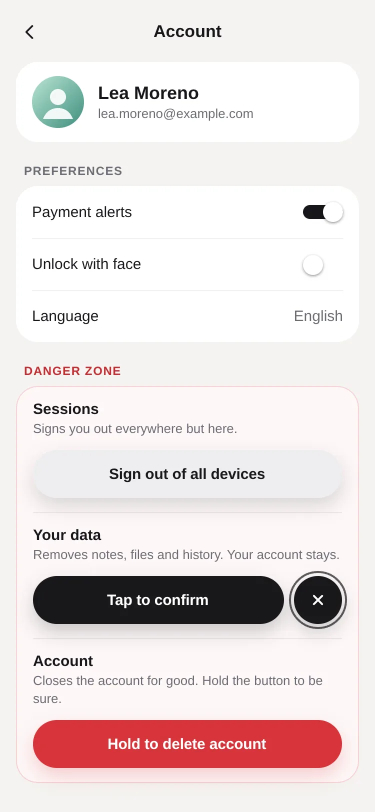
A button for actions that mustn't happen by accident: one press arms it and a cancel bubble buds off on a liquid neck that stretches and snaps; a second press confirms through busy, done and error, driven by your promise. It disarms itself with a countdown, or hold to confirm…
by UpFork, built by Ramin ValadanMobile componentUpdated 14 Oct 2026
8 files · 6 packages
import { Canvas, Group, Paint, Path, Shadow, Skia } from '@shopify/react-native-skia';
import * as Haptics from 'expo-haptics';
import { useEffect, useRef, useState, type ComponentType, type ReactNode } from 'react';
import {
  AccessibilityInfo,
  I18nManager,
  Platform,
  StyleSheet,
  Text,
  View,
  type AccessibilityActionEvent,
  type LayoutChangeEvent,
  type StyleProp,
  type ViewStyle,
} from 'react-native';
import { Gesture, GestureDetector } from 'react-native-gesture-handler';
import Animated, {
  ReduceMotion,
  cancelAnimation,
  useAnimatedReaction,
  useAnimatedStyle,
  useDerivedValue,
  useReducedMotion,
  useSharedValue,
  withRepeat,
  withSequence,
  withSpring,
  withDelay,
  withTiming,
  type SharedValue,
} from 'react-native-reanimated';
import { scheduleOnRN } from 'react-native-worklets';

import { useScheme, type Scheme } from '../../lib/use-scheme';
import { addNeck, addWaveFill, smoothstep } from './geometry';
import { Cross, DrawnCheck, Spinner, linear, outCubic } from './icons';
import { fromLab, mixLab, toLab, type Lab } from './oklab';
import { PALETTES, SIZES, type Size, type Tone } from './palette';
import { useConfirm, type ConfirmState } from './use-confirm';

export type ConfirmButtonProps = {
  /** The idle label: what pressing it will do. */
  label: string;
  armedLabel?: string;
  /** Read by screen readers while busy (the button shows a spinner). */
  busyLabel?: string;
  doneLabel?: string;
  errorLabel?: string | ((error: unknown) => string);
  /** Return a promise: the button stays busy until it settles, then shows done or error. */
  onConfirm: () => void | Promise<unknown>;
  onArm?: () => void;
  onCancel?: () => void;
  /** `tap`: press to arm, press again to confirm. `hold`: press and hold to confirm. */
  mode?: 'tap' | 'hold';
  /** ms before an armed button disarms itself; 0 = never. */
  armTimeout?: number;
  holdDuration?: number;
  resetAfter?: number;
  persistDone?: boolean;
  tone?: Tone;
  size?: Size;
  fullWidth?: boolean;
  /** Where the button sits in its box when it's narrower than the widest of its states. */
  align?: 'start' | 'center' | 'end';
  icon?: ComponentType<{ color: string; size: number }>;
  disabled?: boolean;
  /** Start armed (for a poster); the countdown starts on the first interaction. */
  defaultArmed?: boolean;
  scheme?: Scheme;
  haptics?: boolean;
  style?: StyleProp<ViewStyle>;
};

/** Room round the button inside its canvas, for the shadow and the countdown ring. */
const ROOM = 28;
const BUBBLE_GAP = 10;
const SPLIT = { stiffness: 300, damping: 20, mass: 1 };
const SHAPE = { stiffness: 260, damping: 26, mass: 1 };
const CAN_BUZZ = Platform.OS !== 'web';
// React Native Skia's web canvas shows colours as Display P3: give it P3 numbers there (see oklab.ts).
const P3 = Platform.OS === 'web';
const webPointer = Platform.OS === 'web' ? ({ cursor: 'pointer', outlineStyle: 'none' } as unknown as ViewStyle) : null;

function buzz(enabled: boolean, call: () => Promise<void>) {
  if (!enabled || !CAN_BUZZ) return;
  call().catch(() => undefined);
}

type Widths = { idle: number; armed: number; done: number; error: number };

/**
 * A button for actions people must not trigger by accident. One press arms it: the label changes its mind, and a
 * cancel bubble buds off its side on a liquid neck that stretches and snaps. A second press confirms, through
 * busy, done and error. Left alone it disarms itself, with a countdown round the bubble. Or: hold to confirm.
 */
export function ConfirmButton({
  label,
  armedLabel = 'Tap to confirm',
  busyLabel,
  doneLabel = 'Done',
  errorLabel = 'Something went wrong',
  onConfirm,
  onArm,
  onCancel,
  mode = 'tap',
  armTimeout = 4000,
  holdDuration = 1200,
  resetAfter = 1400,
  persistDone = false,
  tone = 'danger',
  size = 'md',
  fullWidth = false,
  align = 'center',
  icon: Icon,
  disabled = false,
  defaultArmed = false,
  scheme: schemeProp,
  haptics = true,
  style,
}: ConfirmButtonProps) {
  const scheme = useScheme(schemeProp);
  const palette = PALETTES[scheme][tone];
  const dims = SIZES[size];
  const H = dims.height;
  const r = H / 2;
  const reduced = useReducedMotion();
  const rtl = I18nManager.isRTL;

  const machine = useConfirm({
    onConfirm,
    onArm,
    onCancel,
    armTimeout: mode === 'hold' ? 0 : armTimeout,
    resetAfter,
    persistDone,
    defaultArmed: mode === 'tap' && defaultArmed,
  });
  const { state } = machine;
  const errorText = typeof errorLabel === 'function' ? errorLabel(machine.error) : errorLabel;

  // ---- measured labels ----
  const [widths, setWidths] = useState<Partial<Widths>>({});
  const measured = (key: keyof Widths) => (e: LayoutChangeEvent) => {
    // React Native Web reports whole pixels, rounded down: a pixel of room keeps the label from an ellipsis.
    const w = Math.ceil(e.nativeEvent.layout.width) + 1;
    setWidths((old) => (old[key] === w ? old : { ...old, [key]: w }));
  };
  const ready = widths.idle !== undefined && widths.armed !== undefined && widths.done !== undefined && widths.error !== undefined;
  const iconRoom = Icon ? dims.icon + dims.gap : 0;
  const checkRoom = dims.icon + dims.gap;
  const pillFor = (s: ConfirmState) => {
    const w = widths as Widths;
    if (s === 'busy') return H;
    if (s === 'armed') return dims.pad * 2 + w.armed;
    if (s === 'done') return dims.pad * 2 + checkRoom + w.done;
    if (s === 'error') return dims.pad * 2 + w.error;
    return dims.pad * 2 + iconRoom + w.idle;
  };
  const [boxWidth, setBoxWidth] = useState(0);
  const natural = ready
    ? Math.max(pillFor('idle'), pillFor('armed') + BUBBLE_GAP + H, pillFor('done'), pillFor('error'))
    : 0;
  const footprint = fullWidth ? boxWidth : natural;

  /** Where the pill sits and how wide it is, in each state. */
  const target = (s: ConfirmState) => {
    if (!ready || footprint <= 0) return { x: 0, w: H };
    const armedBubble = s === 'armed' ? BUBBLE_GAP + H : 0;
    let w = fullWidth && s !== 'busy' ? footprint - armedBubble : pillFor(s);
    w = Math.max(H, Math.min(w, footprint - armedBubble));
    const group = w + armedBubble;
    const start = align === 'start' ? 0 : align === 'end' ? footprint - group : (footprint - group) / 2;
    // Right to left: the bubble buds off the leading side, so the pill sits after it.
    const x = rtl ? footprint - start - group + armedBubble : start;
    return { x, w };
  };
  const now = target(state);

  // ---- shared state ----
  const pillX = useSharedValue(now.x);
  const pillW = useSharedValue(now.w);
  const gap = useSharedValue(state === 'armed' ? BUBBLE_GAP : -H);
  const bubbleShown = useSharedValue(state === 'armed' ? 1 : 0);
  const attached = useSharedValue(state !== 'armed');
  const merging = useSharedValue(false);
  const wobble = useSharedValue(1);
  const shake = useSharedValue(0);
  const hold = useSharedValue(0);
  const phase = useSharedValue(0);
  const fromColor = useSharedValue<Lab>(toLab(palette[state === 'armed' ? 'armed' : 'idle'].fill));
  const toColor = useSharedValue<Lab>(toLab(palette[state === 'armed' ? 'armed' : 'idle'].fill));
  const colorT = useSharedValue(1);
  const holdLab = useSharedValue<Lab>(mixLab(toLab(palette.idle.fill), toLab(palette.armed.fill), tone === 'neutral' ? 0.16 : 0.42));
  const dir = rtl ? -1 : 1;
  const snapGap = 0.55 * H;
  const reformGap = 0.35 * H;

  // The fill's colour for each state, blended in OKLab from wherever it is.
  const fillFor = (s: ConfirmState) =>
    s === 'armed' || s === 'busy' ? palette.armed.fill : s === 'done' ? palette.done.fill : s === 'error' ? palette.error.fill : palette.idle.fill;
  const fill = fillFor(state);
  useEffect(() => {
    const t = colorT.value;
    fromColor.value = mixLab(fromColor.value, toColor.value, t < 0 ? 0 : t > 1 ? 1 : t);
    toColor.value = toLab(fill);
    colorT.value = 0;
    colorT.value = withTiming(1, { duration: 260, easing: outCubic });
  }, [fill, colorT, fromColor, toColor]);
  useEffect(() => {
    holdLab.value = mixLab(toLab(palette.idle.fill), toLab(palette.armed.fill), tone === 'neutral' ? 0.16 : 0.42);
  }, [palette, tone, holdLab]);

  // ---- the choreography of each state ----
  const previous = useRef<ConfirmState>(state);
  const first = useRef(true);
  useEffect(() => {
    const t = target(state);
    if (first.current || !ready) {
      // Nothing to animate from: the first measured frame is simply where it is.
      if (ready) first.current = false;
      pillX.value = t.x;
      pillW.value = t.w;
      return;
    }
    const was = previous.current;
    previous.current = state;
    pillX.value = withSpring(t.x, SHAPE);
    pillW.value = withSpring(t.w, SHAPE);

    if (state === 'armed' && was !== 'armed') {
      buzz(haptics, () => Haptics.impactAsync(Haptics.ImpactFeedbackStyle.Light));
      merging.value = false;
      if (reduced) {
        gap.value = BUBBLE_GAP;
        attached.value = false;
        bubbleShown.value = withTiming(1, { duration: 180, easing: outCubic });
      } else {
        // The bubble buds off: out past the point where the neck snaps, then it settles back, 10 points away.
        attached.value = true;
        bubbleShown.value = 1;
        gap.value = -H;
        gap.value = withSequence(withTiming(snapGap * 1.15, { duration: 240, easing: outCubic }), withSpring(BUBBLE_GAP, SPLIT));
      }
    }
    if (was === 'armed' && state !== 'armed') {
      // Merging back (cancel, disarm, or busy): the neck reforms and pulls the bubble in.
      merging.value = true;
      if (reduced) {
        bubbleShown.value = withTiming(0, { duration: 140, easing: outCubic });
      } else {
        gap.value = withTiming(-H, { duration: 340, easing: outCubic }, (finished) => {
          if (finished) bubbleShown.value = 0;
        });
      }
    }
    if (state === 'busy') buzz(haptics, () => Haptics.impactAsync(Haptics.ImpactFeedbackStyle.Medium));
    if (state === 'done') {
      buzz(haptics, () => Haptics.notificationAsync(Haptics.NotificationFeedbackType.Success));
      AccessibilityInfo.announceForAccessibility(doneLabel);
    }
    if (state === 'error') {
      buzz(haptics, () => Haptics.notificationAsync(Haptics.NotificationFeedbackType.Error));
      AccessibilityInfo.announceForAccessibility(errorText);
      if (!reduced) {
        shake.value = withSequence(
          withTiming(-8, { duration: 55, easing: linear }),
          withTiming(7, { duration: 90, easing: linear }),
          withTiming(-5, { duration: 85, easing: linear }),
          withTiming(3, { duration: 80, easing: linear }),
          withTiming(-1.5, { duration: 70, easing: linear }),
          withTiming(0, { duration: 60, easing: linear }),
        );
      }
    }
    if (state === 'armed') AccessibilityInfo.announceForAccessibility(`${label}, armed. Activate again to confirm.`);
    // A completed hold stays full through busy; done and error replace it at once with their own colour.
    if (state === 'done' || state === 'error') {
      cancelAnimation(hold);
      hold.value = 0;
    }
    // The targets follow the state and the measured widths.
    // eslint-disable-next-line react-hooks/exhaustive-deps
  }, [state, ready, footprint, widths]);

  // Snap and reform: the neck breaks once stretched past 0.55 × height, and comes back under 0.35 × height when merging.
  useAnimatedReaction(
    () => gap.value,
    (g) => {
      if (attached.value && !merging.value && g > snapGap) {
        attached.value = false;
        wobble.value = withSequence(withTiming(1.04, { duration: 70, easing: outCubic }), withSpring(1, { stiffness: 320, damping: 14 }));
      } else if (!attached.value && merging.value && g < reformGap) {
        attached.value = true;
      }
    },
  );

  // The hold fill's wavy front keeps moving while it fills.
  useEffect(() => {
    if (mode !== 'hold') return undefined;
    phase.value = withRepeat(withTiming(Math.PI * 2, { duration: 900, easing: linear }), -1, false);
    return () => cancelAnimation(phase);
  }, [mode, phase]);

  // ---- the drawing: pill, neck and bubble are one path, with one shadow ----
  // Three shapes in one layer (one fill colour, one shadow): drawn as separate paths, so the neck's curves never
  // cancel the circles they overlap (one path with mixed windings leaves holes).
  const pillShape = useDerivedValue(() => {
    const path = Skia.PathBuilder.Make();
    const w = pillW.value;
    const x = ROOM + pillX.value + shake.value;
    const grow = (wobble.value - 1) * r;
    path.addRRect(Skia.RRectXY(Skia.XYWHRect(x - grow, ROOM - grow, w + grow * 2, H + grow * 2), r + grow, r + grow));
    return path.build();
  });
  const bubbleShape = useDerivedValue(() => {
    const path = Skia.PathBuilder.Make();
    if (bubbleShown.value <= 0.001 || (gap.value <= -2 * r + 0.5 && !reduced)) return path.build();
    const x = ROOM + pillX.value + shake.value;
    const cap = dir > 0 ? x + pillW.value - r : x + r;
    const bx = cap + dir * (gap.value + 2 * r);
    const br = r * wobble.value * (reduced ? 0.8 + 0.2 * bubbleShown.value : 1);
    path.addCircle(bx, ROOM + r, br);
    return path.build();
  });
  const neckShape = useDerivedValue(() => {
    const path = Skia.PathBuilder.Make();
    if (bubbleShown.value <= 0.001 || !attached.value || reduced) return path.build();
    const x = ROOM + pillX.value + shake.value;
    const cap = dir > 0 ? x + pillW.value - r : x + r;
    const bx = cap + dir * (gap.value + 2 * r);
    const limit = merging.value ? reformGap : snapGap;
    const waist = 1 - smoothstep(0, limit, gap.value);
    addNeck(path, cap, ROOM + r, r, bx, ROOM + r, r * wobble.value, waist);
    return path.build();
  });
  const bubbleOpacity = useDerivedValue(() => (reduced ? bubbleShown.value : 1));
  // A small concave shape drawn under the pill from the start (the pill covers it): the GPU builds the program for
  // curved, concave paths now, not in the first frame of the first split (a 66 ms stall when it waited).
  const warm = useDerivedValue(() => {
    const path = Skia.PathBuilder.Make();
    const cx = ROOM + pillX.value + pillW.value / 2;
    const cy = ROOM + r;
    const s = r * 0.4;
    path.moveTo(cx - s, cy - s);
    path.cubicTo(cx, cy, cx, cy, cx + s, cy - s);
    path.lineTo(cx + s, cy + s);
    path.cubicTo(cx, cy, cx, cy, cx - s, cy + s);
    path.close();
    return path.build();
  });
  // The same for the bubble (a pure circle has its own program) and the countdown ring (a round-capped stroke).
  const warmCircle = useDerivedValue(() => {
    const path = Skia.PathBuilder.Make();
    path.addCircle(ROOM + pillX.value + pillW.value / 2, ROOM + r, r * 0.3);
    return path.build();
  });
  const warmArc = useDerivedValue(() => {
    const path = Skia.PathBuilder.Make();
    const cx = ROOM + pillX.value + pillW.value / 2;
    path.addArc(Skia.XYWHRect(cx - r * 0.3, ROOM + r * 0.7, r * 0.6, r * 0.6), -90, 300);
    return path.build();
  });
  const pillOnly = useDerivedValue(() => {
    const path = Skia.PathBuilder.Make();
    path.addRRect(Skia.RRectXY(Skia.XYWHRect(ROOM + pillX.value + shake.value, ROOM, pillW.value, H), r, r));
    return path.build();
  });
  const holdPath = useDerivedValue(() => {
    const path = Skia.PathBuilder.Make();
    if (hold.value <= 0.001) return path.build();
    const x = ROOM + pillX.value + shake.value;
    const w = pillW.value;
    const front = dir > 0 ? x + w * hold.value : x + w * (1 - hold.value);
    const amp = hold.value < 0.999 ? 3 : 0;
    addWaveFill(path, x, ROOM, w, H, front, phase.value, amp, dir);
    return path.build();
  });
  const ring = useDerivedValue(() => {
    const path = Skia.PathBuilder.Make();
    const x = ROOM + pillX.value + shake.value;
    const cap = dir > 0 ? x + pillW.value - r : x + r;
    const bx = cap + dir * (gap.value + 2 * r);
    const rr = r + 4;
    path.addArc(Skia.XYWHRect(bx - rr, ROOM + r - rr, rr * 2, rr * 2), -90, 359.9);
    return path.build();
  });
  const ringEnd = useDerivedValue(() => machine.countdown.value);
  const ringOpacity = useDerivedValue(() =>
    state === 'armed' && armTimeout > 0 && mode === 'tap' ? bubbleShown.value * (attached.value ? 0 : 1) : 0,
  );
  const color = useDerivedValue(() => {
    const t = colorT.value < 0 ? 0 : colorT.value > 1 ? 1 : colorT.value;
    return fromLab(mixLab(fromColor.value, toColor.value, t), 1, P3);
  });
  const holdColor = useDerivedValue(() => fromLab(holdLab.value, 1, P3));
  const shadowColor = useDerivedValue(() => {
    const t = colorT.value < 0 ? 0 : colorT.value > 1 ? 1 : colorT.value;
    const lab = mixLab(fromColor.value, toColor.value, t);
    return palette.shadow.tinted ? fromLab(lab, palette.shadow.alpha, P3) : `rgba(0, 0, 0, ${palette.shadow.alpha})`;
  });
  const glowColor = useDerivedValue(() => {
    const t = colorT.value < 0 ? 0 : colorT.value > 1 ? 1 : colorT.value;
    return fromLab(mixLab(fromColor.value, toColor.value, t), palette.shadow.glow, P3);
  });

  // ---- gestures ----
  const hitsPill = (x: number, y: number) => {
    'worklet';
    return x >= pillX.value - 6 && x <= pillX.value + pillW.value + 6 && y >= -6 && y <= H + 6;
  };
  const hitsBubble = (x: number, y: number) => {
    'worklet';
    if (bubbleShown.value < 0.5) return false;
    const cap = dir > 0 ? pillX.value + pillW.value - r : pillX.value + r;
    const bx = cap + dir * (gap.value + 2 * r);
    return Math.hypot(x - bx, y - r) <= r + 8;
  };
  const press = useRef(machine);
  press.current = machine;
  const onTap = (where: 'pill' | 'bubble' | 'none') => {
    const m = press.current;
    if (disabled || where === 'none') return;
    if (m.state === 'idle') m.arm();
    else if (m.state === 'armed') {
      if (where === 'bubble') m.cancel();
      else m.confirm();
    }
  };
  const tap = Gesture.Tap()
    .enabled(!disabled && mode === 'tap')
    .maxDuration(700)
    .onBegin(() => {
      scheduleOnRN(machine.pause);
    })
    .onEnd((e, success) => {
      if (success) scheduleOnRN(onTap, hitsBubble(e.x, e.y) ? 'bubble' : hitsPill(e.x, e.y) ? 'pill' : 'none');
    })
    .onFinalize(() => {
      scheduleOnRN(machine.resume);
    });

  const holdTick = (quarter: number) => {
    if (quarter >= 4) buzz(haptics, () => Haptics.impactAsync(Haptics.ImpactFeedbackStyle.Medium));
    else buzz(haptics, () => Haptics.selectionAsync());
  };
  const holdDone = () => {
    if (press.current.state === 'idle') press.current.confirm();
  };
  const longPress = Gesture.LongPress()
    .enabled(!disabled && mode === 'hold' && (state === 'idle' || state === 'error'))
    .minDuration(holdDuration)
    .maxDistance(30)
    .onBegin(() => {
      cancelAnimation(hold);
      // A timer, not motion: it runs even with reduce motion on.
      hold.value = withTiming(1, { duration: holdDuration * (1 - hold.value), easing: linear, reduceMotion: ReduceMotion.Never });
    })
    .onStart(() => {
      scheduleOnRN(holdDone);
    })
    .onFinalize((_, success) => {
      // Held to the end: the fill stays while the action runs.
      if (success || hold.value >= 0.999) return;
      cancelAnimation(hold);
      // Let go early: it drains back, twice as fast.
      hold.value = withTiming(0, { duration: (holdDuration / 2) * hold.value, easing: outCubic, reduceMotion: ReduceMotion.Never });
    });
  useAnimatedReaction(
    () => Math.floor(hold.value * 4 + 0.0001),
    (q, before) => {
      if (before !== null && q > before && q >= 1) scheduleOnRN(holdTick, q);
    },
  );

  const gesture = mode === 'hold' ? longPress : tap;

  // ---- what screen readers and keyboards get ----
  const a11yLabel =
    state === 'armed'
      ? `${label}, armed. Activate again to confirm`
      : state === 'busy'
        ? (busyLabel ?? `${label}…`)
        : state === 'done'
          ? doneLabel
          : state === 'error'
            ? errorText
            : mode === 'hold'
              ? `${label}, press and hold`
              : label;
  const onAccessibilityAction = (event: AccessibilityActionEvent) => {
    const m = press.current;
    if (event.nativeEvent.actionName === 'activate') {
      if (mode === 'hold') {
        if (m.state === 'idle') m.confirm();
      } else onTap('pill');
    }
  };
  const onKeyDown = (event: { nativeEvent: { key: string }; preventDefault?: () => void }) => {
    const key = event.nativeEvent.key;
    if (key === 'Enter' || key === ' ') {
      if (mode === 'hold') {
        if (press.current.state === 'idle') press.current.confirm();
      } else onTap('pill');
    } else if (key === 'Escape' && press.current.state === 'armed') press.current.cancel();
    else return;
    event.preventDefault?.();
  };
  const webProps = Platform.OS === 'web' ? ({ onKeyDown, focusable: !disabled } as Record<string, unknown>) : {};

  // ---- labels: the outgoing slides and fades as the incoming arrives ----
  const text =
    state === 'armed' ? armedLabel : state === 'done' ? doneLabel : state === 'error' ? errorText : state === 'busy' ? '' : label;
  const textColor =
    state === 'armed' ? palette.armed.text : state === 'done' ? palette.done.text : state === 'error' ? palette.error.text : palette.idle.text;
  const [lines, setLines] = useState(() => [{ key: 0, text, color: textColor, state, leaving: false }]);
  const lineKey = useRef(0);
  useEffect(() => {
    setLines((old) => {
      const top = old[old.length - 1];
      if (top && top.text === text && top.color === textColor && !top.leaving) return old;
      lineKey.current += 1;
      return [
        ...old.filter((l) => !l.leaving).map((l) => ({ ...l, leaving: true })),
        { key: lineKey.current, text, color: textColor, state, leaving: false },
      ];
    });
  }, [text, textColor, state]);
  const dropLine = (key: number) => setLines((old) => old.filter((l) => l.key !== key));

  const onBox = (e: LayoutChangeEvent) => {
    const w = Math.round(e.nativeEvent.layout.width);
    if (w !== boxWidth) setBoxWidth(w);
  };

  const canvasW = footprint + ROOM * 2;
  const canvasH = H + ROOM * 2;
  const bubbleX = useAnimatedStyle(() => {
    const cap = dir > 0 ? pillX.value + pillW.value - r : pillX.value + r;
    const bx = cap + dir * (gap.value + 2 * r) + shake.value;
    // The × shows once the bubble is out of the pill.
    const out = reduced ? 1 : Math.min(Math.max((gap.value + 0.4 * r) / (0.6 * r), 0), 1);
    return { opacity: out * bubbleShown.value, transform: [{ translateX: bx - 10 }, { scale: wobble.value }] };
  });
  const center = useAnimatedStyle(() => ({ transform: [{ translateX: pillX.value + pillW.value / 2 - H / 2 + shake.value }] }));
  const busyStyle = useAnimatedStyle(() => ({ opacity: withTiming(state === 'busy' ? 1 : 0, { duration: state === 'busy' ? 160 : 100 }) }));

  return (
    <View
      onLayout={fullWidth ? onBox : undefined}
      style={[{ height: H, width: fullWidth ? '100%' : footprint || undefined, opacity: disabled ? 0.45 : ready ? 1 : 0 }, style]}
    >
      {/* Labels measured once, unseen. */}
      <View style={styles.measure} pointerEvents="none" aria-hidden importantForAccessibility="no-hide-descendants" accessibilityElementsHidden>
        <View style={styles.measureRow}>
          <Text style={[styles.label, styles.natural, { fontSize: dims.font }]} onLayout={measured('idle')}>{label}</Text>
          <Text style={[styles.label, styles.natural, { fontSize: dims.font }]} onLayout={measured('armed')}>{armedLabel}</Text>
          <Text style={[styles.label, styles.natural, { fontSize: dims.font }]} onLayout={measured('done')}>{doneLabel}</Text>
          <Text style={[styles.label, styles.natural, { fontSize: dims.font }]} onLayout={measured('error')}>{errorText}</Text>
        </View>
      </View>

      {ready && footprint > 0 ? (
        <>
          {/* The canvas reaches past the button (room for the shadow and the ring): on the web it would take the
              clicks meant for whatever is beside it, so it sits in a box that lets every touch through. */}
          <View pointerEvents="none" style={[styles.room, { left: -ROOM, top: -ROOM, width: canvasW, height: canvasH }]}>
          <Canvas style={{ width: canvasW, height: canvasH }} pointerEvents="none">
            <Group
              layer={
                <Paint>
                  <Shadow dx={0} dy={8} blur={9} color={shadowColor} />
                  {palette.shadow.glow > 0 ? <Shadow dx={0} dy={0} blur={12} color={glowColor} /> : null}
                </Paint>
              }
            >
              <Path path={warm} color={color} />
              <Path path={warmCircle} color={color} />
              <Path path={warmArc} color={palette.ring} style="stroke" strokeWidth={2} strokeCap="round" start={0} end={0.8} />
              <Path path={pillShape} color={color} />
              <Path path={neckShape} color={color} />
              <Path path={bubbleShape} color={color} opacity={bubbleOpacity} />
            </Group>
            {mode === 'hold' ? (
              <Group clip={pillOnly}>
                <Path path={holdPath} color={holdColor} />
              </Group>
            ) : null}
            <Path path={ring} color={palette.ring} style="stroke" strokeWidth={2} strokeCap="round" start={0} end={ringEnd} opacity={ringOpacity} />
          </Canvas>
          </View>

          {lines.map((line) => (
            <Line
              key={line.key}
              text={line.text}
              color={line.color}
              leaving={line.leaving}
              onGone={() => dropLine(line.key)}
              pillX={pillX}
              pillW={pillW}
              shake={shake}
              height={H}
              font={dims.font}
              icon={line.state === 'idle' && Icon ? <Icon color={line.color} size={dims.icon} /> : line.state === 'done' ? <DrawnCheck size={dims.icon} color={line.color} drawn /> : null}
              iconRoom={line.state === 'idle' && Icon ? iconRoom : line.state === 'done' ? checkRoom : 0}
              first={line.key === 0}
              textWidth={line.state === 'armed' ? widths.armed! : line.state === 'done' ? widths.done! : line.state === 'error' ? widths.error! : widths.idle!}
            />
          ))}

          <Animated.View pointerEvents="none" style={[styles.center, { width: H, height: H }, center, busyStyle]}>
            <Spinner size={dims.icon + 2} color={palette.armed.text} />
          </Animated.View>

          <Animated.View pointerEvents="none" style={[styles.cross, { top: r - 10 }, bubbleX]}>
            <Cross size={20} color={palette.armed.text} />
          </Animated.View>

          <GestureDetector gesture={gesture}>
            <View
              style={[StyleSheet.absoluteFill, webPointer]}
              accessible
              accessibilityRole="button"
              accessibilityLabel={a11yLabel}
              accessibilityState={{ disabled, busy: state === 'busy' }}
              accessibilityActions={[{ name: 'activate', label: mode === 'hold' ? 'Confirm' : undefined }]}
              onAccessibilityAction={onAccessibilityAction}
              aria-live="polite"
              {...webProps}
            />
          </GestureDetector>
          {state === 'armed' && mode === 'tap' ? (
            <CancelTarget pillX={pillX} pillW={pillW} gap={gap} r={r} dir={dir} onCancel={() => press.current.cancel()} />
          ) : null}
        </>
      ) : null}
    </View>
  );
}

/** For screen readers: the cancel bubble as a button of its own (touches go through to the gesture). */
function CancelTarget({
  pillX,
  pillW,
  gap,
  r,
  dir,
  onCancel,
}: {
  pillX: SharedValue<number>;
  pillW: SharedValue<number>;
  gap: SharedValue<number>;
  r: number;
  dir: number;
  onCancel: () => void;
}) {
  const style = useAnimatedStyle(() => {
    const cap = dir > 0 ? pillX.value + pillW.value - r : pillX.value + r;
    const bx = cap + dir * (gap.value + 2 * r);
    return { transform: [{ translateX: bx - r }] };
  });
  return (
    <Animated.View
      pointerEvents="none"
      style={[styles.cancel, { width: r * 2, height: r * 2 }, style]}
      accessible
      accessibilityRole="button"
      accessibilityLabel="Cancel"
      onAccessibilityTap={onCancel}
      accessibilityActions={[{ name: 'activate' }]}
      onAccessibilityAction={onCancel}
    />
  );
}

type LineProps = {
  text: string;
  color: string;
  leaving: boolean;
  onGone: () => void;
  pillX: SharedValue<number>;
  pillW: SharedValue<number>;
  shake: SharedValue<number>;
  height: number;
  font: number;
  icon: ReactNode;
  iconRoom: number;
  textWidth: number;
  first: boolean;
};

/** One label, centred in the pill; it rises in, and rises out (faster) when the next one comes. */
function Line({ text, color, leaving, onGone, pillX, pillW, shake, height, font, icon, iconRoom, textWidth, first }: LineProps) {
  // The first label is simply there.
  const t = useSharedValue(first ? 1 : 0);
  useEffect(() => {
    if (leaving) {
      t.value = withTiming(2, { duration: 110, easing: outCubic }, (done) => {
        if (done) scheduleOnRN(onGone);
      });
    } else {
      // Arrives only once the outgoing label has nearly gone: the two never overlap.
      t.value = withDelay(first ? 0 : 95, withTiming(1, { duration: 190, easing: outCubic }));
    }
    // The line's own orders.
    // eslint-disable-next-line react-hooks/exhaustive-deps
  }, [leaving]);
  const content = iconRoom + textWidth;
  const style = useAnimatedStyle(() => {
    const v = t.value;
    const inPart = v <= 1 ? v : 1;
    const outPart = v > 1 ? v - 1 : 0;
    // The incoming line waits a beat, so the two never overlap.
    const shown = v <= 1 ? inPart : 1 - outPart;
    const y = v <= 1 ? 6 * (1 - inPart) : -5 * outPart;
    return {
      opacity: shown,
      transform: [{ translateX: pillX.value + (pillW.value - content) / 2 + shake.value }, { translateY: y }],
    };
  });
  if (!text) return null;
  return (
    <Animated.View pointerEvents="none" style={[styles.line, { height, width: content }, style]}>
      {icon ? <View style={{ width: iconRoom }}>{icon}</View> : null}
      <Text style={[styles.label, { fontSize: font, color }]} numberOfLines={1}>
        {text}
      </Text>
    </Animated.View>
  );
}

const styles = StyleSheet.create({
  measure: { position: 'absolute', left: 0, top: 0, width: 0, height: 0, overflow: 'hidden', opacity: 0 },
  room: { position: 'absolute' },
  measureRow: { position: 'absolute', left: 0, top: 0, width: 4000, flexDirection: 'row', alignItems: 'flex-start' },
  natural: { flexShrink: 0 },
  label: { fontWeight: '600', letterSpacing: -0.1 },
  line: { position: 'absolute', left: 0, top: 0, flexDirection: 'row', alignItems: 'center' },
  center: { position: 'absolute', left: 0, top: 0, alignItems: 'center', justifyContent: 'center' },
  cross: { position: 'absolute', left: 0, width: 20, height: 20 },
  cancel: { position: 'absolute', left: 0, top: 0 },
});
Confirm Button is for the actions people must not trigger by accident: delete an account, remove an item, leave a group, send money.
Three complete demos: an account's danger zone (one button armed at rest), a shopping bag whose rows fold away, and a hold-to-send transfer that can fail.
0 reviews · 0 bugs
Ship it0With fixes0Skip0· 0 reviews
0 bugs0 open0 fixed
Members who have it review it and report its bugs. Sign in
No reviews or bugs yet.
React Native · Expo SDK 57
Built withSkiaExpo HapticsGesture HandlerReanimatedSVGSafe Area Context
Copy the files into your app
At your app’s root, the folders side by side as they are: the files import each other by relative paths.
Install the packages with Expo
npx expo install @shopify/react-native-skia expo-haptics react-native-gesture-handler react-native-reanimated react-native-svg react-native-workletsAnd what the demos use
npx expo install react-native-safe-area-contextSee it in your app
Make demos/account.tsx your app’s App.tsx, inside the GestureHandlerRootView that Gesture Handler needs at its root:
On the web, load Skia first
Phones need nothing more. On the web, copy node_modules/canvaskit-wasm/bin/full/canvaskit.wasm into your app’s public/ folder, add this index.web.ts, and set "main" to "index" in your package.json:
UpFork installs every revision just so into a fresh Expo app (SDK 57), type-checks it and builds it for the web before it goes on sale. An AI assistant can do it for you through UpFork’s MCP server: Install mobile components has both ways.
import { GestureHandlerRootView } from 'react-native-gesture-handler';

import Account from './demos/account';

export default function App() {
  return (
    <GestureHandlerRootView style={{ flex: 1 }}>
      <Account scheme="light" />
    </GestureHandlerRootView>
  );
}
import '@expo/metro-runtime';
import { LoadSkiaWeb } from '@shopify/react-native-skia/lib/module/web';
import { registerRootComponent } from 'expo';

// Skia's engine first (public/canvaskit.wasm), then the app: nothing that uses Skia may load before it.
LoadSkiaWeb({ locateFile: (file: string) => `/${file}` })
  .then(() => import('./App'))
  .then(({ default: App }) => registerRootComponent(App));


