New


Toasts & Alerts
Loading the page…
Loading the page…
Before you buy
How this mobile component gets from the preview into your project, and what buyers ask most.
How to use it
From the preview to your project
Try it in the preview
Switch between light and dark, and resize it to phone and tablet widths, before you decide.
Get it
Free products are yours with a free account. Paid ones settle in USDT on TRON, sent straight to the wallet on your order.
Install it
Components go into your project with one shadcn command, dependencies included. Everything else downloads with a checksum.
Make it yours
It's your code now: rename it, restyle it and wire in your real data.
Or hand it to your AI
Copy the prompt and let your coding assistant place it in your project, following your conventions.
Yes, a free one: it keeps your order, every payment you make for it and the files together. Free products need it too: without an account you can look and try the live preview, but not download, install or copy anything.
Send the price as a USDT transfer on TRON (TRC-20) to the wallet on your order, shown with its QR code, then paste the transaction ID on the order. It's checked on-chain, and the files unlock once it's confirmed. Paid less? You're asked for the rest.
Yes. The Standard License covers unlimited personal and commercial projects, client work included; just don't resell it on its own. Open-source licenses say so on the product.
Create a CLI token on your account page, put it in your project's .env.local, add UpFork to components.json once, and install with npx shadcn add: free and paid components alike.
Onto your order, in your account. Download links last ten minutes and can be made again.
Releases are scanned for malware and reviewed before anyone can download them, and every file shows its SHA-256 so you can check what you got.
Building with an AI assistant?
Copy a ready-made prompt with the code, its dependencies and a demo, and your assistant can put it in place for you.
Selling your own work?
Get approved once, then publish components, templates and mobile components, paid in USDT straight to your own wallet.
Mobile
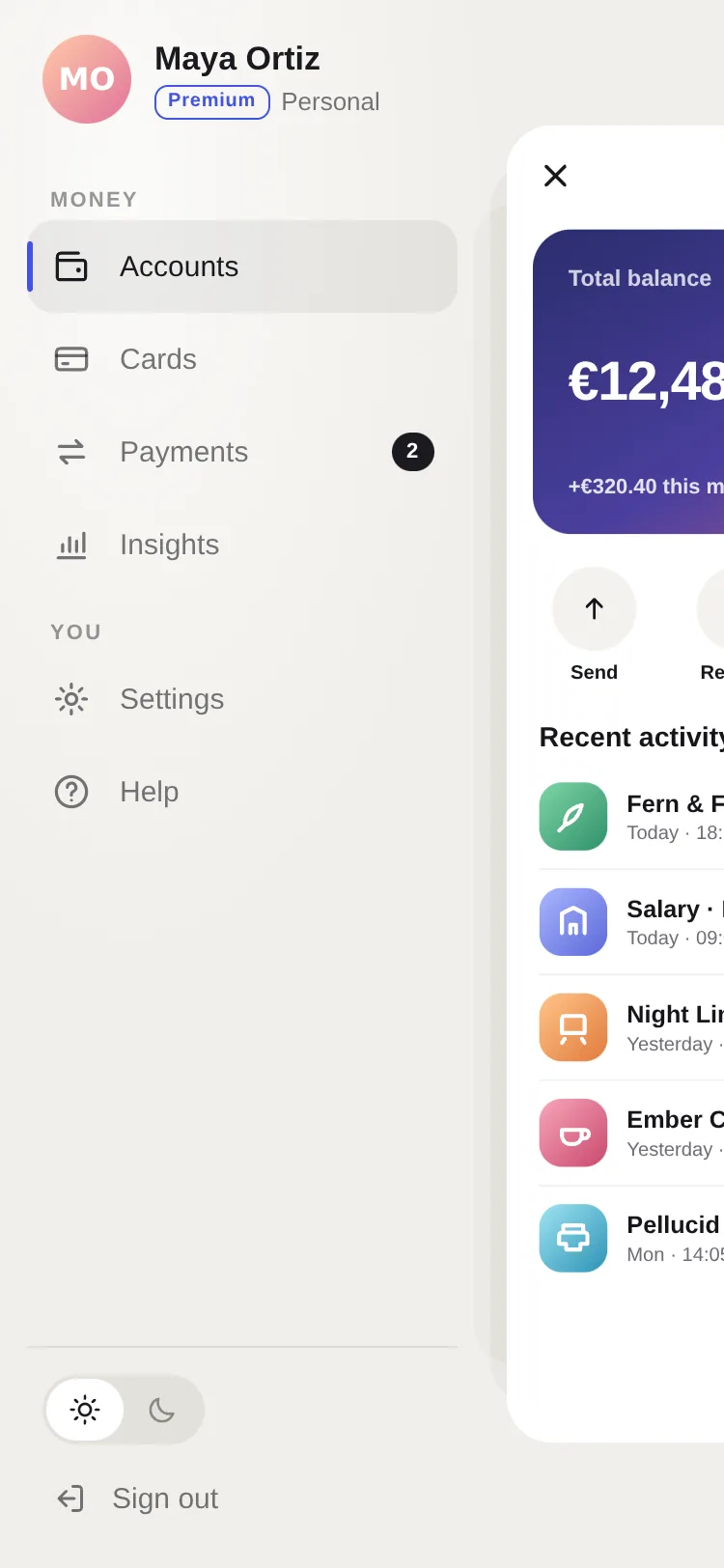
A side menu where the screen steps back into depth: it shrinks, rounds and moves aside with ghost layers behind it, swings back like a door, slides, or stays under a floating menu card. One progress scrubs it all from the first pixel of an edge swipe: the menu's stagger, the…
by UpFork, built by Ramin ValadanMobile componentUpdated 14 Oct 2026
7 files · 7 packages
import * as Haptics from 'expo-haptics';
import { setStatusBarStyle, type StatusBarStyle } from 'expo-status-bar';
import {
  createContext,
  useCallback,
  useContext,
  useEffect,
  useId,
  useImperativeHandle,
  useMemo,
  useRef,
  useState,
  type ReactNode,
  type Ref,
} from 'react';
import {
  BackHandler,
  I18nManager,
  Platform,
  StyleSheet,
  View,
  type LayoutChangeEvent,
  type StyleProp,
  type ViewStyle,
} from 'react-native';
import { Gesture, GestureDetector } from 'react-native-gesture-handler';
import Animated, {
  cancelAnimation,
  useAnimatedReaction,
  useAnimatedStyle,
  useReducedMotion,
  useSharedValue,
  withSpring,
  withTiming,
  type SharedValue,
} from 'react-native-reanimated';
import Svg, { Defs, LinearGradient, RadialGradient, Rect, Stop } from 'react-native-svg';
import { scheduleOnRN } from 'react-native-worklets';

import { useScheme, type Scheme } from '../../lib/use-scheme';
import { DRAWER_THEMES, type DrawerTheme } from './theme';

export type DrawerVariant = 'push' | 'scale' | 'swing' | 'float';
export type DrawerHandle = { open(): void; close(): void; toggle(): void };

export type DrawerProps = {
  renderMenu: () => ReactNode;
  /** The screen. */
  children: ReactNode;
  variant?: DrawerVariant;
  /** Defaults to the right in a right-to-left app. */
  side?: 'left' | 'right';
  /** Controlled. */
  open?: boolean;
  defaultOpen?: boolean;
  onOpenChange?: (open: boolean) => void;
  menuWidth?: number | `${number}%`;
  /** How wide (points) the strip along the edge is that a swipe opens from. */
  edgeWidth?: number;
  swipeEnabled?: boolean;
  /** `scale` only: faint copies of the screen's edge behind it, for depth. */
  ghostLayers?: 0 | 1 | 2;
  screenRadius?: number;
  /** The stage behind a moved screen (and the menu's ground). Defaults to the theme's. */
  menuBackground?: string;
  /** The screen's own colour: what its shadow and rounded corners are cut from. */
  screenBackground?: string;
  /** Status bar styles to switch between (a light menu over a dark screen, or the reverse). */
  statusBarStyle?: { open: StatusBarStyle; closed: StatusBarStyle };
  scheme?: Scheme;
  haptics?: boolean;
  style?: StyleProp<ViewStyle>;
  ref?: Ref<DrawerHandle>;
};

type DrawerContextValue = DrawerHandle & {
  progress: SharedValue<number>;
  isOpen: boolean;
  side: 'left' | 'right';
  variant: DrawerVariant;
  theme: DrawerTheme;
  scheme: Scheme;
  reduced: boolean;
  haptics: boolean;
  /** The menu registers how to move focus to its first item when the drawer opens. */
  setFocusFirst: (focus: (() => void) | null) => void;
};

const DrawerContext = createContext<DrawerContextValue | null>(null);

/** The drawer around this component: open(), close(), toggle(), its progress (0 closed → 1 open) and isOpen. */
export function useDrawer() {
  const value = useContext(DrawerContext);
  if (!value) throw new Error('useDrawer() is for components inside a <Drawer>.');
  return value;
}

/** The drawer's progress, 0 closed → 1 open (a little past 1 while pulled further): for anything to follow it. */
export function useDrawerProgress() {
  return useDrawer().progress;
}

export function useDrawerContext() {
  return useContext(DrawerContext);
}

const SPRING = { stiffness: 260, damping: 30, mass: 1 };
const PROJECT = 0.18;
const SCALE_TO = 0.84;
const SWING_DEG = 16;
const CAN_BUZZ = Platform.OS !== 'web';

/** The pointer's speed (points a second) from [x, t, x, t, …]: Gesture Handler's is sometimes 0 on the web. */
function trackedSpeed(samples: number[]) {
  'worklet';
  const n = samples.length;
  if (n < 4) return 0;
  const x1 = samples[n - 2];
  const t1 = samples[n - 1];
  let k = n - 4;
  while (k >= 2 && t1 - samples[k - 1] <= 100) k -= 2;
  const dt = t1 - samples[k + 1];
  return dt > 0 ? ((x1 - samples[k]) / dt) * 1000 : 0;
}

function clamp01(v: number) {
  'worklet';
  return v < 0 ? 0 : v > 1 ? 1 : v;
}

function resolveWidth(width: number | `${number}%`, total: number) {
  if (typeof width === 'number') return Math.min(width, total);
  return (total * parseFloat(width)) / 100;
}

/**
 * A side menu that the screen steps back from: it slides (`push`), steps into depth with ghost layers
 * (`scale`), swings open like a door (`swing`), or stays while the menu floats over it (`float`). One
 * progress drives everything from the first pixel of an edge swipe to the settle.
 */
export function Drawer({
  renderMenu,
  children,
  variant: variantProp = 'scale',
  side: sideProp,
  open,
  defaultOpen = false,
  onOpenChange,
  menuWidth = '78%',
  edgeWidth = 28,
  swipeEnabled = true,
  ghostLayers = 2,
  screenRadius = 28,
  menuBackground,
  screenBackground,
  statusBarStyle,
  scheme: schemeProp,
  haptics = true,
  style,
  ref,
}: DrawerProps) {
  const scheme = useScheme(schemeProp);
  const theme = DRAWER_THEMES[scheme];
  const reduced = useReducedMotion();
  // SVG gradient ids are global on the web: one per drawer.
  const uid = useId().replace(/[^a-zA-Z0-9]/g, '');
  // Reduced motion: no depth or swing, a plain slide.
  const variant: DrawerVariant = reduced && (variantProp === 'scale' || variantProp === 'swing') ? 'push' : variantProp;
  const side = sideProp ?? (I18nManager.isRTL ? 'right' : 'left');
  const sign = side === 'left' ? 1 : -1;
  const stage = menuBackground ?? theme.stage;
  const screenColor = screenBackground ?? (scheme === 'dark' ? '#000000' : '#FFFFFF');

  const [size, setSize] = useState({ width: 0, height: 0 });
  const W = useSharedValue(0);
  const menuW = useSharedValue(0);
  // Under `scale` and `swing` the screen's near edge rests at 70% / 62% of the width: the menu ends before it.
  const fitMenu = (width: number) =>
    variant === 'scale' || variant === 'swing'
      ? Math.min(resolveWidth(menuWidth, width), width * (variant === 'scale' ? 0.7 : 0.62) - 12)
      : resolveWidth(menuWidth, width);
  const menuPx = size.width ? fitMenu(size.width) : 0;
  const onLayout = (event: LayoutChangeEvent) => {
    const { width, height } = event.nativeEvent.layout;
    W.value = width;
    menuW.value = fitMenu(width);
    if (width !== size.width || height !== size.height) setSize({ width, height });
  };
  useEffect(() => {
    if (size.width) menuW.value = fitMenu(size.width);
    // fitMenu depends on these.
    // eslint-disable-next-line react-hooks/exhaustive-deps
  }, [menuWidth, size.width, menuW, variant]);

  const initial = open ?? defaultOpen;
  const progress = useSharedValue(initial ? 1 : 0);
  const [isOpen, setIsOpen] = useState(initial);
  const settledOpen = useRef(initial);
  const focusFirst = useRef<(() => void) | null>(null);

  const settled = useCallback(
    (target: number, fromGesture: boolean) => {
      const nowOpen = target === 1;
      if (nowOpen && fromGesture && haptics && CAN_BUZZ) {
        Haptics.impactAsync(Haptics.ImpactFeedbackStyle.Light).catch(() => undefined);
      }
      if (nowOpen) focusFirst.current?.();
      if (settledOpen.current !== nowOpen) {
        settledOpen.current = nowOpen;
        onOpenChange?.(nowOpen);
      }
    },
    [haptics, onOpenChange],
  );

  const animateTo = (target: number, velocity: number, fromGesture: boolean) => {
    'worklet';
    scheduleOnRN(setIsOpen, target === 1);
    const done = (finished?: boolean) => {
      'worklet';
      if (finished) scheduleOnRN(settled, target, fromGesture);
    };
    progress.value = reduced
      ? withTiming(target, { duration: 200 }, done)
      : withSpring(target, { ...SPRING, velocity }, done);
  };

  const handle = useMemo<DrawerHandle>(
    () => ({
      open: () => {
        cancelAnimation(progress);
        animateTo(1, 0, false);
      },
      close: () => {
        cancelAnimation(progress);
        animateTo(0, 0, false);
      },
      toggle: () => {
        cancelAnimation(progress);
        animateTo(progress.value > 0.5 ? 0 : 1, 0, false);
      },
    }),
    // animateTo reads only shared values and stable callbacks.
    // eslint-disable-next-line react-hooks/exhaustive-deps
    [progress, reduced, settled],
  );
  useImperativeHandle(ref, () => handle, [handle]);

  // Controlled: follow `open`.
  useEffect(() => {
    if (open === undefined) return;
    if ((progress.value > 0.5) !== open) (open ? handle.open : handle.close)();
  }, [open, handle, progress]);

  // Back closes it on Android; Esc on the web.
  useEffect(() => {
    if (!isOpen) return undefined;
    const sub = BackHandler.addEventListener('hardwareBackPress', () => {
      handle.close();
      return true;
    });
    let unkey: (() => void) | undefined;
    if (Platform.OS === 'web' && typeof document !== 'undefined') {
      const onKey = (e: KeyboardEvent) => {
        if (e.key === 'Escape') handle.close();
      };
      document.addEventListener('keydown', onKey);
      unkey = () => document.removeEventListener('keydown', onKey);
    }
    return () => {
      sub.remove();
      unkey?.();
    };
  }, [isOpen, handle]);

  useEffect(() => {
    if (statusBarStyle) setStatusBarStyle(isOpen ? statusBarStyle.open : statusBarStyle.closed, true);
  }, [isOpen, statusBarStyle]);

  // Screen content stops taking touches as soon as the drawer starts to open.
  const [blocked, setBlocked] = useState(initial);
  useAnimatedReaction(
    () => progress.value > 0.02,
    (now, before) => {
      if (now !== before) scheduleOnRN(setBlocked, now);
    },
  );

  // ---- gestures: one pull, from wherever it starts ----
  const start = useSharedValue(0);
  const startX = useSharedValue(0);
  const samples = useSharedValue<number[]>([]);
  const lastMove = useSharedValue(0);

  const begin = (absoluteX: number) => {
    'worklet';
    cancelAnimation(progress);
    start.value = progress.value;
    startX.value = absoluteX;
    samples.value = [absoluteX, Date.now()];
    lastMove.value = Date.now();
  };
  const follow = (absoluteX: number) => {
    'worklet';
    const raw = start.value + (sign * (absoluteX - startX.value)) / Math.max(menuW.value, 1);
    // Past fully open it gives a little, like a rubber band.
    progress.value = raw < 0 ? 0 : raw > 1 ? 1 + (raw - 1) * 0.22 : raw;
    lastMove.value = Date.now();
    samples.value = [...samples.value.slice(-10), absoluteX, Date.now()];
  };
  const release = (velocityX: number) => {
    'worklet';
    const resting = Date.now() - lastMove.value > 80;
    const speed = Math.abs(velocityX) > 1 ? velocityX : trackedSpeed(samples.value);
    const velocity = resting ? 0 : (sign * speed) / Math.max(menuW.value, 1);
    const projected = progress.value + velocity * PROJECT;
    animateTo(projected > 0.5 ? 1 : 0, velocity, true);
  };

  const edgePan = Gesture.Pan()
    .enabled(swipeEnabled && !isOpen)
    .activeOffsetX(sign > 0 ? [-1000, 8] : [-8, 1000])
    .failOffsetY([-14, 14])
    .onBegin((e) => begin(e.absoluteX))
    .onUpdate((e) => follow(e.absoluteX))
    .onEnd((e) => release(e.velocityX))
    .onFinalize((_, success) => {
      if (!success && progress.value > 0 && progress.value < 1) animateTo(progress.value > 0.5 ? 1 : 0, 0, false);
    });

  const screenPan = Gesture.Pan()
    .enabled(swipeEnabled)
    .activeOffsetX([-8, 8])
    .failOffsetY([-14, 14])
    .onBegin((e) => begin(e.absoluteX))
    .onUpdate((e) => follow(e.absoluteX))
    .onEnd((e) => release(e.velocityX));
  const screenTap = Gesture.Tap().onEnd((_, success) => {
    if (success) animateTo(0, 0, false);
  });
  const screenGesture = Gesture.Race(screenPan, screenTap);

  const menuPan = Gesture.Pan()
    .enabled(swipeEnabled && isOpen)
    .activeOffsetX(sign > 0 ? [-8, 1000] : [-1000, 8])
    .failOffsetY([-14, 14])
    .onBegin((e) => begin(e.absoluteX))
    .onUpdate((e) => follow(e.absoluteX))
    .onEnd((e) => release(e.velocityX));

  // ---- what moves ----
  const cardStyle = useAnimatedStyle(() => {
    const p = progress.value;
    const c = clamp01(p);
    const w = W.value;
    if (variant === 'push') return { transform: [{ translateX: sign * p * menuW.value }] };
    if (variant === 'scale') {
      const s = 1 - (1 - SCALE_TO) * c;
      // The near edge comes to rest at 70% of the width.
      const tx = 0.7 * w - ((1 - SCALE_TO) / 2) * w;
      return { borderRadius: screenRadius * c, transform: [{ translateX: sign * p * tx }, { scale: s }] };
    }
    if (variant === 'swing') {
      // A door hinged on the far edge: the near edge swings back into depth while the screen slides.
      return {
        borderRadius: screenRadius * 0.7 * c,
        transform: [{ perspective: 1000 }, { translateX: sign * p * 0.6 * w }, { rotateY: `${sign * -SWING_DEG * c}deg` }],
      };
    }
    return {};
  });
  const clipStyle = useAnimatedStyle(() => {
    const c = clamp01(progress.value);
    if (variant === 'scale') return { borderRadius: screenRadius * c };
    if (variant === 'swing') return { borderRadius: screenRadius * 0.7 * c };
    return {};
  });
  const shadowStyle = useAnimatedStyle(() => ({ shadowOpacity: theme.shadowOpacity * clamp01(progress.value) }));
  const shadeStyle = useAnimatedStyle(() => ({ opacity: clamp01(progress.value) }));
  const scrimStyle = useAnimatedStyle(() => ({ opacity: clamp01(progress.value) }));

  const menuStyle = useAnimatedStyle(() => {
    const p = progress.value;
    const c = clamp01(p);
    if (variant === 'float') {
      return { transform: [{ translateX: -sign * (1 - c) * (menuW.value + 24) }] };
    }
    // Under the screen the menu drifts in from a little way behind.
    return { transform: [{ translateX: -sign * (1 - c) * menuW.value * 0.22 }] };
  });

  const ghost = (k: 1 | 2) =>
    // eslint-disable-next-line react-hooks/rules-of-hooks
    useAnimatedStyle(() => {
      const p = progress.value;
      const c = clamp01(p);
      const w = W.value;
      const s = (1 - (1 - SCALE_TO) * c) * (k === 1 ? 1 - 0.06 * c : 1 - 0.12 * c);
      const tx = 0.7 * w - ((1 - SCALE_TO) / 2) * w;
      return {
        opacity: c,
        borderRadius: screenRadius * c,
        transform: [{ translateX: sign * (p * tx - (k === 1 ? 18 : 36) * c) }, { scale: s }],
      };
    });
  const ghost1 = ghost(1);
  const ghost2 = ghost(2);

  const ctx = useMemo<DrawerContextValue>(
    () => ({
      ...handle,
      progress,
      isOpen,
      side,
      variant,
      theme,
      scheme,
      reduced,
      haptics,
      setFocusFirst: (focus) => {
        focusFirst.current = focus;
      },
    }),
    [handle, progress, isOpen, side, variant, theme, scheme, reduced, haptics],
  );

  const floating = variant === 'float';
  const menuInset = floating ? 12 : 0;
  const hidden = { accessibilityElementsHidden: true, importantForAccessibility: 'no-hide-descendants' as const, 'aria-hidden': true };

  const menu = (
    <GestureDetector gesture={menuPan}>
      <Animated.View
        style={[
          styles.menu,
          side === 'left' ? { left: menuInset } : { right: menuInset },
          { width: Math.max(0, menuPx - menuInset * (floating ? 1 : 0)) },
          floating
            ? [
                styles.menuCard,
                { backgroundColor: theme.card, borderColor: theme.cardBorder, top: menuInset, bottom: menuInset, shadowColor: theme.shadow },
              ]
            : null,
          menuStyle,
        ]}
        accessibilityViewIsModal={isOpen}
        {...(isOpen ? { role: 'dialog', 'aria-modal': true, 'aria-label': 'Menu' } : hidden)}
      >
        {renderMenu()}
      </Animated.View>
    </GestureDetector>
  );

  return (
    <DrawerContext.Provider value={ctx}>
      <View onLayout={onLayout} style={[styles.root, { backgroundColor: stage }, style]}>
        {!floating ? (
          <>
            {/* A faint light near the header, inside the stage. */}
            <Svg pointerEvents="none" style={StyleSheet.absoluteFill} width="100%" height="100%">
              <Defs>
                <RadialGradient id={`${uid}glow`} cx={side === 'left' ? '18%' : '82%'} cy="12%" rx="70%" ry="45%">
                  <Stop offset="0" stopColor={theme.glow} stopOpacity={1} />
                  <Stop offset="0.45" stopColor={theme.glow} stopOpacity={0.45} />
                  <Stop offset="1" stopColor={theme.glow} stopOpacity={0} />
                </RadialGradient>
              </Defs>
              <Rect x={0} y={0} width="100%" height="100%" fill={`url(#${uid}glow)`} />
            </Svg>
            {menu}
            {variant === 'scale' && ghostLayers >= 2 ? (
              <Animated.View pointerEvents="none" style={[StyleSheet.absoluteFill, { backgroundColor: theme.ghost[1] }, ghost2]} />
            ) : null}
            {variant === 'scale' && ghostLayers >= 1 ? (
              <Animated.View pointerEvents="none" style={[StyleSheet.absoluteFill, { backgroundColor: theme.ghost[0] }, ghost1]} />
            ) : null}
          </>
        ) : null}

        {/* The screen card: the shadow on the outside, the rounded clip inside it. */}
        <Animated.View
          style={[
            StyleSheet.absoluteFill,
            styles.card,
            { backgroundColor: screenColor, shadowColor: theme.shadow },
            variant === 'swing' ? { transformOrigin: side === 'left' ? 'right center' : 'left center' } : null,
            cardStyle,
            variant === 'scale' || variant === 'swing' ? shadowStyle : null,
          ]}
        >
          <Animated.View style={[StyleSheet.absoluteFill, styles.clip, clipStyle]}>
            <View
              style={StyleSheet.absoluteFill}
              pointerEvents={blocked ? 'none' : 'auto'}
              {...(isOpen ? hidden : null)}
            >
              {children}
            </View>
            {variant === 'swing' ? (
              <Animated.View pointerEvents="none" style={[StyleSheet.absoluteFill, shadeStyle]}>
                <Svg width="100%" height="100%">
                  <Defs>
                    <LinearGradient id={`${uid}shade`} x1={side === 'left' ? '1' : '0'} y1="0" x2={side === 'left' ? '0' : '1'} y2="0">
                      <Stop offset="0" stopColor="#000000" stopOpacity={0} />
                      <Stop offset="1" stopColor="#000000" stopOpacity={0.25} />
                    </LinearGradient>
                  </Defs>
                  <Rect x={0} y={0} width="100%" height="100%" fill={`url(#${uid}shade)`} />
                </Svg>
              </Animated.View>
            ) : null}
          </Animated.View>
          {/* Open: the visible part of the screen closes the drawer (a tap or a pull). */}
          {blocked && !floating ? (
            <GestureDetector gesture={screenGesture}>
              <View
                style={StyleSheet.absoluteFill}
                accessible={isOpen}
                accessibilityRole="button"
                accessibilityLabel="Close menu"
              />
            </GestureDetector>
          ) : null}
        </Animated.View>

        {floating ? (
          <>
            <Animated.View pointerEvents="none" style={[StyleSheet.absoluteFill, { backgroundColor: theme.scrim }, scrimStyle]} />
            {blocked ? (
              <GestureDetector gesture={screenGesture}>
                <View style={StyleSheet.absoluteFill} accessible={isOpen} accessibilityRole="button" accessibilityLabel="Close menu" />
              </GestureDetector>
            ) : null}
            {menu}
          </>
        ) : null}

        {swipeEnabled && !isOpen ? (
          <GestureDetector gesture={edgePan}>
            <View style={[styles.edge, side === 'left' ? { left: 0 } : { right: 0 }, { width: edgeWidth }]} />
          </GestureDetector>
        ) : null}
      </View>
    </DrawerContext.Provider>
  );
}

const styles = StyleSheet.create({
  root: { flex: 1, overflow: 'hidden' },
  menu: { position: 'absolute', top: 0, bottom: 0 },
  menuCard: {
    borderRadius: 24,
    borderWidth: StyleSheet.hairlineWidth,
    overflow: 'hidden',
    shadowOffset: { width: 0, height: 18 },
    shadowRadius: 40,
    shadowOpacity: 0.28,
    elevation: 18,
  },
  card: { shadowOffset: { width: 0, height: 30 }, shadowRadius: 60, shadowOpacity: 0 },
  clip: { overflow: 'hidden' },
  edge: { position: 'absolute', top: 0, bottom: 0 },
});
Depth Drawer is the side menu that makes an app feel built, not assembled: the screen doesn't just slide away, it steps back.
Three complete demos: a finance app opened in the scale style with ghost layers, a music player that swings, and a notes app with a floating menu of folders and tags.
0 reviews · 0 bugs
Ship it0With fixes0Skip0· 0 reviews
0 bugs0 open0 fixed
Members who have it review it and report its bugs. Sign in
No reviews or bugs yet.
React Native · Expo SDK 57
Built withExpo HapticsExpo Status BarGesture HandlerReanimatedSafe Area ContextSVG
Copy the files into your app
At your app’s root, the folders side by side as they are: the files import each other by relative paths.
Install the packages with Expo
npx expo install expo-haptics expo-status-bar react-native-gesture-handler react-native-reanimated react-native-safe-area-context react-native-svg react-native-workletsSee it in your app
Make demos/wallet.tsx your app’s App.tsx, inside the GestureHandlerRootView that Gesture Handler needs at its root:
UpFork installs every revision just so into a fresh Expo app (SDK 57), type-checks it and builds it for the web before it goes on sale. An AI assistant can do it for you through UpFork’s MCP server: Install mobile components has both ways.
import { GestureHandlerRootView } from 'react-native-gesture-handler';

import Wallet from './demos/wallet';

export default function App() {
  return (
    <GestureHandlerRootView style={{ flex: 1 }}>
      <Wallet scheme="light" />
    </GestureHandlerRootView>
  );
}


