New


Toasts & Alerts
Loading the page…
Loading the page…
Before you buy
How this mobile component gets from the preview into your project, and what buyers ask most.
How to use it
From the preview to your project
Try it in the preview
Switch between light and dark, and resize it to phone and tablet widths, before you decide.
Get it
Free products are yours with a free account. Paid ones settle in USDT on TRON, sent straight to the wallet on your order.
Install it
Components go into your project with one shadcn command, dependencies included. Everything else downloads with a checksum.
Make it yours
It's your code now: rename it, restyle it and wire in your real data.
Or hand it to your AI
Copy the prompt and let your coding assistant place it in your project, following your conventions.
Yes, a free one: it keeps your order, every payment you make for it and the files together. Free products need it too: without an account you can look and try the live preview, but not download, install or copy anything.
Send the price as a USDT transfer on TRON (TRC-20) to the wallet on your order, shown with its QR code, then paste the transaction ID on the order. It's checked on-chain, and the files unlock once it's confirmed. Paid less? You're asked for the rest.
Yes. The Standard License covers unlimited personal and commercial projects, client work included; just don't resell it on its own. Open-source licenses say so on the product.
Create a CLI token on your account page, put it in your project's .env.local, add UpFork to components.json once, and install with npx shadcn add: free and paid components alike.
Onto your order, in your account. Download links last ten minutes and can be made again.
Releases are scanned for malware and reviewed before anyone can download them, and every file shows its SHA-256 so you can check what you got.
Building with an AI assistant?
Copy a ready-made prompt with the code, its dependencies and a demo, and your assistant can put it in place for you.
Selling your own work?
Get approved once, then publish components, templates and mobile components, paid in USDT straight to your own wallet.
Mobile
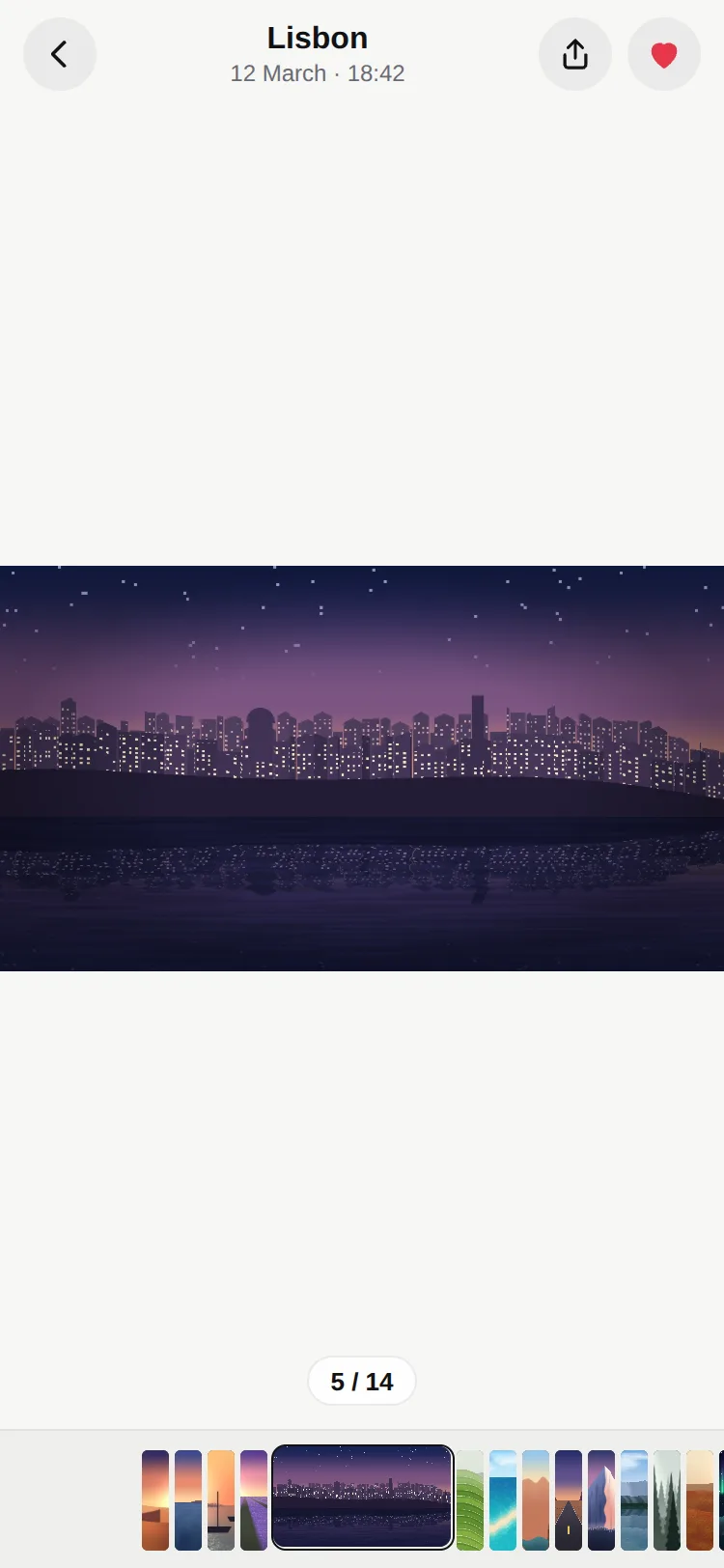
The photo app's gallery for React Native: a big viewer, and a strip where the current photo opens to its true shape between slivers of the others. Scrub the strip and the viewer follows frame by frame; swipe the viewer and the strip follows. No stretching, double-tap zoom…
by UpFork, built by Ramin ValadanMobile componentUpdated 14 Oct 2026
10 files · 5 packages · 14 assets
import { useCallback, useEffect, useImperativeHandle, useRef, useState, type Ref } from 'react';
import { AccessibilityInfo, StyleSheet, View } from 'react-native';
import Animated, {
  cancelAnimation,
  useAnimatedReaction,
  useReducedMotion,
  useSharedValue,
  withSpring,
  withTiming,
} from 'react-native-reanimated';
import { scheduleOnRN } from 'react-native-worklets';

import { useScheme } from '../../lib/use-scheme';
import { clamp } from './layout';
import { FilmstripStrip } from './strip';
import { SwapText } from './swap-text';
import type { FilmItem, FilmstripHandle, FilmstripProps } from './types';
import { FilmstripViewer } from './viewer';

export const FILMSTRIP_THEMES = {
  dark: { page: '#050506', counter: 'rgba(0, 0, 0, 0.45)', counterBorder: 'rgba(255, 255, 255, 0.14)', counterText: '#FFFFFF' },
  light: { page: '#F7F7F5', counter: 'rgba(255, 255, 255, 0.85)', counterBorder: 'rgba(0, 0, 0, 0.08)', counterText: '#111111' },
} as const;

/**
 * A photo viewer with a filmstrip: the big picture on top, and along the bottom the current item open
 * to its true shape between slivers of the others. One float index drives both, so scrubbing the
 * strip pages the viewer frame by frame and swiping the viewer slides the strip.
 */
export function Filmstrip<T extends FilmItem>({
  data,
  renderImage,
  index,
  defaultIndex = 0,
  onIndexChange,
  position: positionProp,
  thumbHeight = 52,
  sliverWidth = 14,
  gap = 3,
  showCounter = true,
  renderCaption,
  viewer = true,
  onRequestClose,
  onEndReached,
  endThreshold = 4,
  scheme: schemeProp,
  haptics = true,
  style,
  ref,
}: FilmstripProps<T> & { ref?: Ref<FilmstripHandle> }) {
  const scheme = useScheme(schemeProp);
  const theme = FILMSTRIP_THEMES[scheme];
  const reduceMotion = useReducedMotion();
  const n = data.length;
  const last = Math.max(0, n - 1);
  const start = clamp(index ?? defaultIndex, 0, last);
  const own = useSharedValue(start);
  const position = positionProp ?? own;

  // The item under the centre, live (counter, caption, loading more).
  const [live, setLive] = useState(start);
  useAnimatedReaction(
    () => Math.round(position.value),
    (now, before) => {
      if (now !== before) scheduleOnRN(setLive, Math.min(Math.max(now, 0), last));
    },
    [last],
  );

  const settledAt = useRef(start);
  const settle = useCallback(
    (i: number) => {
      if (i === settledAt.current) return;
      settledAt.current = i;
      onIndexChange?.(i);
    },
    [onIndexChange],
  );

  const goTo = useCallback(
    (i: number, animated = true) => {
      const target = clamp(i, 0, last);
      cancelAnimation(position);
      if (!animated) {
        position.value = target;
        settle(target);
        return;
      }
      const done = (finished?: boolean) => {
        'worklet';
        if (finished) scheduleOnRN(settle, target);
      };
      position.value = reduceMotion
        ? withTiming(target, { duration: 160 }, done)
        : withSpring(target, { stiffness: 260, damping: 30, mass: 1 }, done);
    },
    [last, position, reduceMotion, settle],
  );

  useImperativeHandle(ref, () => ({ scrollToIndex: goTo }), [goTo]);

  // Controlled: follow `index` when it changes from outside.
  useEffect(() => {
    if (index === undefined || index === settledAt.current) return;
    goTo(index);
  }, [index, goTo]);

  // New items appended (infinite loading) keep the position; a shorter list keeps it in range.
  useEffect(() => {
    if (position.value > last) position.value = last;
  }, [last, position]);

  // Loading more, once per length.
  const askedAt = useRef(-1);
  useEffect(() => {
    if (!onEndReached || n === 0) return;
    if (live >= n - 1 - endThreshold && askedAt.current !== n) {
      askedAt.current = n;
      onEndReached();
    }
  }, [live, n, endThreshold, onEndReached]);

  // The counter is read when it changes (screen readers).
  const announced = useRef(live);
  useEffect(() => {
    if (!showCounter || live === announced.current) return;
    announced.current = live;
    const timer = setTimeout(() => AccessibilityInfo.announceForAccessibility(`${live + 1} of ${n}`), 350);
    return () => clearTimeout(timer);
  }, [live, n, showCounter]);

  const viewerOptions = typeof viewer === 'object' ? viewer : {};
  const item = data[live];

  return (
    <View style={[styles.root, { backgroundColor: theme.page }, style]}>
      {viewer !== false ? (
        <View style={styles.viewerArea}>
          <FilmstripViewer
            data={data}
            position={position}
            renderImage={renderImage}
            parallax={viewerOptions.parallax}
            zoom={viewerOptions.zoom}
            fit={viewerOptions.fit}
            onIndexChange={settle}
            onRequestClose={onRequestClose}
            haptics={haptics}
          />
          {showCounter && n > 0 ? (
            <View pointerEvents="none" style={styles.counterSlot}>
              <View style={[styles.counter, { backgroundColor: theme.counter, borderColor: theme.counterBorder }]}>
                <SwapText text={`${live + 1} / ${n}`} style={[styles.counterText, { color: theme.counterText }]} />
              </View>
            </View>
          ) : null}
        </View>
      ) : null}
      {renderCaption && item ? <Animated.View style={styles.caption}>{renderCaption(item, live)}</Animated.View> : null}
      {n > 1 ? (
        <FilmstripStrip
          data={data}
          position={position}
          renderImage={renderImage}
          thumbHeight={thumbHeight}
          sliverWidth={sliverWidth}
          gap={gap}
          onIndexChange={settle}
          scheme={scheme}
          haptics={haptics}
        />
      ) : null}
    </View>
  );
}

const styles = StyleSheet.create({
  root: { flex: 1, overflow: 'hidden' },
  viewerArea: { flex: 1 },
  counterSlot: { position: 'absolute', left: 0, right: 0, bottom: 12, alignItems: 'center' },
  counter: { height: 26, borderRadius: 13, paddingHorizontal: 11, justifyContent: 'center', borderWidth: StyleSheet.hairlineWidth },
  counterText: { fontSize: 13, fontWeight: '600', fontVariant: ['tabular-nums'] },
  caption: { paddingHorizontal: 16, paddingTop: 10, paddingBottom: 8 },
});
Filmstrip is the gallery from your phone's photo app, for your own app: a big viewer on top and, along the bottom, a strip where the current item opens to its true shape while every other one is squeezed into a sliver.
Three complete demos: a photo viewer whose place and time morph per photo, a stay listing with the strip over the photo, and a film's chapters. Every picture in them is painted by our own shader.
0 reviews · 0 bugs
Ship it0With fixes0Skip0· 0 reviews
0 bugs0 open0 fixed
Members who have it review it and report its bugs. Sign in
No reviews or bugs yet.
React Native · Expo SDK 57
Built withExpo HapticsGesture HandlerReanimatedSVGSafe Area Context
Copy the files into your app
At your app’s root, the folders side by side as they are: the files import each other by relative paths. Its pictures come in Download source’s ZIP, where the code requires them.
Install the packages with Expo
npx expo install expo-haptics react-native-gesture-handler react-native-reanimated react-native-svg react-native-workletsAnd what the demos use
npx expo install react-native-safe-area-contextSee it in your app
Make demos/gallery.tsx your app’s App.tsx, inside the GestureHandlerRootView that Gesture Handler needs at its root:
UpFork installs every revision just so into a fresh Expo app (SDK 57), type-checks it and builds it for the web before it goes on sale. An AI assistant can do it for you through UpFork’s MCP server: Install mobile components has both ways.
import { GestureHandlerRootView } from 'react-native-gesture-handler';

import Gallery from './demos/gallery';

export default function App() {
  return (
    <GestureHandlerRootView style={{ flex: 1 }}>
      <Gallery scheme="light" />
    </GestureHandlerRootView>
  );
}


