New
Loading the page…
Loading the page…
Loading the page…
Before you buy
How this mobile component gets from the preview into your project, and what buyers ask most.
How to use it
From the preview to your project
Try it in the preview
Switch between light and dark, and resize it to phone and tablet widths, before you decide.
Get it
Free products are yours with a free account. Paid ones settle in USDT on TRON, sent straight to the wallet on your order.
Install it
Components go into your project with one shadcn command, dependencies included. Everything else downloads with a checksum.
Make it yours
It's your code now: rename it, restyle it and wire in your real data.
Or hand it to your AI
Copy the prompt and let your coding assistant place it in your project, following your conventions.
Yes, a free one: it keeps your order, every payment you make for it and the files together. Free products need it too: without an account you can look and try the live preview, but not download, install or copy anything.
Send the price as a USDT transfer on TRON (TRC-20) to the wallet on your order, shown with its QR code, then paste the transaction ID on the order. It's checked on-chain, and the files unlock once it's confirmed. Paid less? You're asked for the rest.
Yes. The Standard License covers unlimited personal and commercial projects, client work included; just don't resell it on its own. Open-source licenses say so on the product.
Create a CLI token on your account page, put it in your project's .env.local, add UpFork to components.json once, and install with npx shadcn add: free and paid components alike.
Onto your order, in your account. Download links last ten minutes and can be made again.
Releases are scanned for malware and reviewed before anyone can download them, and every file shows its SHA-256 so you can check what you got.
Building with an AI assistant?
Copy a ready-made prompt with the code, its dependencies and a demo, and your assistant can put it in place for you.
Selling your own work?
Get approved once, then publish components, templates and mobile components, paid in USDT straight to your own wallet.
Mobile
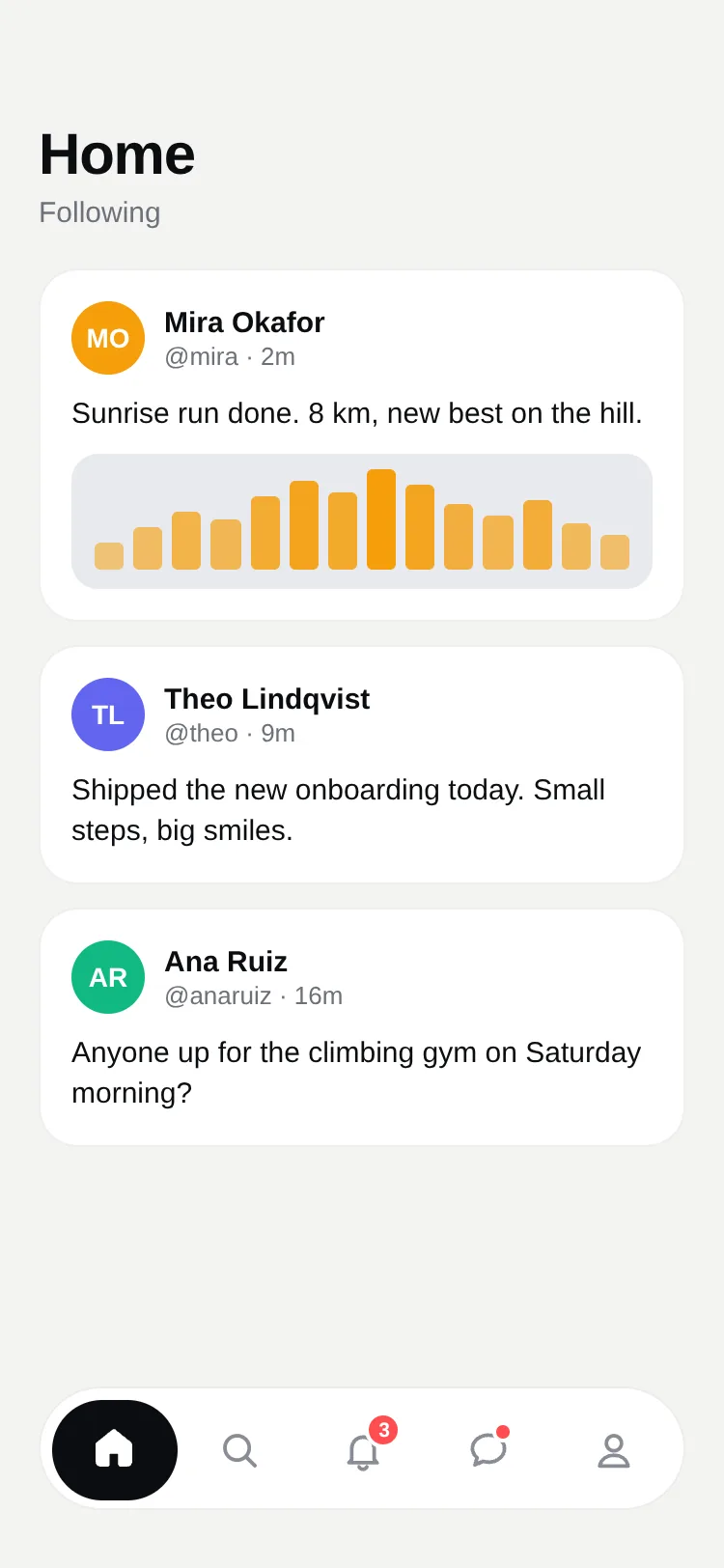
A floating bottom tab bar for React Native whose highlight stretches from tab to tab like liquid. Two styles (a pill behind the icon, or a tab that expands to show its label), badges that pop, icons that light up as the pill passes. Reanimated 4, light and dark, touch and mouse.
by UpFork, built by Ramin ValadanMobile componentUpdated 14 Oct 2026
4 files · 4 packages
import * as Haptics from 'expo-haptics';
import { useEffect, useRef, useState, type ReactNode } from 'react';
import {
  Platform,
  Pressable,
  StyleSheet,
  Text,
  View,
  type LayoutChangeEvent,
  type StyleProp,
  type ViewStyle,
} from 'react-native';
import Animated, {
  interpolateColor,
  useAnimatedStyle,
  useReducedMotion,
  useSharedValue,
  withSequence,
  withSpring,
  withTiming,
  type SharedValue,
} from 'react-native-reanimated';

import { useScheme, type Scheme } from '../../lib/use-scheme';

export type FluidTabIconProps = { color: string; size: number; focused: boolean };

export type FluidTab = {
  key: string;
  label: string;
  /** Draws the tab's icon: outlined when it isn't focused, filled when it is (see TabIcons). */
  icon: (props: FluidTabIconProps) => ReactNode;
  /** A count on the tab ("99+" past 99), or `true` for a plain dot. 0, false or none shows nothing. */
  badge?: number | boolean;
};

export type FluidTabBarProps = {
  tabs: FluidTab[];
  /** The focused tab's key. */
  value: string;
  onChange: (key: string) => void;
  /**
   * 'pill': equal tabs, with a liquid pill that stretches from tab to tab behind the icons.
   * 'expand': the focused tab grows to show its label beside its icon.
   */
  variant?: 'pill' | 'expand';
  /** The pill's color. Defaults to the theme's ink. */
  tint?: string;
  /** The focused icon's and label's color on the pill. */
  onTint?: string;
  height?: number;
  scheme?: Scheme;
  style?: StyleProp<ViewStyle>;
};

const PAD = 6;
const ICON = 24;
const LABEL_GAP = 8;
/** The edge that leads moves fast, the one that trails follows: the pill stretches, then settles. */
const LEAD = { damping: 22, stiffness: 420, mass: 0.6 };
const TRAIL = { damping: 24, stiffness: 150, mass: 0.9 };
const BODY = { damping: 20, stiffness: 240, mass: 0.7 };
const QUICK = { duration: 180 };

const THEMES = {
  light: {
    bar: '#FFFFFF',
    line: 'rgba(12, 13, 16, 0.08)',
    ink: '#0C0D10',
    page: '#FFFFFF',
    muted: '#8A8D96',
    badge: '#FF4D4F',
    shadow: 0.12,
  },
  dark: {
    bar: '#18191D',
    line: 'rgba(255, 255, 255, 0.08)',
    ink: '#F2F3F5',
    page: '#0C0D10',
    muted: '#80848D',
    badge: '#FF5C5F',
    shadow: 0.5,
  },
} as const;

const webPointer = Platform.OS === 'web' ? ({ cursor: 'pointer' } as unknown as ViewStyle) : null;

/**
 * A floating tab bar whose highlight moves like a drop of liquid: its leading edge darts to the new tab and its
 * trailing edge follows, so it stretches on the way and settles on arrival. Works with a finger and the mouse.
 */
export function FluidTabBar({
  tabs,
  value,
  onChange,
  variant = 'pill',
  tint,
  onTint,
  height = 64,
  scheme: schemeProp,
  style,
}: FluidTabBarProps) {
  const scheme = useScheme(schemeProp);
  const theme = THEMES[scheme];
  const fill = tint ?? theme.ink;
  const fillText = onTint ?? (tint ? '#FFFFFF' : theme.page);
  const reduceMotion = useReducedMotion();
  const expand = variant === 'expand';

  const index = Math.max(0, tabs.findIndex((tab) => tab.key === value));
  const previous = useRef(index);

  const [width, setWidth] = useState(0);
  const widthValue = useSharedValue(0);
  const count = tabs.length;
  // The labels' widths, measured once off screen: how far a focused tab grows in 'expand'.
  const labels = useSharedValue<number[]>(tabs.map(() => 0));
  const [measured, setMeasured] = useState(false);

  // pos: where the focus is, as a fractional tab index; left and right: the pill's two edges, the same way.
  const pos = useSharedValue(index);
  const left = useSharedValue(index);
  const right = useSharedValue(index);

  useEffect(() => {
    const from = previous.current;
    previous.current = index;
    if (from === index) return;
    if (reduceMotion) {
      pos.value = withTiming(index, QUICK);
      left.value = withTiming(index, QUICK);
      right.value = withTiming(index, QUICK);
      return;
    }
    pos.value = withSpring(index, BODY);
    left.value = withSpring(index, index > from ? TRAIL : LEAD);
    right.value = withSpring(index, index > from ? LEAD : TRAIL);
  }, [index, pos, left, right, reduceMotion]);

  function onLayout(event: LayoutChangeEvent) {
    const next = event.nativeEvent.layout.width;
    setWidth(next);
    widthValue.value = next;
  }

  function onLabelLayout(at: number, labelWidth: number) {
    const next = [...labels.value];
    next[at] = labelWidth;
    labels.value = next;
    if (next.every((w) => w > 0)) setMeasured(true);
  }

  function select(key: string) {
    if (key === value) return;
    Haptics.selectionAsync().catch(() => undefined);
    onChange(key);
  }

  const slot = height - PAD * 2;
  const geometry = { count, slot, expand, widthValue, labels, pos, left, right };

  const pillStyle = useAnimatedStyle(() => {
    const l = boxAt(geometry, left.value).x;
    const end = boxAt(geometry, right.value);
    const w = Math.max(slot, end.x + end.w - l);
    // Stretched, it thins a little, as a drop does; at rest it's its full height.
    const rest = boxAt(geometry, pos.value).w;
    const squeeze = Math.min(0.14, Math.max(0, w / Math.max(rest, 1) - 1) * 0.09);
    return { left: l, width: w, top: PAD + (slot * squeeze) / 2, height: slot * (1 - squeeze) };
  });

  return (
    <View
      accessibilityRole="tablist"
      onLayout={onLayout}
      style={[
        styles.bar,
        {
          height,
          borderRadius: height / 2,
          backgroundColor: theme.bar,
          borderColor: theme.line,
          shadowOpacity: theme.shadow,
        },
        style,
      ]}>
      {width > 0 ? (
        <Animated.View
          pointerEvents="none"
          style={[styles.pill, { borderRadius: slot / 2, backgroundColor: fill }, pillStyle]}
        />
      ) : null}

      {width > 0
        ? tabs.map((tab, at) => (
            <Tab
              key={tab.key}
              tab={tab}
              at={at}
              focused={at === index}
              geometry={geometry}
              showLabel={expand && measured}
              colors={{ on: fillText, off: theme.muted, badge: theme.badge, bar: theme.bar, pill: fill }}
              onPress={() => select(tab.key)}
            />
          ))
        : null}

      {/* The labels, measured where nobody sees them. */}
      {expand ? (
        <View pointerEvents="none" style={styles.measure} aria-hidden>
          {tabs.map((tab, at) => (
            <Text
              key={tab.key}
              numberOfLines={1}
              style={styles.label}
              onLayout={(event) => onLabelLayout(at, Math.ceil(event.nativeEvent.layout.width))}>
              {tab.label}
            </Text>
          ))}
        </View>
      ) : null}
    </View>
  );
}

type Geometry = {
  count: number;
  slot: number;
  expand: boolean;
  widthValue: SharedValue<number>;
  labels: SharedValue<number[]>;
  pos: SharedValue<number>;
  left: SharedValue<number>;
  right: SharedValue<number>;
};

/** How focused tab `at` is while the focus is at `pos`: 1 on it, falling to 0 a tab away. */
function weight(pos: number, at: number) {
  'worklet';
  return Math.max(0, 1 - Math.abs(pos - at));
}

/** Tab `i`'s width: an equal share in 'pill'; in 'expand', its icon, plus its label as it gains focus. */
function tabWidth(g: Geometry, i: number) {
  'worklet';
  if (!g.expand) return (g.widthValue.value - PAD * 2) / g.count;
  return g.slot + (g.labels.value[i] + LABEL_GAP + 6) * weight(g.pos.value, i);
}

/** Where tab `i` starts. In 'expand', the room the tabs leave is spread evenly between them. */
function tabX(g: Geometry, i: number) {
  'worklet';
  const inner = g.widthValue.value - PAD * 2;
  if (!g.expand) return PAD + (inner / g.count) * i;
  let total = 0;
  let before = 0;
  for (let k = 0; k < g.count; k++) {
    const w = tabWidth(g, k);
    total += w;
    if (k < i) before += w;
  }
  const gap = g.count > 1 ? Math.max(0, inner - total) / (g.count - 1) : 0;
  return PAD + before + gap * i;
}

/** The pill's width in 'pill': hugging the icon rather than filling a wide tab. */
function pillWidth(g: Geometry) {
  'worklet';
  return Math.min(tabWidth(g, 0), g.slot * 1.5);
}

/** A tab's box, or between two tabs' boxes for a fractional index: where the pill's edges stand. */
function boxAt(g: Geometry, at: number) {
  'worklet';
  const lo = Math.max(0, Math.min(g.count - 1, Math.floor(at)));
  const hi = Math.min(g.count - 1, lo + 1);
  const t = Math.max(0, Math.min(1, at - lo));
  const x = tabX(g, lo) * (1 - t) + tabX(g, hi) * t;
  const w = tabWidth(g, lo) * (1 - t) + tabWidth(g, hi) * t;
  if (g.expand) return { x, w };
  const p = pillWidth(g);
  return { x: x + (w - p) / 2, w: p };
}

/**
 * How much the pill covers tab `at`'s icon right now: 1 well inside it, 0 outside. As the pill sweeps past a tab on its
 * way, that tab's icon lights up and its badge's ring takes the pill's color, so nothing gray sits on the pill.
 */
function cover(g: Geometry, at: number) {
  'worklet';
  const l = boxAt(g, g.left.value).x;
  const end = boxAt(g, g.right.value);
  const center = tabX(g, at) + (g.expand ? g.slot / 2 : tabWidth(g, at) / 2);
  return Math.max(0, Math.min(1, Math.min(center - l, end.x + end.w - center) / 14));
}

function Tab({
  tab,
  at,
  focused,
  geometry,
  showLabel,
  colors,
  onPress,
}: {
  tab: FluidTab;
  at: number;
  focused: boolean;
  geometry: Geometry;
  showLabel: boolean;
  colors: { on: string; off: string; badge: string; bar: string; pill: string };
  onPress: () => void;
}) {
  const pressed = useSharedValue(0);
  const g = geometry;

  const box = useAnimatedStyle(() => ({
    left: tabX(g, at),
    width: tabWidth(g, at),
    transform: [{ scale: 1 - pressed.value * 0.06 }],
  }));
  const on = useAnimatedStyle(() => ({ opacity: Math.max(weight(g.pos.value, at), cover(g, at)) }));
  const off = useAnimatedStyle(() => ({ opacity: 1 - Math.max(weight(g.pos.value, at), cover(g, at)) }));
  const lift = useAnimatedStyle(() => {
    const w = weight(g.pos.value, at);
    return { transform: [{ translateY: g.expand ? 0 : -1.5 * w }, { scale: 1 + 0.06 * w }] };
  });
  const label = useAnimatedStyle(() => ({ opacity: Math.max(0, weight(g.pos.value, at) * 1.6 - 0.6) }));


  return (
    <Animated.View style={[styles.tab, { top: PAD, height: g.slot }, box]}>
      <Pressable
        accessibilityRole="tab"
        accessibilityLabel={tab.label}
        accessibilityState={{ selected: focused }}
        onPress={onPress}
        onPressIn={() => (pressed.value = withTiming(1, { duration: 90 }))}
        onPressOut={() => (pressed.value = withSpring(0, { damping: 14, stiffness: 320 }))}
        style={[styles.press, g.expand ? styles.pressExpand : null, webPointer]}>
        <Animated.View style={[styles.icon, { width: g.slot, height: g.slot }, lift]}>
          <Animated.View style={[StyleSheet.absoluteFill, styles.center, off]}>
            {tab.icon({ color: colors.off, size: ICON, focused: false })}
          </Animated.View>
          <Animated.View style={[StyleSheet.absoluteFill, styles.center, on]}>
            {tab.icon({ color: colors.on, size: ICON, focused: true })}
          </Animated.View>
          <Badge
            value={tab.badge}
            color={colors.badge}
            ring={colors.bar}
            pill={colors.pill}
            onPill={colors.on}
            geometry={g}
            at={at}
          />
        </Animated.View>
        {showLabel ? (
          <Animated.Text numberOfLines={1} style={[styles.label, { color: colors.on }, label]}>
            {tab.label}
          </Animated.Text>
        ) : null}
      </Pressable>
    </Animated.View>
  );
}

/** A count or a dot that pops in when it appears or grows, and shrinks away when it's cleared. */
function Badge({
  value,
  color,
  ring,
  pill,
  onPill,
  geometry,
  at,
}: {
  value: FluidTab['badge'];
  color: string;
  /** The ring's color on the bar, and on the pill when the pill is under it. */
  ring: string;
  pill: string;
  /** On the pill, the badge turns the pill's text color, with the pill's color for its digits. */
  onPill: string;
  geometry: Geometry;
  at: number;
}) {
  const shown = value === true || (typeof value === 'number' && value > 0);
  const scale = useSharedValue(shown ? 1 : 0);
  const last = useRef(value);

  useEffect(() => {
    const grew = typeof value === 'number' && typeof last.current === 'number' && value > last.current;
    last.current = value;
    if (!shown) scale.value = withTiming(0, { duration: 160 });
    else if (grew) scale.value = withSequence(withTiming(1.3, { duration: 110 }), withSpring(1, { damping: 9, stiffness: 300 }));
    else scale.value = withSpring(1, { damping: 11, stiffness: 260 });
  }, [value, shown, scale]);

  const style = useAnimatedStyle(() => ({
    transform: [{ scale: scale.value }],
    opacity: Math.min(1, scale.value * 2),
    borderColor: interpolateColor(cover(geometry, at), [0, 1], [ring, pill]),
    backgroundColor: interpolateColor(cover(geometry, at), [0, 1], [color, onPill]),
  }));
  const digits = useAnimatedStyle(() => ({ color: interpolateColor(cover(geometry, at), [0, 1], ['#FFFFFF', pill]) }));
  const text = typeof value === 'number' ? (value > 99 ? '99+' : String(value)) : '';
  const dot = text === '';

  return (
    <Animated.View
      pointerEvents="none"
      style={[
        styles.badge,
        dot ? styles.dot : styles.count,
        style,
      ]}>
      {dot ? null : <Animated.Text style={[styles.badgeText, digits]}>{text}</Animated.Text>}
    </Animated.View>
  );
}

const styles = StyleSheet.create({
  bar: {
    width: '100%',
    borderWidth: StyleSheet.hairlineWidth,
    shadowColor: '#000',
    shadowRadius: 22,
    shadowOffset: { width: 0, height: 10 },
    elevation: 10,
  },
  pill: { position: 'absolute' },
  tab: { position: 'absolute' },
  press: { flex: 1, flexDirection: 'row', alignItems: 'center', justifyContent: 'center' },
  pressExpand: { justifyContent: 'flex-start', overflow: 'hidden' },
  icon: { alignItems: 'center', justifyContent: 'center' },
  center: { alignItems: 'center', justifyContent: 'center' },
  label: { fontSize: 15, fontWeight: '600', letterSpacing: -0.1, marginLeft: LABEL_GAP - 8, userSelect: 'none' },
  measure: { position: 'absolute', left: 0, top: 0, opacity: 0, flexDirection: 'row', alignItems: 'flex-start' },
  badge: { position: 'absolute', alignItems: 'center', justifyContent: 'center', borderWidth: 2 },
  dot: { top: 11, right: 13, width: 11, height: 11, borderRadius: 6 },
  count: { top: 6, right: 6, minWidth: 19, height: 19, borderRadius: 10, paddingHorizontal: 4 },
  badgeText: { fontSize: 10.5, fontWeight: '700', fontVariant: ['tabular-nums'] },
});
The tab bar is the part of your app people touch most, so it should feel good. Fluid Tab Bar's highlight moves like a drop of liquid: the edge facing the new tab darts ahead, the other follows, and the pill stretches, thins a little, and settles round on arrival.
pill keeps the tabs equal with the highlight hugging the icon; expand opens the focused tab to show its label beside its icon.{ color, size, focused } component works; nine outlined-and-filled icons come with it.tabBar.0 reviews · 0 bugs
Ship it0With fixes0Skip0· 0 reviews
0 bugs0 open0 fixed
Members who have it review it and report its bugs. Sign in
No reviews or bugs yet.
React Native · Expo SDK 57
Built withExpo HapticsReanimatedSVG
Copy the files into your app
At your app’s root, the folders side by side as they are: the files import each other by relative paths.
Install the packages with Expo
npx expo install expo-haptics react-native-reanimated react-native-svg react-native-workletsSee it in your app
Make demos/social.tsx your app’s App.tsx:
import Social from './demos/social';

export default function App() {
  return <Social scheme="light" />;
}
UpFork installs every revision just so into a fresh Expo app (SDK 57), type-checks it and builds it for the web before it goes on sale. An AI assistant can do it for you through UpFork’s MCP server: Install mobile components has both ways.


