New
Loading the page…
Loading the page…
Loading the page…
Before you buy
How this mobile component gets from the preview into your project, and what buyers ask most.
How to use it
From the preview to your project
Try it in the preview
Switch between light and dark, and resize it to phone and tablet widths, before you decide.
Get it
Free products are yours with a free account. Paid ones settle in USDT on TRON, sent straight to the wallet on your order.
Install it
Components go into your project with one shadcn command, dependencies included. Everything else downloads with a checksum.
Make it yours
It's your code now: rename it, restyle it and wire in your real data.
Or hand it to your AI
Copy the prompt and let your coding assistant place it in your project, following your conventions.
Yes, a free one: it keeps your order, every payment you make for it and the files together. Free products need it too: without an account you can look and try the live preview, but not download, install or copy anything.
Send the price as a USDT transfer on TRON (TRC-20) to the wallet on your order, shown with its QR code, then paste the transaction ID on the order. It's checked on-chain, and the files unlock once it's confirmed. Paid less? You're asked for the rest.
Yes. The Standard License covers unlimited personal and commercial projects, client work included; just don't resell it on its own. Open-source licenses say so on the product.
Create a CLI token on your account page, put it in your project's .env.local, add UpFork to components.json once, and install with npx shadcn add: free and paid components alike.
Onto your order, in your account. Download links last ten minutes and can be made again.
Releases are scanned for malware and reviewed before anyone can download them, and every file shows its SHA-256 so you can check what you got.
Building with an AI assistant?
Copy a ready-made prompt with the code, its dependencies and a demo, and your assistant can put it in place for you.
Selling your own work?
Get approved once, then publish components, templates and mobile components, paid in USDT straight to your own wallet.
Mobile
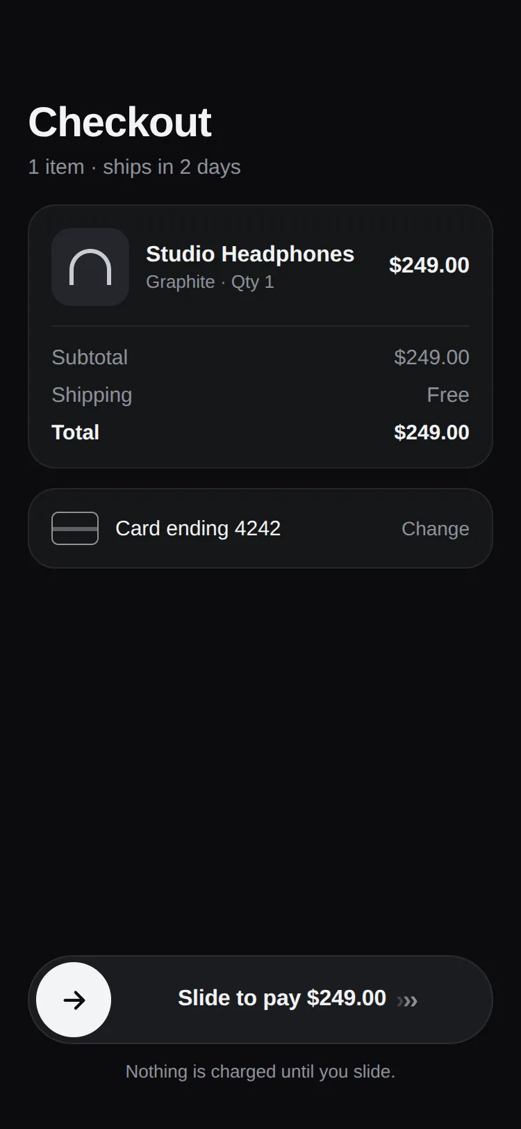
A slide-to-confirm button for React Native: drag to pay, transfer or unlock, with a spinner while your action runs, a done state and a retryable error. Reanimated 4, Gesture Handler, haptics, light and dark, works with touch and mouse.
by UpFork, built by Ramin ValadanMobile componentUpdated 14 Oct 2026
4 files · 5 packages
import { useEffect } from 'react';
import Animated, {
  Easing,
  cancelAnimation,
  useAnimatedStyle,
  useSharedValue,
  withRepeat,
  withTiming,
} from 'react-native-reanimated';
import Svg, { Circle, Path } from 'react-native-svg';

type IconProps = { size: number; color: string };

export function ArrowIcon({ size, color }: IconProps) {
  return (
    <Svg width={size} height={size} viewBox="0 0 24 24" fill="none">
      <Path
        d="M5 12h13M13 6l6 6-6 6"
        stroke={color}
        strokeWidth={2.2}
        strokeLinecap="round"
        strokeLinejoin="round"
      />
    </Svg>
  );
}

export function CheckIcon({ size, color }: IconProps) {
  return (
    <Svg width={size} height={size} viewBox="0 0 24 24" fill="none">
      <Path
        d="M5 12.5l4.5 4.5L19 7.5"
        stroke={color}
        strokeWidth={2.4}
        strokeLinecap="round"
        strokeLinejoin="round"
      />
    </Svg>
  );
}

export function CrossIcon({ size, color }: IconProps) {
  return (
    <Svg width={size} height={size} viewBox="0 0 24 24" fill="none">
      <Path d="M7 7l10 10M17 7L7 17" stroke={color} strokeWidth={2.4} strokeLinecap="round" />
    </Svg>
  );
}

/** A quarter-open ring that turns while the confirmation is under way. */
export function Spinner({ size, color }: IconProps) {
  const turn = useSharedValue(0);

  useEffect(() => {
    turn.value = withRepeat(withTiming(1, { duration: 850, easing: Easing.linear }), -1, false);
    return () => cancelAnimation(turn);
  }, [turn]);

  const style = useAnimatedStyle(() => ({ transform: [{ rotate: `${turn.value * 360}deg` }] }));

  return (
    <Animated.View style={[{ width: size, height: size }, style]}>
      <Svg width={size} height={size} viewBox="0 0 24 24" fill="none">
        <Circle cx={12} cy={12} r={8.5} stroke={color} strokeOpacity={0.25} strokeWidth={2.4} />
        <Path d="M12 3.5a8.5 8.5 0 0 1 8.5 8.5" stroke={color} strokeWidth={2.4} strokeLinecap="round" />
      </Svg>
    </Animated.View>
  );
}
Some actions shouldn't happen on a stray tap: paying, sending money, unlocking, deleting an account. Slide to Confirm asks for a deliberate swipe, then keeps the person informed: a spinner while your code runs, a calm "Paid" when it's done, and a clear error they can retry when it isn't.
onConfirm: the thumb waits at the end with a spinner, then shows your done label, or springs back with your error label.0 reviews · 0 bugs
Ship it0With fixes0Skip0· 0 reviews
0 bugs0 open0 fixed
Members who have it review it and report its bugs. Sign in
No reviews or bugs yet.
React Native · Expo SDK 57
Built withExpo HapticsGesture HandlerReanimatedSVG
Copy the files into your app
At your app’s root, the folders side by side as they are: the files import each other by relative paths.
Install the packages with Expo
npx expo install expo-haptics react-native-gesture-handler react-native-reanimated react-native-svg react-native-workletsSee it in your app
Make demos/checkout.tsx your app’s App.tsx, inside the GestureHandlerRootView that Gesture Handler needs at its root:
UpFork installs every revision just so into a fresh Expo app (SDK 57), type-checks it and builds it for the web before it goes on sale. An AI assistant can do it for you through UpFork’s MCP server: Install mobile components has both ways.
import { GestureHandlerRootView } from 'react-native-gesture-handler';

import Checkout from './demos/checkout';

export default function App() {
  return (
    <GestureHandlerRootView style={{ flex: 1 }}>
      <Checkout scheme="light" />
    </GestureHandlerRootView>
  );
}


