New
Loading the page…
Loading the page…
Loading the page…
Before you buy
How this mobile component gets from the preview into your project, and what buyers ask most.
How to use it
From the preview to your project
Try it in the preview
Switch between light and dark, and resize it to phone and tablet widths, before you decide.
Get it
Free products are yours with a free account. Paid ones settle in USDT on TRON, sent straight to the wallet on your order.
Install it
Components go into your project with one shadcn command, dependencies included. Everything else downloads with a checksum.
Make it yours
It's your code now: rename it, restyle it and wire in your real data.
Or hand it to your AI
Copy the prompt and let your coding assistant place it in your project, following your conventions.
Yes, a free one: it keeps your order, every payment you make for it and the files together. Free products need it too: without an account you can look and try the live preview, but not download, install or copy anything.
Send the price as a USDT transfer on TRON (TRC-20) to the wallet on your order, shown with its QR code, then paste the transaction ID on the order. It's checked on-chain, and the files unlock once it's confirmed. Paid less? You're asked for the rest.
Yes. The Standard License covers unlimited personal and commercial projects, client work included; just don't resell it on its own. Open-source licenses say so on the product.
Create a CLI token on your account page, put it in your project's .env.local, add UpFork to components.json once, and install with npx shadcn add: free and paid components alike.
Onto your order, in your account. Download links last ten minutes and can be made again.
Releases are scanned for malware and reviewed before anyone can download them, and every file shows its SHA-256 so you can check what you got.
Building with an AI assistant?
Copy a ready-made prompt with the code, its dependencies and a demo, and your assistant can put it in place for you.
Selling your own work?
Get approved once, then publish components, templates and mobile components, paid in USDT straight to your own wallet.
Mobile
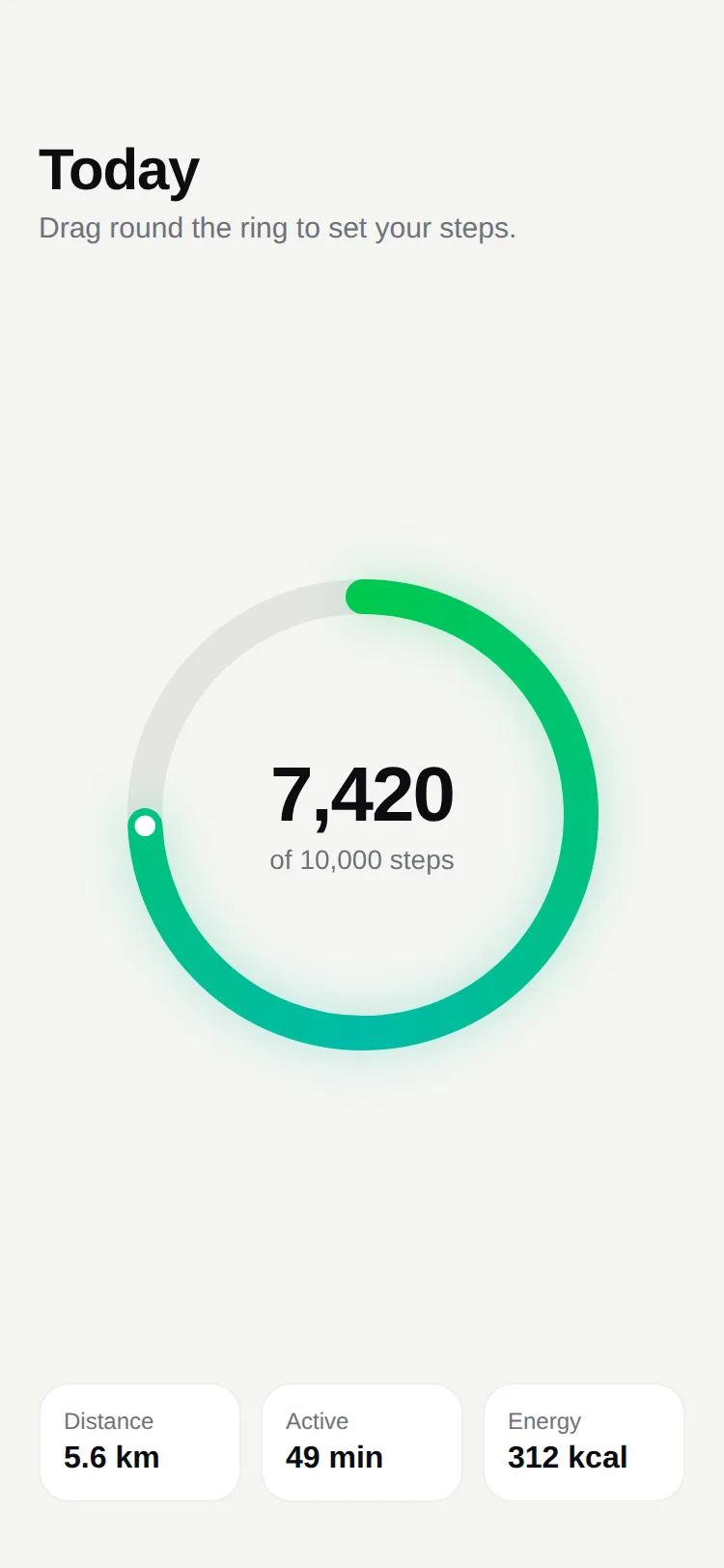
A progress ring for React Native drawn with Skia: a seamless gradient arc with a soft glow, a riding end dot and your content in the middle. Animate it, drive it with a shared value, or let people drag round it to set a goal. Light and dark.
by UpFork, built by Ramin ValadanMobile componentUpdated 14 Oct 2026
3 files · 5 packages
import { BlurMask, Canvas, Circle, Group, Path, Skia, SweepGradient, vec } from '@shopify/react-native-skia';
import * as Haptics from 'expo-haptics';
import { useEffect, useMemo, type ReactNode } from 'react';
import { StyleSheet, View, type StyleProp, type ViewStyle } from 'react-native';
import { Gesture, GestureDetector } from 'react-native-gesture-handler';
import {
  Easing,
  useDerivedValue,
  useSharedValue,
  withTiming,
  type SharedValue,
} from 'react-native-reanimated';
import { scheduleOnRN } from 'react-native-worklets';

import { useScheme, type Scheme } from '../../lib/use-scheme';

export type GoalRingProps = {
  /**
   * How full the ring is, from 0 to 1. A number animates to its new value; a shared value is
   * followed frame by frame (for progress you drive yourself).
   */
  progress: number | SharedValue<number>;
  /** Lets the user set the progress by dragging round the ring (or tapping on it). */
  interactive?: boolean;
  /** Called while the user drags, with the new progress. */
  onChange?: (progress: number) => void;
  /** Rounds dragged values to steps, e.g. 0.01 for whole percents. */
  step?: number;
  size?: number;
  thickness?: number;
  /** The gradient along the ring. It runs there and back, so the ring never shows a seam. */
  colors?: [string, string];
  scheme?: Scheme;
  /** What sits in the middle: a number, a label. */
  children?: ReactNode;
  style?: StyleProp<ViewStyle>;
};

const THEMES = {
  light: { track: 'rgba(12, 13, 16, 0.07)', glow: 0.3, dot: '#FFFFFF' },
  dark: { track: 'rgba(255, 255, 255, 0.08)', glow: 0.55, dot: '#FFFFFF' },
} as const;

const GLOW_ROOM = 14;
const BLUR = 12;
// The glow fades out over about three times its blur. The canvas reaches past the component's box by that much (the
// box itself stays `size` square), so the glow never meets the canvas's edge and shows it as a square.
const BLEED = BLUR * 3;
const TAU = Math.PI * 2;

/** A progress ring drawn with Skia: a gradient arc with a soft glow, set by dragging round it. */
export function GoalRing({
  progress,
  interactive = false,
  onChange,
  step = 0,
  size = 240,
  thickness = 18,
  colors = ['#22C55E', '#14B8A6'],
  scheme: schemeProp,
  children,
  style,
}: GoalRingProps) {
  const theme = THEMES[useScheme(schemeProp)];
  const center = size / 2;
  const radius = center - thickness / 2 - GLOW_ROOM;

  const circle = useMemo(() => {
    const path = Skia.Path.Make();
    path.addCircle(center, center, radius);
    return path;
  }, [center, radius]);

  const own = useSharedValue(0);
  const dragging = useSharedValue(false);
  const onRing = useSharedValue(false);
  const tenth = useSharedValue(-1);
  const external = typeof progress === 'number' ? null : progress;

  useEffect(() => {
    if (typeof progress !== 'number' || dragging.value) return;
    own.value = withTiming(clamp(progress), { duration: 900, easing: Easing.out(Easing.cubic) });
  }, [progress, own, dragging]);

  const value = useDerivedValue(() => (external ? clamp(external.value) : own.value));
  // A sliver at zero would draw a dot of the gradient: nothing at all reads better.
  const end = useDerivedValue(() => Math.max(value.value, 0.0001));
  const arcOpacity = useDerivedValue(() => (value.value < 0.003 ? 0 : 1));
  const dotX = useDerivedValue(() => center + radius * Math.cos(value.value * TAU - Math.PI / 2));
  const dotY = useDerivedValue(() => center + radius * Math.sin(value.value * TAU - Math.PI / 2));

  function report(next: number) {
    onChange?.(next);
  }

  function tick() {
    Haptics.selectionAsync().catch(() => undefined);
  }

  const pick = (x: number, y: number, previous: number) => {
    'worklet';
    let next = (Math.atan2(y - center, x - center) + Math.PI / 2 + TAU) % TAU / TAU;
    // Across the top the angle wraps: keep a full ring full and an empty one empty.
    if (previous > 0.75 && next < 0.25) next = 1;
    else if (previous < 0.25 && next > 0.75) next = 0;
    return step > 0 ? Math.round(next / step) * step : next;
  };

  const drag = Gesture.Pan()
    .enabled(interactive)
    .minDistance(0)
    .onBegin((event) => {
      const distance = Math.hypot(event.x - center, event.y - center);
      onRing.value = Math.abs(distance - radius) <= thickness * 1.6;
      if (!onRing.value) return;
      dragging.value = true;
      const next = pick(event.x, event.y, own.value);
      own.value = withTiming(next, { duration: 220, easing: Easing.out(Easing.cubic) });
      scheduleOnRN(report, next);
    })
    .onUpdate((event) => {
      if (!onRing.value) return;
      const next = pick(event.x, event.y, own.value);
      if (next === own.value) return;
      own.value = next;
      const t = Math.floor(next * 10);
      if (t !== tenth.value) {
        tenth.value = t;
        scheduleOnRN(tick);
      }
      scheduleOnRN(report, next);
    })
    .onFinalize(() => {
      dragging.value = false;
      onRing.value = false;
    });

  const gradient = [colors[0], colors[1], colors[0]];

  return (
    <GestureDetector gesture={drag}>
      <View
        accessible
        accessibilityRole={interactive ? 'adjustable' : 'progressbar'}
        accessibilityValue={{ min: 0, max: 100, now: Math.round(clampNumber(progress) * 100) }}
        style={[{ width: size, height: size }, style]}>
        <View pointerEvents="none" style={[styles.bleed, { width: size + BLEED * 2, height: size + BLEED * 2 }]}>
          <Canvas style={{ width: size + BLEED * 2, height: size + BLEED * 2 }}>
            <Group transform={[{ translateX: BLEED }, { translateY: BLEED }]}>
              <Path path={circle} style="stroke" strokeWidth={thickness} color={theme.track} />
              <Group transform={[{ rotate: -Math.PI / 2 }]} origin={vec(center, center)} opacity={arcOpacity}>
                <Path
                  path={circle}
                  style="stroke"
                  strokeWidth={thickness}
                  strokeCap="round"
                  start={0}
                  end={end}
                  opacity={theme.glow}>
                  <SweepGradient c={vec(center, center)} colors={gradient} />
                  <BlurMask blur={BLUR} style="normal" />
                </Path>
                <Path path={circle} style="stroke" strokeWidth={thickness} strokeCap="round" start={0} end={end}>
                  <SweepGradient c={vec(center, center)} colors={gradient} />
                </Path>
              </Group>
              <Circle cx={dotX} cy={dotY} r={thickness * 0.3} color={theme.dot} opacity={arcOpacity} />
            </Group>
          </Canvas>
        </View>
        <View pointerEvents="none" style={styles.middle}>
          {children}
        </View>
      </View>
    </GestureDetector>
  );
}

function clamp(value: number) {
  'worklet';
  return Math.min(Math.max(value, 0), 1);
}

function clampNumber(progress: number | SharedValue<number>) {
  return typeof progress === 'number' ? clamp(progress) : 0;
}

const styles = StyleSheet.create({
  bleed: { position: 'absolute', top: -BLEED, left: -BLEED },
  middle: {
    position: 'absolute',
    top: 0,
    right: 0,
    bottom: 0,
    left: 0,
    alignItems: 'center',
    justifyContent: 'center',
  },
});
Goal Ring draws progress the way fitness and storage apps do: a gradient arc with a soft glow and a bright dot riding its end, with whatever you like in the middle.
0 reviews · 0 bugs
Ship it0With fixes0Skip0· 0 reviews
0 bugs0 open0 fixed
Members who have it review it and report its bugs. Sign in
No reviews or bugs yet.
React Native · Expo SDK 57
Built withSkiaExpo HapticsGesture HandlerReanimated
Copy the files into your app
At your app’s root, the folders side by side as they are: the files import each other by relative paths.
Install the packages with Expo
npx expo install @shopify/react-native-skia expo-haptics react-native-gesture-handler react-native-reanimated react-native-workletsSee it in your app
Make demos/steps.tsx your app’s App.tsx, inside the GestureHandlerRootView that Gesture Handler needs at its root:
import { GestureHandlerRootView } from 'react-native-gesture-handler';

import Steps from './demos/steps';

export default function App() {
  return (
    <GestureHandlerRootView style={{ flex: 1 }}>
      <Steps scheme="light" />
    </GestureHandlerRootView>
  );
}
On the web, load Skia first
Phones need nothing more. On the web, copy node_modules/canvaskit-wasm/bin/full/canvaskit.wasm into your app’s public/ folder, add this index.web.ts, and set "main" to "index" in your package.json:
UpFork installs every revision just so into a fresh Expo app (SDK 57), type-checks it and builds it for the web before it goes on sale. An AI assistant can do it for you through UpFork’s MCP server: Install mobile components has both ways.
import '@expo/metro-runtime';
import { LoadSkiaWeb } from '@shopify/react-native-skia/lib/module/web';
import { registerRootComponent } from 'expo';

// Skia's engine first (public/canvaskit.wasm), then the app: nothing that uses Skia may load before it.
LoadSkiaWeb({ locateFile: (file: string) => `/${file}` })
  .then(() => import('./App'))
  .then(({ default: App }) => registerRootComponent(App));


