New
Loading the page…
Loading the page…
Loading the page…
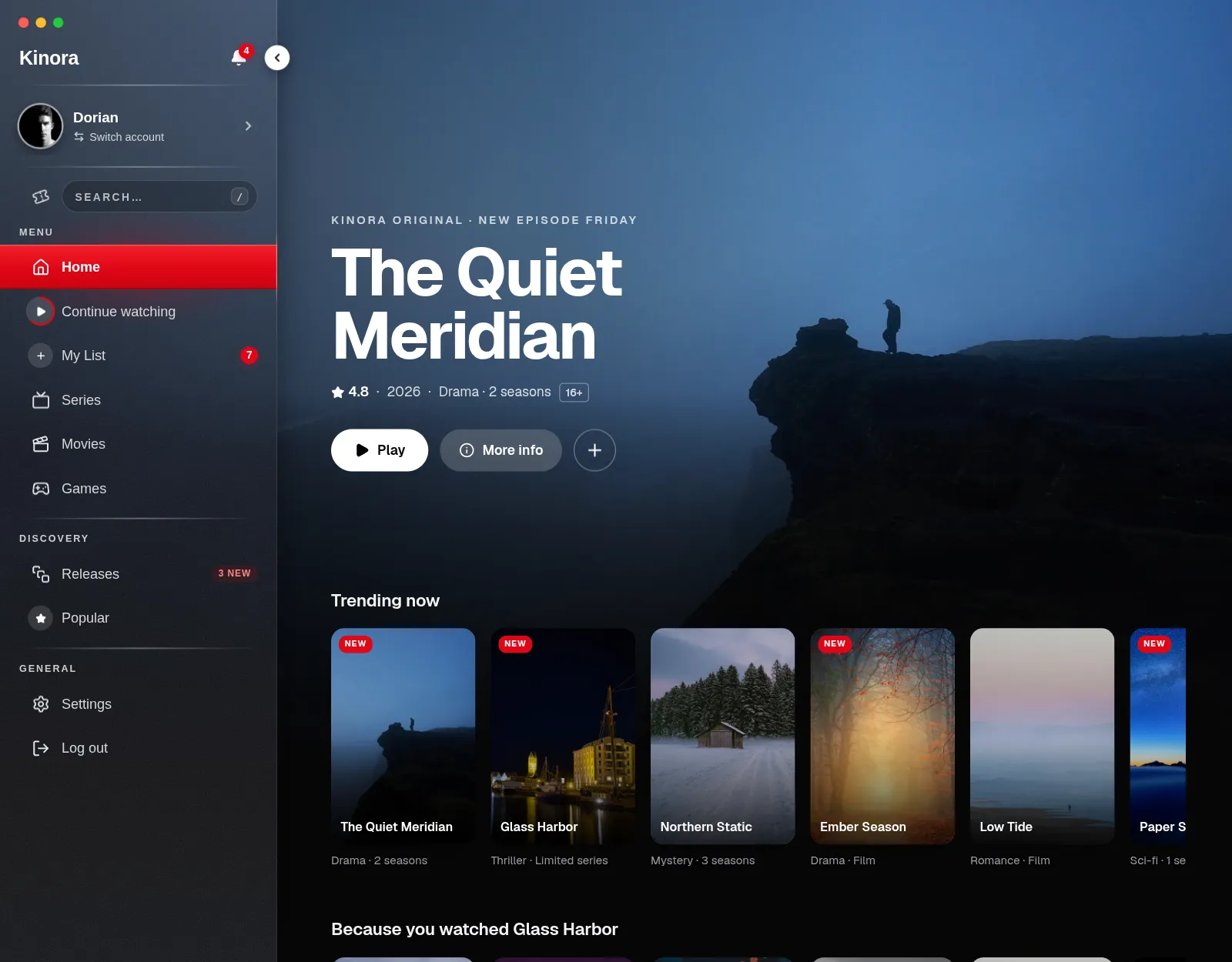
A cinema-grade glass sidebar for React: a red active bar that travels between rows, a collapse into a monogram rail, notifications, a profile switcher, search, preview flyouts, light/dark/auto, five accents, RTL and a phone drawer.
by UpFork, built by Ramin ValadanComponentUpdated 20 Oct 2026
Before you buy
How this component gets from the preview into your project, and what buyers ask most.
How to use it
From the preview to your project
Try it in the preview
Switch between light and dark, and resize it to phone and tablet widths, before you decide.
Get it
Free products are yours with a free account. Paid ones settle in USDT on TRON, sent straight to the wallet on your order.
Install it
Components go into your project with one shadcn command, dependencies included. Everything else downloads with a checksum.
Make it yours
It's your code now: rename it, restyle it and wire in your real data.
Or hand it to your AI
Copy the prompt and let your coding assistant place it in your project, following your conventions.
Yes, a free one: it keeps your order, every payment you make for it and the files together. Free products need it too: without an account you can look and try the live preview, but not download, install or copy anything.
Send the price as a USDT transfer on TRON (TRC-20) to the wallet on your order, shown with its QR code, then paste the transaction ID on the order. It's checked on-chain, and the files unlock once it's confirmed. Paid less? You're asked for the rest.
Yes. The Standard License covers unlimited personal and commercial projects, client work included; just don't resell it on its own. Open-source licenses say so on the product.
Create a CLI token on your account page, put it in your project's .env.local, add UpFork to components.json once, and install with npx shadcn add: free and paid components alike.
Onto your order, in your account. Download links last ten minutes and can be made again.
Releases are scanned for malware and reviewed before anyone can download them, and every file shows its SHA-256 so you can check what you got.
Building with an AI assistant?
Copy a ready-made prompt with the code, its dependencies and a demo, and your assistant can put it in place for you.
Selling your own work?
Get approved once, then publish components, templates and mobile components, paid in USDT straight to your own wallet.
Components
npm packages
20 files · 3 packages · 53 assets
The code comes with the Pro plan
The files above install into your project with one command, or download as a ZIP.
See the plansA cinema-grade glass navigation sidebar for React, made for streaming and media apps but at home in any dashboard.
[ or Ctrl/⌘+B). The title shrinks to its first letter, section labels become glowing dashes, and the rows get tooltips with badges and shortcuts. "Peek on hover" opens the rail over the page./ or Ctrl/⌘+K opens it, with Recent and Trending lists, highlighted matches and arrow keys.Built with Next.js 16, React 19, motion, lucide-react and @floating-ui/react-dom. The component itself is plain CSS.
pnpm install
pnpm dev          # http://localhost:3000
There are three demos:
| Page | What it shows |
|---|---|
/ | In an app (the default). Docked in a small dark streaming app, Kinora: the billboard and rows follow the sidebar. |
/showcase | Showcase. The floating sidebar over silk drawn by a WebGL shader, with a dock to try theme, accent, collapsed, peek, docked, RTL (Persian) and "Simulate notification". |
/rail | Collapsed rail. The same app in light theme, as a rail that peeks open on hover. |
Copy components/velvet-sidebar/ (or install it from UpFork), then:
pnpm add motion lucide-react @floating-ui/react-dom
Props, keyboard, theming and accessibility are documented in components/velvet-sidebar/README.md.
| Path | What |
|---|---|
components/velvet-sidebar/ | The component (CSS, hooks, popovers, tests). |
components/demo/ | Demo-only code: Kinora's data (data.ts), the silk shader, the control dock, the in-app page, and Persian copy. |
public/velvet/ | Demo photos, cut by pnpm photos (scripts/photos.mjs). Credits are in CREDITS.md. |
registry/ | What UpFork lists, written by pnpm registry. |
Kinora, its shows and its people are fictional. Any likeness to a real service or title is a coincidence.
pnpm lint && pnpm typecheck && pnpm test && pnpm build
0 reviews · 0 bugs
Ship it0With fixes0Skip0· 0 reviews
0 bugs0 open0 fixed
Members who have it review it and report its bugs. Sign in
No reviews or bugs yet.


