import { PixelRatio, Pressable, StyleSheet, Text, View } from 'react-native';
import Svg, { Path } from 'react-native-svg';

import { AddToBagPill, type PillState, SizeChips } from './controls';
import { nameSize, spaceKey, useDirection } from './direction';
import { cornerOf, labelOf, ring, useFace, useSkin } from './skin';
import type { Garment, TurnrailColours, TurnrailLabels } from './types';

export type CardProps = {
  garment: Garment;
  index: number;
  count: number;
  colourway: number;
  size: string | null;
  pill: PillState;
  pillReason?: string;
  onColourway: (i: number) => void;
  onSize: (label: string) => void;
  onAdd: () => void;
  onOpen: () => void;
  /** Counts presses of the pill with no size chosen: the chips light up briefly each time. */
  nudge?: number;
  /** Set for a few seconds after an add: "View bag" in the pill. */
  onViewBag?: () => void;
  onStep?: (delta: number) => void;
  colours: TurnrailColours;
  accent: string;
  labels: TurnrailLabels;
  formatPrice: (amount: number, currency: string) => string;
  fonts: { display?: string; text?: string };
  /** The card's width, for setting the name in two lines at most. */
  width: number;
  /** Short of room: 1 drops the description, 2 the swatch names too. */
  room?: 0 | 1 | 2;
  /** Small phones drop the description first, then the swatch names. */
  compact?: boolean;
  tight?: boolean;
};

export function Price({ g, colours, formatPrice, big }: { g: Garment; colours: TurnrailColours; formatPrice: CardProps['formatPrice']; fonts?: CardProps['fonts']; big?: boolean }) {
  const face = useFace();
  return (
    <View style={styles.priceRow}>
      <Text style={[big ? styles.priceBig : styles.price, face('600'), { color: colours.ink }]}>{formatPrice(g.price, g.currency)}</Text>
      {g.compareAtPrice ? (
        <Text style={[styles.was, face('400'), { color: colours.muted }]}>{formatPrice(g.compareAtPrice, g.currency)}</Text>
      ) : null}
    </View>
  );
}

export function Swatches({ g, colourway, onColourway, colours, accent, names }: { g: Garment; colourway: number; onColourway: (i: number) => void; colours: TurnrailColours; accent: string; fonts?: CardProps['fonts']; names: boolean }) {
  const skin = useSkin();
  const face = useFace();
  // A circle, or a square with the skin's corner: the ring sits 3 pt outside the swatch.
  const round = (d: number) => (skin.swatch === 'circle' ? d / 2 : Math.min(cornerOf(skin, d), 3));
  return (
    <View style={styles.swatches} accessibilityRole="radiogroup">
      {g.colourways.map((cw, i) => {
        const on = i === colourway;
        return (
          <Pressable key={cw.name} onPress={() => onColourway(i)} accessibilityRole="radio" accessibilityState={{ selected: on }} aria-checked={on} accessibilityLabel={cw.name} {...spaceKey(() => onColourway(i))}
            {...ring(colours.ink)} style={({ pressed }) => [styles.swatchHit, pressed && { opacity: 0.8 }]}>
            <View style={[styles.swatchRing, { borderColor: on ? accent : 'transparent', borderRadius: round(32) }]}>
              <View style={[styles.swatch, { backgroundColor: cw.swatch, borderColor: colours.line, borderRadius: round(24) }]} />
            </View>
            {names ? <Text style={[styles.swatchName, face(on ? '500' : '400'), { color: on ? colours.ink : colours.muted }]}>{cw.name}</Text> : null}
          </Pressable>
        );
      })}
    </View>
  );
}

function Chevron({ dir, colour }: { dir: -1 | 1; colour: string }) {
  // Right to left, "previous" sits on the right and points right.
  const flow = useDirection();
  return (
    <View style={flow < 0 ? styles.mirror : null}>
      <Svg width={18} height={18} viewBox="0 0 18 18">
        <Path d={dir < 0 ? 'M11 4 L6 9 L11 14' : 'M7 4 L12 9 L7 14'} stroke={colour} strokeWidth={1.8} fill="none" strokeLinecap="round" strokeLinejoin="round" />
      </Svg>
    </View>
  );
}

/** The counter with its chevrons: "4 / 14". */
export function Counter({ index, count, onStep, colours, labels }: { index: number; count: number; onStep?: (d: number) => void; colours: TurnrailColours; labels: TurnrailLabels; fonts?: CardProps['fonts'] }) {
  const skin = useSkin();
  const face = useFace();
  if (count <= 1) return null;
  const corner = cornerOf(skin, 44);
  return (
    <View style={styles.counter}>
      <Pressable onPress={() => onStep?.(-1)} disabled={index === 0} accessibilityRole="button" accessibilityLabel={labels.previous} hitSlop={4}
        {...ring(colours.ink)} style={({ pressed }) => [styles.chev, { borderRadius: corner }, pressed && { backgroundColor: colours.line }, index === 0 && { opacity: 0.35 }]}>
        <Chevron dir={-1} colour={colours.ink} />
      </Pressable>
      <Text style={[styles.count, face('500'), { color: colours.muted }]}>{labels.counter(index + 1, count)}</Text>
      <Pressable onPress={() => onStep?.(1)} disabled={index === count - 1} accessibilityRole="button" accessibilityLabel={labels.next} hitSlop={4}
        {...ring(colours.ink)} style={({ pressed }) => [styles.chev, { borderRadius: corner }, pressed && { backgroundColor: colours.line }, index === count - 1 && { opacity: 0.35 }]}>
        <Chevron dir={1} colour={colours.ink} />
      </Pressable>
    </View>
  );
}

/** Under the rail: the piece in front, and buying it right here. */
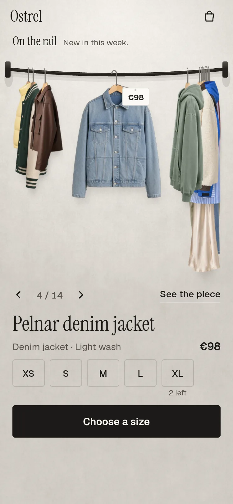
export function BuyingCard(p: CardProps) {
  const skin = useSkin();
  const face = useFace();
  const { garment: g, colours, labels, fonts, accent } = p;
  const cw = g.colourways[Math.min(p.colourway, g.colourways.length - 1)];
  const mark = g.badge === 'new' ? labels.newMark : g.badge === 'last-sizes' ? labels.lastSizes : null;
  const room = p.room ?? (p.tight ? 2 : 0);
  const base = p.tight ? 28 : 34;
  // Two lines at most, then smaller, never cut off (long names).
  const size = nameSize(g.name, Math.max(120, p.width - 40), base, PixelRatio.getFontScale());
  return (
    <View style={styles.card}>
      <View style={styles.headRow}>
        <Counter index={p.index} count={p.count} onStep={p.onStep} colours={colours} labels={labels} fonts={fonts} />
        <View style={styles.headRight}>
          {mark ? <Text style={[styles.mark, labelOf(skin, 13), face('600'), { color: accent, borderColor: accent, borderRadius: cornerOf(skin, 22) }]}>{mark}</Text> : null}
          <Pressable onPress={p.onOpen} accessibilityRole="button" accessibilityLabel={labels.seePiece} hitSlop={6}
            {...ring(colours.ink)} style={({ pressed }) => [styles.see, { borderRadius: cornerOf(skin, 44) }, pressed && { backgroundColor: colours.line }]}>
            <View>
              <Text style={[styles.seeText, labelOf(skin, 15), face('500'), { color: colours.ink }]}>{labels.seePiece}</Text>
              <View style={[styles.seeRule, { backgroundColor: colours.ink }]} />
            </View>
          </Pressable>
        </View>
      </View>
      <Text style={[styles.name, { fontSize: size, lineHeight: Math.round(size * 1.12), color: colours.ink, fontFamily: fonts.display }]} accessibilityRole="header">
        {g.name}
      </Text>
      <View style={styles.metaRow}>
        <Text style={[styles.kind, face('400'), { color: colours.muted }]}>{`${g.kind} · ${cw.name}`}</Text>
        <Price g={g} colours={colours} formatPrice={p.formatPrice} fonts={fonts} />
      </View>
      {g.description && room < 1 ? (
        <Text style={[styles.desc, face('400'), { color: colours.muted }]} numberOfLines={3}>{g.description}</Text>
      ) : null}
      {g.colourways.length > 1 ? (
        <Swatches g={g} colourway={p.colourway} onColourway={p.onColourway} colours={colours} accent={accent} fonts={fonts} names={room < 2} />
      ) : null}
      <SizeChips sizes={cw.sizes} value={p.size} onChange={p.onSize} colours={colours} accent={accent} labels={labels} compact={p.tight} nudge={p.nudge} />
      <View style={styles.actions}>
        <AddToBagPill state={p.pill} reason={p.pillReason} price={p.formatPrice(g.price, g.currency)} onPress={p.onAdd} onViewBag={p.onViewBag} colours={colours} accent={accent} labels={labels} />
      </View>
    </View>
  );
}

const styles = StyleSheet.create({
  card: { paddingHorizontal: 20, gap: 10 },
  headRow: { flexDirection: 'row', alignItems: 'center', justifyContent: 'space-between', minHeight: 44 },
  headRight: { flexDirection: 'row', alignItems: 'center', gap: 6, marginRight: -10 },
  counter: { flexDirection: 'row', alignItems: 'center', gap: 2, marginLeft: -12 },
  chev: { width: 44, height: 44, alignItems: 'center', justifyContent: 'center' },
  count: { fontSize: 15, fontVariant: ['tabular-nums'], minWidth: 52, textAlign: 'center' },
  mark: { fontSize: 13, fontWeight: '600', borderWidth: 1, paddingHorizontal: 9, paddingVertical: 2, overflow: 'hidden' },
  name: { fontSize: 34, lineHeight: 38, marginTop: -4 },
  mirror: { transform: [{ scaleX: -1 }] },
  metaRow: { flexDirection: 'row', alignItems: 'baseline', justifyContent: 'space-between', gap: 12, marginTop: -4 },
  kind: { fontSize: 15, flexShrink: 1 },
  desc: { fontSize: 15, lineHeight: 21 },
  priceRow: { flexDirection: 'row', alignItems: 'baseline', gap: 8 },
  price: { fontSize: 17, fontWeight: '600', fontVariant: ['tabular-nums'] },
  priceBig: { fontSize: 20, fontWeight: '600', fontVariant: ['tabular-nums'] },
  was: { fontSize: 15, textDecorationLine: 'line-through', fontVariant: ['tabular-nums'] },
  swatches: { flexDirection: 'row', gap: 14, flexWrap: 'wrap' },
  swatchHit: { flexDirection: 'row', alignItems: 'center', gap: 6, minHeight: 44 },
  swatchRing: { width: 32, height: 32, borderRadius: 16, borderWidth: 2, alignItems: 'center', justifyContent: 'center' },
  swatch: { width: 24, height: 24, borderRadius: 12, borderWidth: StyleSheet.hairlineWidth },
  swatchName: { fontSize: 15 },
  actions: { gap: 6, marginTop: 2 },
  see: { minHeight: 44, paddingHorizontal: 10, justifyContent: 'center' },
  // The link's own rule, 1 pt under its words with room to breathe: not the browser's underline.
  seeRule: { height: 1, marginTop: 3 },
  seeText: { fontSize: 15, fontWeight: '500' },
});