FreeMIT LicenseNewFeatured

Pacewall — Sneaker & Shoe Store Product Grid for React and Tailwind CSS

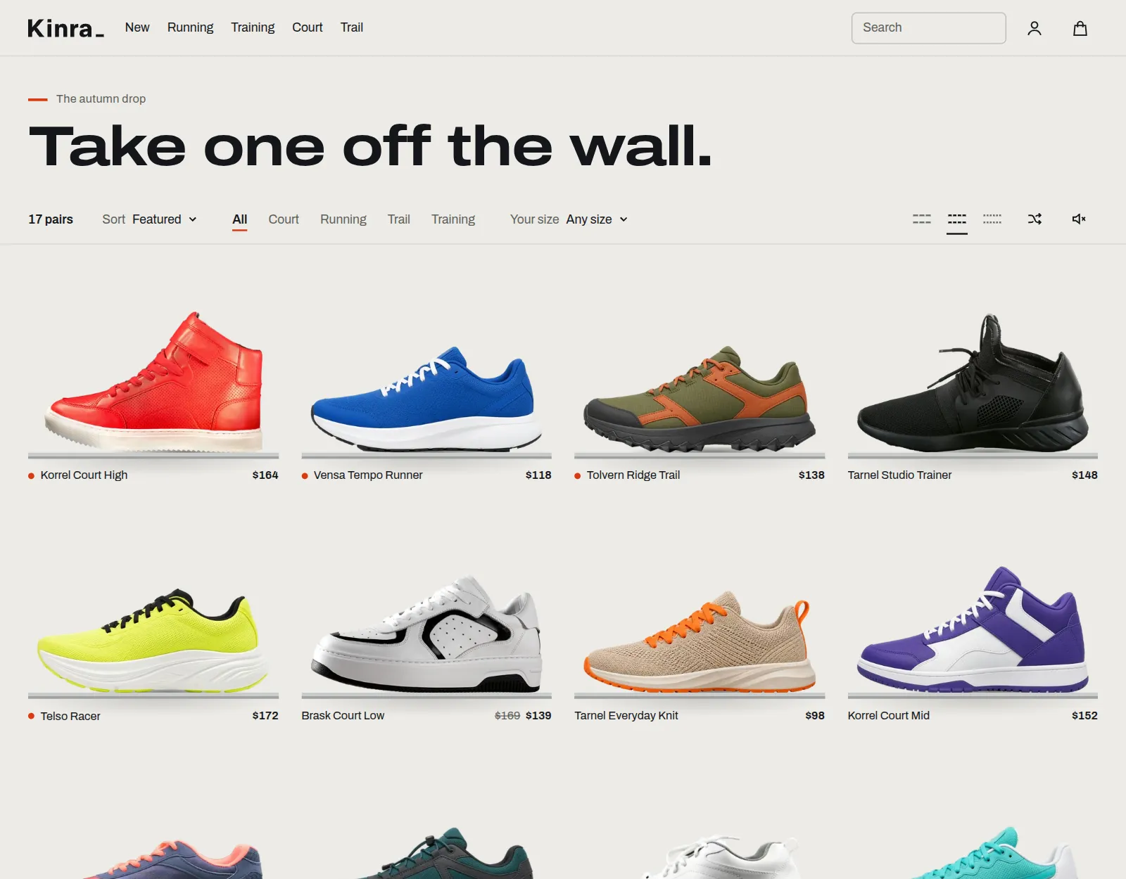
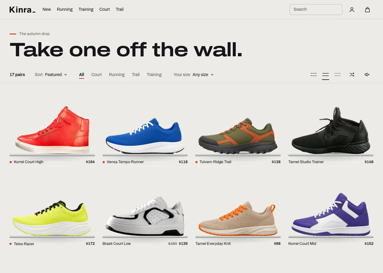
An animated product grid for shoe and sneaker stores in React and Tailwind CSS: shoes stand on slim shelves, shoppers sort and filter by size, and the shoe itself travels into a detail view with sizes and add to bag. No animation library.

by UpFork, built by Ramin ValadanComponentUpdated 5 Nov 2026

2 articles about itBehind the build32 lessons
Watch0
Preview of Pacewall — Sneaker & Shoe Store Product Grid for React and Tailwind CSS

Code

17 files · 84 assets

"use client";

import { useCallback, useEffect, useRef, useState } from "react";
import { defaultLabels } from "./labels";
import type { ShoeWallLabels } from "./types";

export type AddState = "needs-size" | "ready" | "adding" | "added" | "again" | "error" | "sold-out";

export type AddToBagButtonProps = {
  /** No size chosen yet. */
  needsSize: boolean;
  soldOut?: boolean;
  /** Resolves when the bag has it. A rejected promise shows the error state. */
  onAdd: () => void | Promise<void>;
  /** The size is missing: move focus to the sizes and give them a soft pulse. */
  onNeedSize?: () => void;
  /** Changes when the size does: the button goes back to ready at once. */
  sizeKey?: string | null;
  labels?: Partial<ShoeWallLabels>;
  onStateChange?: (state: AddState) => void;
};

const MIN_ADDING = 350;
const AGAIN_AFTER = 2400;

/** One fixed size. No state ever moves anything around it. */
export function AddToBagButton({ needsSize, soldOut, onAdd, onNeedSize, sizeKey, labels: given, onStateChange }: AddToBagButtonProps) {
  const labels = { ...defaultLabels, ...given };
  const [phase, setPhase] = useState<"idle" | "adding" | "added" | "again" | "error">("idle");
  const timer = useRef<number>(0);
  const busy = useRef(false);

  // A different size means a fresh start.
  const [lastSize, setLastSize] = useState(sizeKey);
  if (lastSize !== sizeKey) {
    setLastSize(sizeKey);
    setPhase("idle");
  }

  useEffect(() => () => window.clearTimeout(timer.current), []);

  const state: AddState = soldOut ? "sold-out" : needsSize ? "needs-size" : phase === "idle" ? "ready" : phase;

  useEffect(() => {
    onStateChange?.(state);
  }, [state, onStateChange]);

  const click = useCallback(async () => {
    if (soldOut) return;
    if (needsSize) {
      onNeedSize?.();
      return;
    }
    if (busy.current) return; // A double click is one click.
    busy.current = true;
    setPhase("adding");
    const started = performance.now();
    let failed = false;
    try {
      await onAdd();
    } catch {
      failed = true;
    }
    const left = MIN_ADDING - (performance.now() - started);
    if (left > 0) await new Promise((r) => window.setTimeout(r, left));
    busy.current = false;
    if (failed) {
      setPhase("error");
      return;
    }
    setPhase("added");
    window.clearTimeout(timer.current);
    timer.current = window.setTimeout(() => setPhase("again"), AGAIN_AFTER);
  }, [needsSize, onAdd, onNeedSize, soldOut]);

  const text: Record<AddState, string> = {
    "needs-size": labels.chooseSize,
    ready: labels.addToBag,
    adding: labels.adding,
    added: labels.inBag,
    again: labels.addAnother,
    error: labels.addFailed,
    "sold-out": labels.soldOutButton,
  };

  return (
    <button
      type="button"
      className="pw-add"
      data-state={state}
      data-testid="pw-add"
      aria-disabled={state === "sold-out" || undefined}
      aria-busy={state === "adding" || undefined}
      onClick={click}
    >
      <span className="pw-add-text" key={state}>
        {state === "added" ? (
          <svg className="pw-add-check" width="16" height="16" viewBox="0 0 16 16" fill="none" stroke="currentColor" strokeWidth="2" aria-hidden>
            <path d="M2.5 8.5 6.5 12.5 13.5 4" pathLength={1} />
          </svg>
        ) : null}
        {text[state]}
      </span>
      <span className="pw-add-sweep" aria-hidden />
    </button>
  );
}
17 files84 assets

From the workbench

Written about Pacewall — Sneaker & Shoe Store Product Grid for React and Tailwind CSS

By the developer who built it: how it works, with its real code and live preview in the text, and the lessons learned along the way.

About

A wall of sports shoes for an online store, in React and Tailwind CSS. Each shoe stands on its own slim shelf, with its name and price on a ticket under it. A shopper can rearrange the wall, thin it out to what fits them, and take a pair down: the shoe itself travels from its shelf into a detail view, they pick a size and add it to the bag, and the shoe travels back to its place.

What is in it

  • A real wall. Three densities, chosen with small icons of little shelves. Every sole sits exactly on its shelf at every width, and the last row ends in a finished way, with a "See all" placard and empty shelves at low contrast.
  • Arranging that does something. Sort by price, newest or colour, filter by category and by the shopper's own size, shuffle, and go back to the original order. Every change uses the same flight: shoes lift off the wall, travel in front of it, and land from above.
  • One object in motion. Click a shoe and that shoe travels to the detail view while its shelf stretches into a long rail under it. Closing is the same journey backwards, and the wall reaches full strength as the shoe lands.
  • Size and bag. A size picker with arrow keys, sold-out and low-stock states, and EU, US and UK from your data. A fixed-size button that moves through choosing, adding, added and add another, and handles a rejected promise. An optional small bag drawer.
  • Looking closer. Labelled views that move a camera over the same picture, and zoom that follows the pointer. Zoom stops where the picture would turn soft, so how far it goes depends on your source.
  • Deep links. ?shoe=slug opens a shoe on load, and browser back closes it.
  • Everywhere. Light, dark and auto themes, phones with a bottom sheet and swipe to close, keyboard, screen readers, reduced motion, right to left, and the wall and its links still work with no JavaScript.
  • Small and on its own. About 20 KB of JavaScript, gzipped, without React. No animation library. Works in Next.js and Vite, with plain <img> and <a> by default.

Please read this about the pictures

The wall expects transparent, side-view pictures with the toe to the left, and most shops do not have them. The project includes scripts/photos/, which takes your own photographs through the same steps: cut out, clean the edge, level the sole, export WebP and AVIF, and measure where the sole meets the shelf.

The shoes in the demos are not part of the MIT licence, and you should replace them. Of the 17, seven are real photographs under their own stock licences, and ten are AI-generated images made with Grok and ChatGPT. We have not verified those tools' terms for shipping their images in your product: check them yourself, or replace the pictures. PHOTOS.md lists every one. The shop, the shoe names and the prices are invented.

fromShopifyProducts maps a Storefront API response to the wall's data. It makes no network calls.
Reviews and bugs

0 reviews · 0 bugs

Ship it0With fixes0Skip0· 0 reviews

0 bugs0 open0 fixed

Members who have it review it and report its bugs. Sign in

No reviews or bugs yet.

Manual installation

Without the CLI

  1. 01

    Copy the files into your project

    • components/shoe-wall/AddToBagButton.tsx
    • components/shoe-wall/BagPeek.tsx
    • components/shoe-wall/engine/flight.ts
    • components/shoe-wall/engine/order.ts
    • components/shoe-wall/engine/sound.ts
    • components/shoe-wall/FilterSheet.tsx
    • components/shoe-wall/fromShopifyProducts.ts
    • components/shoe-wall/index.ts
    • components/shoe-wall/labels.ts
    • components/shoe-wall/ShoeDetail.tsx
    • components/shoe-wall/ShoeImage.tsx
    • components/shoe-wall/ShoeWall.tsx
    • components/shoe-wall/SizePicker.tsx
    • components/shoe-wall/Slot.tsx
    • components/shoe-wall/styles.css
    • components/shoe-wall/Toolbar.tsx
    • components/shoe-wall/types.ts

    The paths follow the shadcn/ui layout, with @/ as your project’s import alias.

  2. 02

    Its pictures load from UpFork

    The code above points at UpFork’s copies (4.6 MB), so there’s nothing to copy. To host them yourself, use Download source: its ZIP has the files where the code expects them, and a README on the switch.

Before you buy

Everything you need to know

How this component gets from the preview into your project, and what buyers ask most.

How to use it

From the preview to your project

  1. 01

    Try it in the preview

    Switch between light and dark, and resize it to phone and tablet widths, before you decide.

  2. 02

    Get it

    Free products are yours with a free account. Paid ones settle in USDT on TRON, sent straight to the wallet on your order.

  3. 03

    Install it

    Components go into your project with one shadcn command, dependencies included. Everything else downloads with a checksum.

  4. 04

    Make it yours

    It's your code now: rename it, restyle it and wire in your real data.

  5. 05

    Or hand it to your AI

    Copy the prompt and let your coding assistant place it in your project, following your conventions.

Building with an AI assistant?

Copy a ready-made prompt with the code, its dependencies and a demo, and your assistant can put it in place for you.

Copy AI prompt

Selling your own work?

Get approved once, then publish components, templates and mobile components, paid in USDT straight to your own wallet.